Beater Typers

OKAY. I recently came to the realization that for the serious, or semi-serious, or sometimes-serious writer of prose, who chooses to compose first-drafts via the medium of mechanical typewriter, there are some things worth taking care with, while other things don’t matter so much.
One of those things not worth worrying about is the quality of imprint. These are to be typings that no one else in the entire universe, save for one’s estate trustee or poor offspring stuck with the duty of disposing of your life’s detritus, will ever see; unless you’re one of those few whose writings are of a caliber worth the attention of some university institution.
SO! Quality of imprint doesn't matter. What does matter are other things.
ONE! Legibility. The letters so printed need merely to be readable, so as to facilitate later transcription into one’s word processor for that lengthy, middle-period of revision. But they needn’t be printer- perfect.
TWO! The mechanics of the typewriter need only be sufficient for the job of putting down legible words on paper, to later be transcribed. Nothing camera-ready here. Nothing fit to be published or shared with others, just inked words on paper, that you alone will read.
THREE! Haptics need to suit the writer. All important, this issue of feel, for how the two individuals, the one machine and the one writer, meld into a more perfect cybernetic union, which is that all-important physical sensation of pleasure for the writer, doing the Lord's work of creating literature out of thin air, powered by nothing more than cheese burgers and beer, has everything to do with the success of the endeavor. Even if the machine has some serious issues (like this one, for example), if the feel of the thing - the haptics - are good (like this one, for example), then the fit is right for it to be that all-important first-draft writing machine.
NOW! I will make a pronouncement. That the best, prettiest, sleekest machine in one’s typewriter stable might not be the best suited candidate for the job of workhorse typewriter. Like that stable of fine cars in Jay Leno’s garage, you wouldn't want to use that rare, exotic sports car for one’s daily commute. Doesn't make sense. You leave the pretty stable queens to primp and preen and so be ready for Friday nights out on the Strip; meanwhile that worker’s machine does the daily grind of making a living.
FOUR! The dichotomy should be striking, that one could be found to be creating some dang fine piece of literature using that most humble of writing instrument; that what mattered wasn’t the punter’s concern of fancy paint and shiny nickel trim or brand name, but that this old, ugly junker was a humble tool; that the work of writing is what happens between one’s ears, then to be worked out in fits and starts upon some cantankerous, curmudgeonly clunker of a tin-plated typer. It’s the dichotomy between the humble status of the beater typer and the finery of the resulting work. BEATER TYPER: that’s something to be proud of, that one went out of their way to find and use the most beat of the beater typers as one’s daily workhorse, that’ll take you from point A to point B reliably, though perhaps not in style or fashion.
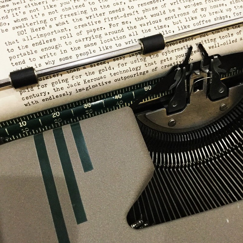
FIVE! Elite font size. You want to not only be using that nearly endless roll of teletype paper, but to fit the most letters on each line of type before the inevitable interruption of the carriage return.

SIX: TRUNK TYPER! You won’t always be chained to your nearly endless roll of paper, that Jack Kerouac-inspired technology, but might want to be out and about on short notice, for one never knows when inspiration might strike. It’s like lightning in that respect. So the Trunk Typer is the one you keep in your car at all times, year-round, come hell or high water. And it needn’t be that ultraportable, svelte runway model of a typewriter, regardless of how much you want to show her off. More apt would be a chunkier, middle-weight job, a serious working typer, a bit of a beater in appearance and performance but one that’ll get the job done. It’s not like you’re going to carry it very far ... it’s in your car, after all.
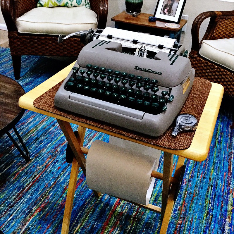
SO! Here’s what the serious typewriter-using writer should consider. That one’s writing station, during that all-important creative first-draft phase of writing, should be the typewriter chained to the nearly endless roll of paper. For me, it’s a wooden folding tray table, paper roll mounted underneath to a dowel rod between the table’s legs. It’s portable enough to easily move around various parts of my home, since I don’t always write in one spot, but like to break up the monotony.
Your needs might be different, I don’t know; but for getting yours gears well-oiled and spinning with endlessly imaginative outpourings of creativity, nothing beats a good beater typewriter well-suited to your person, where you don’t have to worry about every nagging issue (maybe it skips spaces or the letters aren’t even - but so what?), but it works well enough to easily put words down on paper that you alone will read. A beater typer is your true friend, your best friend, as a writer, because you have no higher expectation than it perform to that minimal requirement. It's imperfections are what makes it charming. After all, you’d be afraid to crank out a 50,000 word novel on your museum-grade cabinet queen, afraid you’d wear it out; but not so the beater typer, it has nothing left in life but to serve you, it's one true Master.
Typecast via beater Smith-Corona Silent-Super.
Labels: beater typewriters, smith-corona silent super, typewriter collecting, typing paper, writing

4 Comments:
This is true. I find that I tend to keep the beaters.. my own keeper Super-5 is the one I picked up in the 90's that had a rusted shell. It now wears the skin of a mechanically dead brown & ivory Tower President, so you can imagine the wacky color scheme. Types great though (:
Excellent points, well put!
I have gotten lots of good writing done on beaters.
Some great points Joe. I have a go-to office size manual in my radio room, an HH in the shop and generally carry a Skyriter even though my herd is quite large.
I do prefer pica over elite though. Always did, Sans Serif too. As far back as typing class. Then I guess that Sans comes from broadcast news and other copy as well as teletype. All UC sans is so much easier to read than other fonts.
Great insights, but on the typeface, prefer pica, too. As age has spited me, I now wear reading glasses and pica helps. I use my typewritten pages as written for lecture notes, so it is more important that I be able to see them than my scanner . . .
I've been using a Smith Corona Silent-Super for typing my notes. I have sexier and classier typewriters in my collection, but the ease of typing on a Silent-Super makes it my go-to, despite its zoftig bulbousness.
Post a Comment
<< Home