3D Line Mazes

(Click to embiggen)
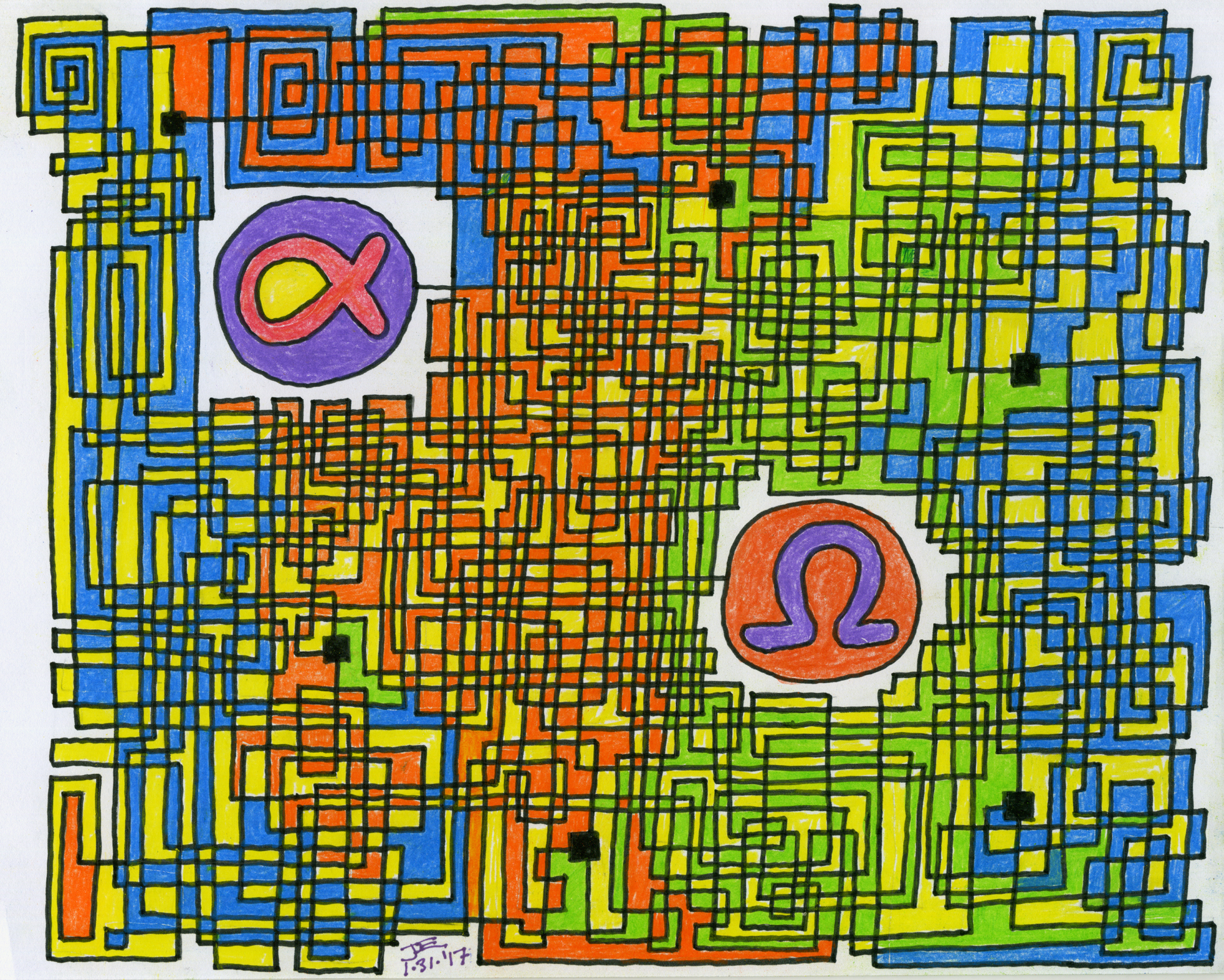
Follow the lines themselves, from Alpha to Omega. They cross over but don't connect to any other line except at the large square nodes. A line goes straight until it makes an elbow bend.
It's strange how events that transpired long ago in one's life can leave a lasting impression. That's the case here, and the reason why there's a colorful, hand-drawn maze adorning this blog posting. Permit me to spin a yarn.
It's the spring of 1971 and I'm several weeks from graduating 8th grade middle school when I come down with a bad intestinal flu. I'm home-bound for several weeks, missing the end of 8th grade, and the illness isn't getting any better. Then one day the pain begins, and gets worse and worse. Finally my dad drives me to the hospital and we find out I have a ruptured appendix that is badly infected with gangrene and peritonitis. I go into surgery an hour or two before dying, or so says my surgeon, Dr. Goddard, a relative of the famous rocket scientist. The hospital was Lovelace Clinic at Bataan Hospital, the same place the Mercury 7 astronauts underwent their pre-flight testing.
I'm in the hospital for several weeks before being sent home, during which I get rather used to the nightly morphine shots administered by the pretty nurse; by now I'm age 13 and already beginning to notice such things. The doctor advises me to take it easy during the summer recess and to not go out for sports that next school year; this decision has a life-long effect upon me being non-athletic.
So what's a kid to do? Hang out at the public library, that's what. Read up on interesting subjects; some that will end up holding my interest throughout my adult life. One of those topics was mazes, and I read every book I could find on the subject.
During that long, lazy summer I began to draw a maze on a sheet of notebook paper. When I filled the page I realized the maze was far from complete, so I taped on another sheet and continued. By summer's end it was done, a scroll of paper about 8 feet long containing blue Bic cristal inky pen lines of swirls and whorls. I'd figured out this graphic design element of double- and triple-spirals, where a pathway leads into a vortex, at the center of which is a decision point node that spins its way back out, only to connect to more such vortices.
Proud as I was by the maze, I had opportunity to show it off in a 9th grade class where our assignment was to "show-and-tell" what we did over the summer vacation. Naturally I didn't want to tell about my illness and resulting operation, so instead I brought The Scroll Maze to class. Much to my chagrin, the teacher demanded that I prove, right then and there, that the maze actually worked, otherwise I wouldn't get credit for the assignment. So I spent the rest of the class ruining my maze with the pencil line tracings of my route from start to end.
I was so incensed by having to ruin my maze that I tossed it out when I got home. Of course, in retrospect I now wish I hadn't. But that maze-drawing experience stuck with me. A few years later, while in military service, I began collecting maze books. One such book was the classic Dover Publications edition of "Mazes & Labyrinths - Their History & Development" by W.H. Matthews, a thorough, historical analysis of mazes ancient and modern.
The book that changed my understanding of maze design was Greg Bright's "The Great Maze Book," which introduced to me the idea of what he called "one-way valving," a topological method of steering the subject away from the correct path, so as to make it as difficult as possible.
I eventually came upon my own method of drawing mazes, what I call "line mazes," meaning the pathway to follow is the line itself, rather than the space between lines, as in a normal maze. Then I realized that the maze could be rendered in 3D if the lines were permitted to cross each other without connecting; actual connection nodes were explicitly drawn so as to reduce ambiguity. The final topping on the cake came years later when I realized that a finished 3D line maze could then be colored, Mondrian-style. The result is what you see at the top of this article.
I'd first advise you to click on the image for a larger rendering, as the 650-pixel wide default image is a bit too small. Follow the maze from Alpha to Omega. Or you could try it backwards, but there's no advantage in doing so. And mazes can be designed to purposefully foil those who try working them backwards. Because us maze designers can be a cruel lot.
Follow the lines themselves. They cross over but don't connect to any other line except at the large square nodes. A line goes straight until it makes an elbow bend. You can appreciate the colorful graphic design on its own merits, but there's no hint or clue to the solution given by the colors themselves.
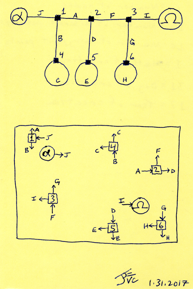
I've included below the schematic diagram for the maze's solution, along with a template map that labels each node and the corresponding letters associated with each path entering or leaving the nodes, as an aid in the puzzle's solution.
I designed the maze by drawing the schematic diagram first. You'll notice there are no dead-ends in this design; instead, I use loops, where a path exits a node (such as path "C" from node 4) and later reenters that same node. After designing the schematic I then laid out the location of all six nodes, then began drawing the lines themselves.
When designing the maze it's all too easy to crowd the lines together too closely early on such that later on, toward the end, it's more difficult to finish. I've thought of ways to prevent this, such as using an under layer of grid paper and assign each segment of the maze its own portion of the grid. For example, this maze has ten discrete pathways (count the lines connecting the various nodes). So using engineering grid paper that has a major grid in bold lines divided into tenths, each pathway would be drawn such that its lines stay on only its portion of the grid; i.e. pathway 3 would only be drawn on the grid lines three spaces over from the major lines, etc.
The result would be a more homogeneous design, with the lines more evenly covering the canvas and each path segment geographically encompassing more of the entirety of the page; with conventional 2D mazes, you'll often find pathways limited geographically to certain areas of the layout, which can give the solver clues to the maze's solution.
It's also possible to use a graphic design program and make the lines absolutely straight and true; whereas in this maze it's pretty obviously hand-drawn and colored with Prismacolor pencil.
Regarding the "one-way valving" principle of Greg Bright, he never actually explained in his books how this works, but I figured it out by assuming that when the solver reaches a node the decision of which branching point to take is made at random; thus, probability theory can be employed in the maze's design.
In this example maze, one-way valving would be evident if I had made nodes 4,5, and 6 with four branches instead of three; when entering node 1 the solver would have a 50% chance of choosing the correct path to node 2; but if he makes an incorrect choice and heads to node 4, then he only has a 33 1/3% chance of getting out of node 4 back onto the correct path. So probability can be used to steer (or "valve") the solver away from the correct path, by making it easy to wander off the correct path and harder to get back on. Just like as in real life.
I also figured out a difficulty rating system for these mazes, involving the odds of solving the maze first time with no backtracking, by multiplying the odds of choosing the correct path through each node. In this example maze, the chance of threading nodes 1, 2 and 3 first time with no backtracking is 1/2 x 1/2 x 1/2, or 12.5%. The lower the number the harder the maze.
Another design concept involves multiple correct routes from start to end, instead of just one. This maze is a classic example of there being only one correct solution path. But suppose the schematic diagram were more like a grid instead of only one correct route? The start could be in the upper left corner of the grid and the end in the lower right corner, for example; most of the nodes would each have four branches; or the sides could be wrapped around to the opposite, so every node has four branches. There wouldn't be just one correct solution through the grid, but many. And no dead-ends or loops. Would that make the solution easier? Perhaps; or, it could also make it more difficult, since it would be easier to get tied up in the complexity of connectivity and never reach the solution. Given my limited mathematical background, I have no idea how to determine the probability rating for solving such a multi-solution design. But these were the kinds of thoughts that kept me preoccupied all those years.
There are ways to make these mazes fiendishly difficult, besides employing one-way valving. For example, take advantage of the propensity for people's eyes to wander off the correct line. Surround the correct path with other lines that don't connect anywhere else but form an isolated, dead-ended loop; once your eyes mistakenly cross over into this nether region, woe betide you, you'll never get out without starting over. And the more graphically complex the maze, with lines drawn tightly together, the more likely you are to slip up. These kinds of graphic features are difficult to model mathematically. My triple-spiral graphic method from long ago was one such technique that can be used in this manner, since while threading the spirals it's all too easy to skip over a line into a neighboring pathway.
I'm interested in these mazes as much for their graphic design potential as for their connectivity as puzzles. This example maze is not great art, nor is it particularly complex as a maze. But it does introduce you to my idea of 3D line mazes, which I may share with you once again, the next time I find myself sitting at the kitchen table late at night for hours on end when I should be in bed. I also have a number of mazes from long ago, which might find themselves herein.
Post-Script: Here's the solution to the maze, including the schematic diagram and the location mapping of the nodes. Have fun.

Labels: cultural history, Mazes, memories

3 Comments:
That is a really nice maze. Looks difficult.
I've got to print the maze and find out how good I do at following it. Then I'll look at the solution.
I'm surprised after you read the book about labyrinths you did not make an Acoustic Labyrinth speaker. I'd have a pair of Van Cleave's in the house instead of Klipsh. I had a pair of old Stromberg-Carlson ones as a teenager.
Nice articles and your information valuable and good articles thank for the sharing information Portable Lap Desk Pillows
Nice articles and your information valuable and good articles thanks for the sharing information cylinder pillow support
Post a Comment
<< Home