Tuesday, September 26, 2017

California Typewriter in ABQ


We finally have confirmed showing times for the film California Typewriter in Albuquerque. It will be showing at the UA High Ridge theatre starting this coming Friday, September 29. I'm excited! Now, I need to decide if I'll sit in the back row and type my movie review real-time. Should I bring the Hermes Rocket or one of the Brother-made machines? Hmm. Just kidding.

Stay tuned sometime next week for a movie review.

Labels:

Monday, September 25, 2017

Bike-In Coffee at Old Town Farm

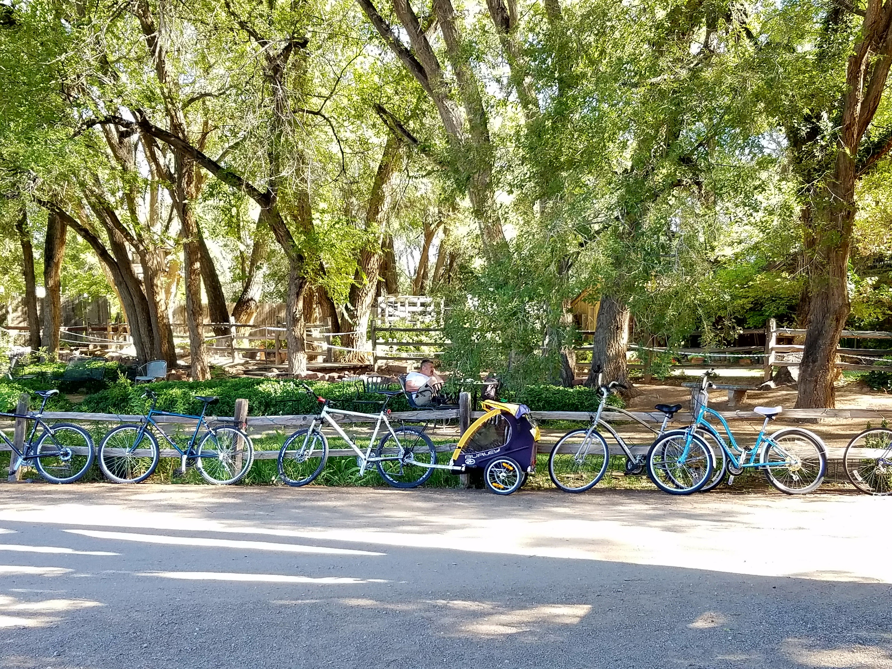
Bikes, Old Town Farm

I've not exactly been a faithful, dedicated bicyclist, especially these last few years. Which in part explains why I've also gained a few unwanted pounds. And when I have cycled, it's never been with the idea of performance cycling. I'm more of a comfort bike rider.

In high school I started with a 3-speed English Racer, in black with gold pin striping and a hub shifter. I'd try to keep up with my older brother who rode the bright-yellow Schwinn Varsity, a bike that by today's standards is just a heavy hunk of steel, but back then was the shizzle. But when he left home for the military, I moved up to the Schwinn, riding it all around the northeast part of town, including down the recently widened Juan Tabo Boulevard, 3-lanes-wide in both directions but devoid of traffic. You couldn't get away with that today without becoming another dead cyclist statistic.

Later, I commuted to work in an early incarnation of a mountain bike, which by today's standards is just an urban bike, as it lacked any kind of suspension. It was a good choice, as I like the more relaxed riding position and the handlebars, over the Binelli racing bike I thought I needed.

Later on, I did get a road bike, and rode it for a few years, but then the itch for a recumbent bit badly and, limited in budget, settled on a BikeE AT, which I enjoyed for some years, and with it made some of my longest rides, including a 50-mile loop into the White Sands Missile Range to see the Trinity Site.

I loved the semi-recumbent riding posture of the BikeE, still do in fact, but then the motor scooter bug bit, then the motorcycle bug, then the trike bug. And now I'm back to a scooter, while the BikeE languishes in my brother's garage, with the seat bracket broken when it fell over. BikeE are no longer in business; perhaps I should see about sourcing a replacement part for that seat bracket.

But for the last half-decade my wife and I have had Townie comfort bikes, mine with the somewhat thinner 700cc tires and rigid aluminum frame; while hers has 26 inch, 1-1/4" tires and an air shock front suspension. Though it's not a recumbent, I'm amazed at how easy that bike is to ride across town. Not having to lean forward onto one's wrists and crane your neck up to see, the riding position is quite good.

We don't have room in our garage to store the bikes, and the storage shed is full of whatever people like to store in sheds, besides garden tools. So we keep the bikes leaning against the north side of the shed, out of the sun and partially protected by the shed's roof's overhang, but also cover both bikes with a large barbecue grill cover. This works pretty well to protect the bikes against the ravages of staying outdoors year-round.

So yesterday morning all I had to do was dust off the spider's webs and air up the tires. And where were we headed on this beautiful autumn morning, you might ask? Why, down to Old Town and the Rio Grande Valley of Albuquerque, to have breakfast at Old Town Farm.

No, we weren't going to ride all that way and back. Are you crazy? It's something like 8 miles each way, and uphill all the way back. Didn't I mention that I'm totally out of shape? Plus, I had a lunch appointment in the area a few hours later. So we loaded the bikes in the back of my truck and drove down to Old Town, parking behind the Albuquerque Museum and cycling down Mountain Road, west of Rio Grande Boulevard, into the neighborhoods of the old Saw Mill district.

I think if I could live anywhere in town, it would be this neighborhood, with its old, adobe-style homes with their courtyards and mature landscaping and the nearness to downtown and the Rio Grande. Especially this time of year, just before it starts to get cold, I was reminded how wonderful this town can be.

Albuquerque has over 400 miles of bike trails and paths. One of those trails runs east/west, parallel to Interstate 40, and skirts the north edge of Old Town Farm, an urban-based working farm. On weekends, from about 8am to 2pm, they host a bike-friendly coffee and snack gathering, with a food truck providing a light fare made from locally-grown produce, and verdant surroundings within which to enjoy one's stop.

I love the idea of this secretive, bike-friendly snack stop deep in the heart of the valley, tucked away in these lazy neighborhoods and accessed by bike path. The farm is currently building a permanent cafe building, from locally-sourced, repurposed building materials, which will provide a facility to offer more complete meals.

I've never been the kind of cyclist who wears spandex, yellow jerseys and clomps around in clip-on biking shoes. Except that one winter when I rode the recumbent around town, but then it was just the spandex leggings to stay warm. And the clip-in shoes were more for pedaling efficiency going uphill, one of the disadvantages of recumbents (you can't stand on the pedals, like with a conventional frame, to get lots of torque). We like more casual clothes for cycling, that enables us to fit cycling into one's lifestyle, the idea being that it's not a particularly grueling exercise, just a fun way to spend the time and get around. And when you do get to your destination, you're dressed in more appropriate attire for whatever you need to do. So, did we feel a bit like posers, as we rode into the farm on our casual Townie bikes, dressed as normal people, instead of the hardcore cyclists with their fancy gear? No, not a bit. There are all kinds of cyclists these days, besides the Ford-or-Chevy, democrat-or-republican bipolarity of mountain bike-or-road bike.

It might seem like cheating to some people, the idea of trucking your bikes across town for a short ride. But we intend on revisiting Old Town Farm, and in the process perhaps making a longer ride, like cycling along the main north/south trail that parallels the river, which can take you as far north as the village of Corrales and as far south as the Isleta Reservation.

Of course, the other thought that struck me while enjoying the idyllic beauty of the Rio Grande valley was how cool it would be to motor scooter to this place! Perhaps another day.

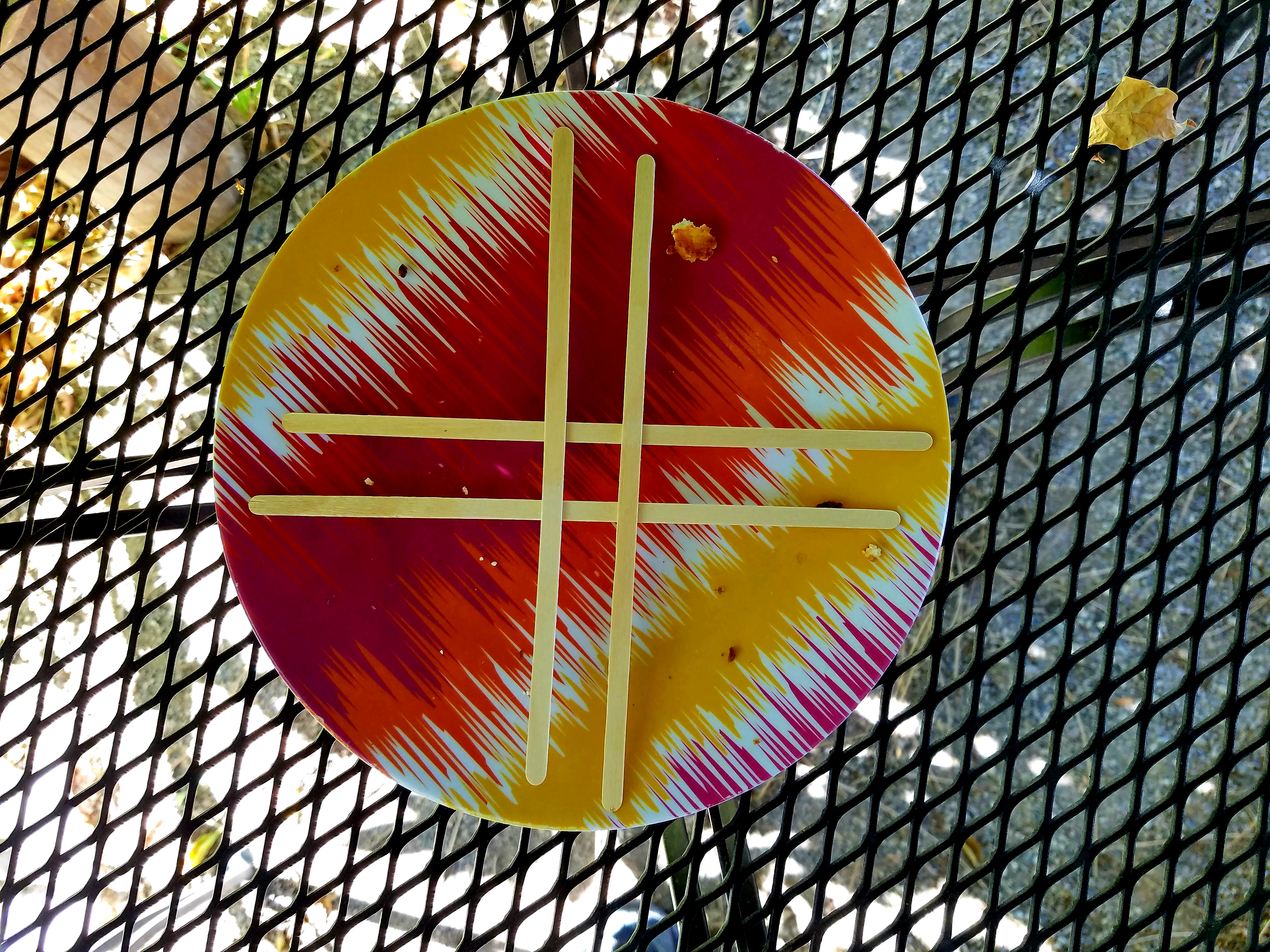
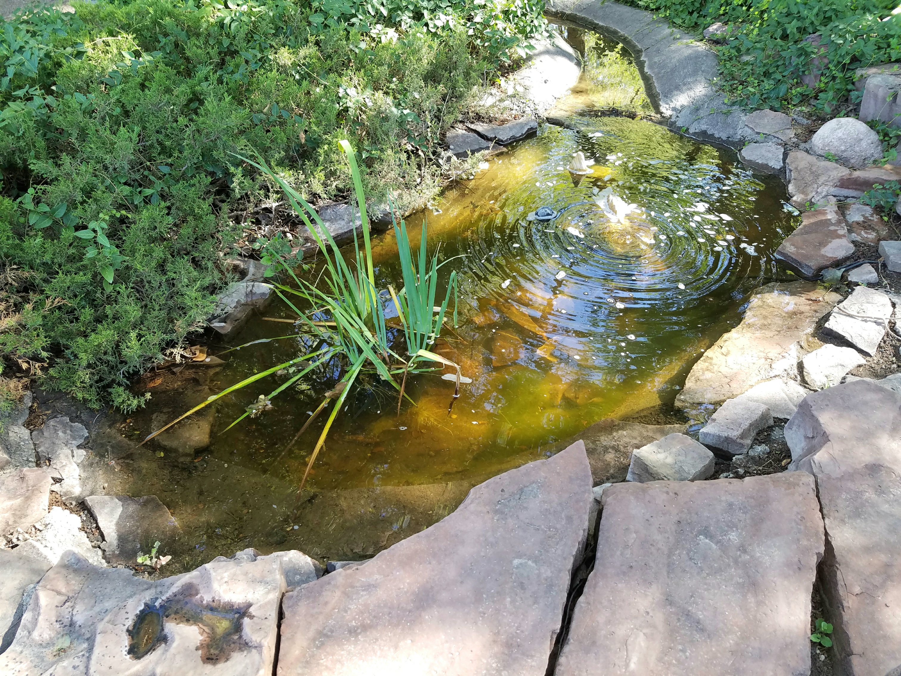
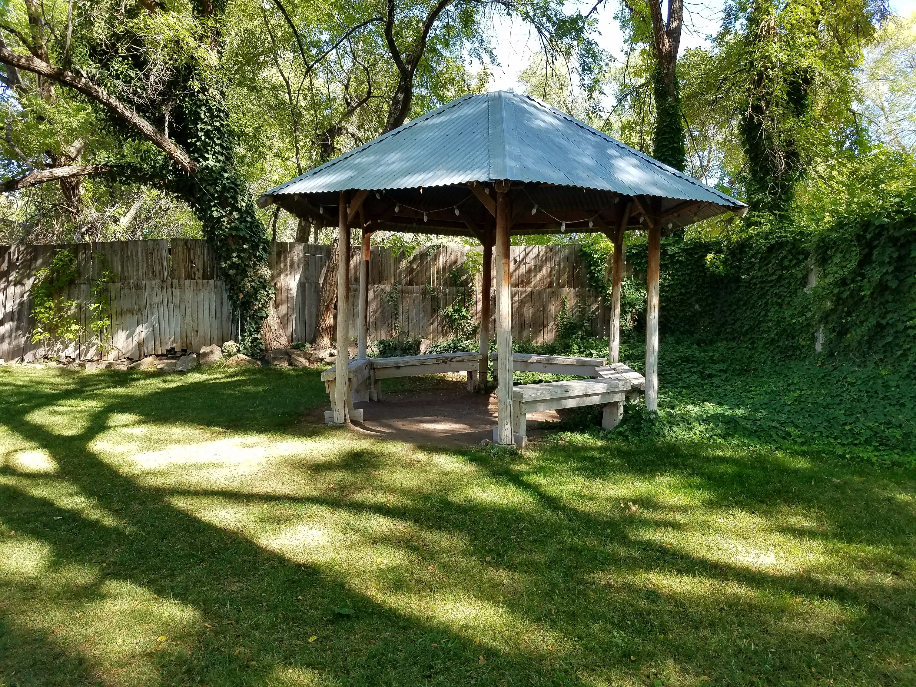
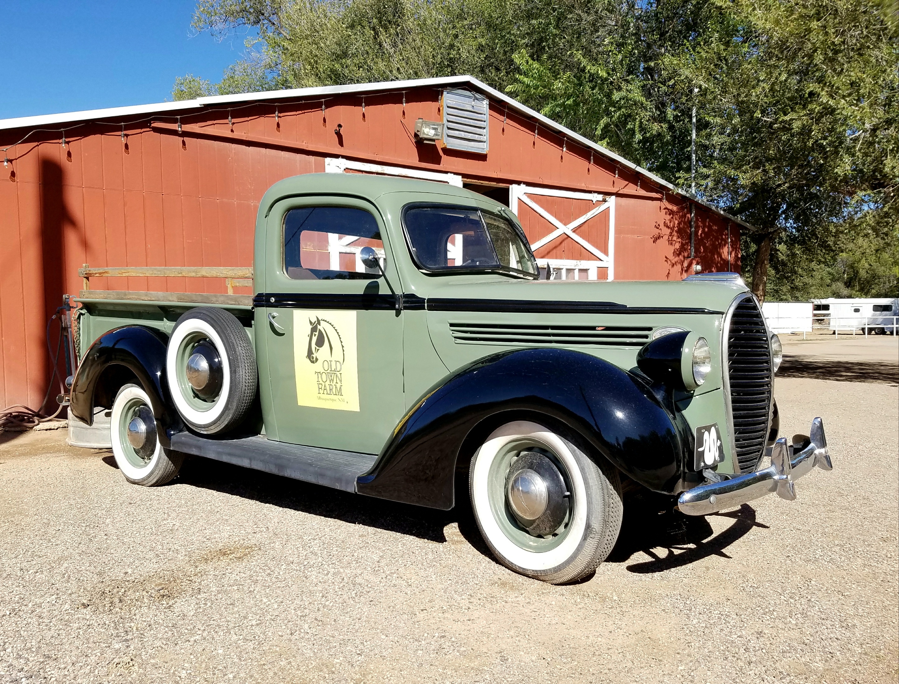
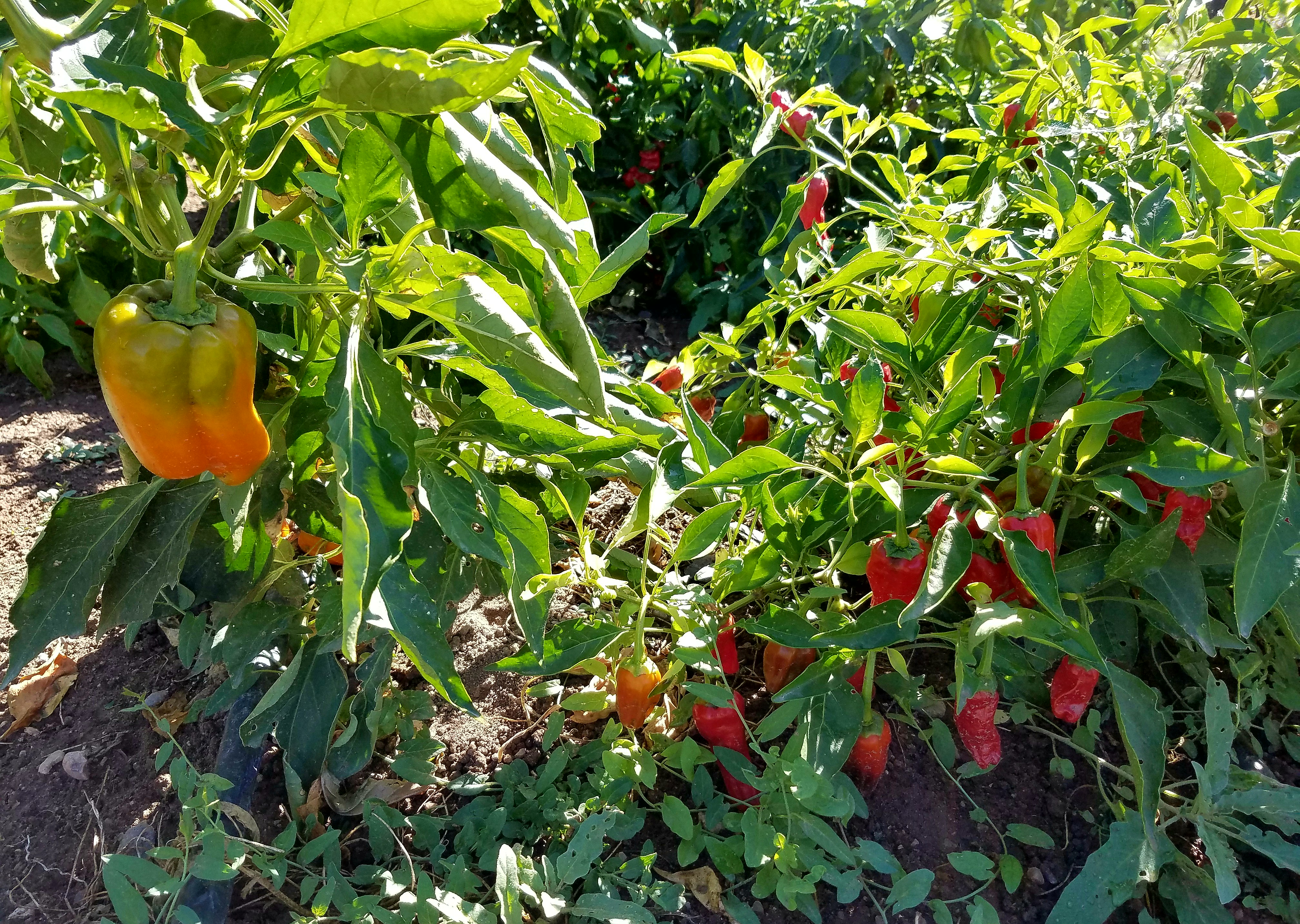
Post-Script: Here are a few snaps I took along the way.
Peppers
Plate
Old Town Farm Pond
Old Town Farm Gazebo
Old Town Farm Truck
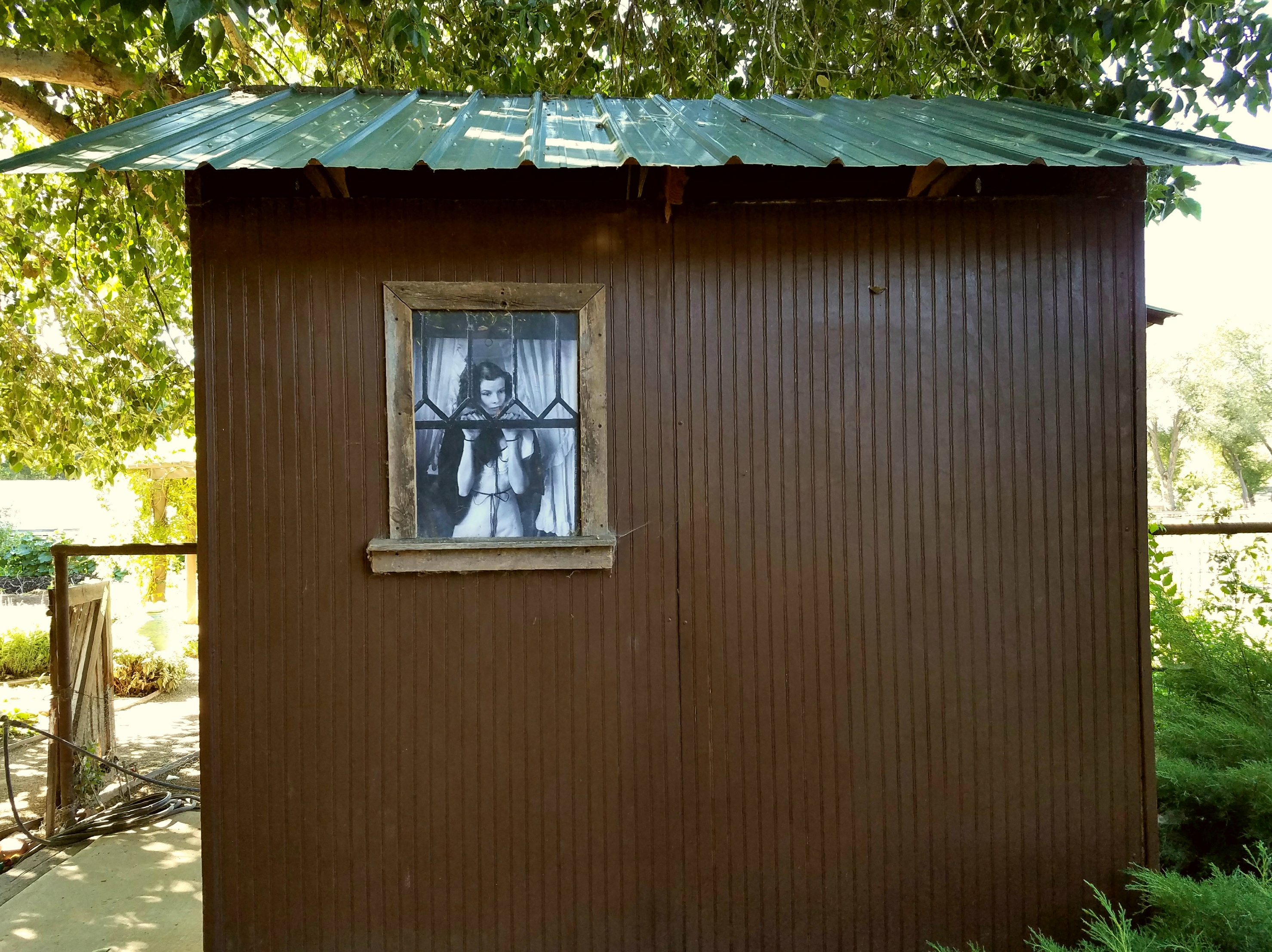
Shed, Old Town Farm

Labels: ,

Monday, September 18, 2017

Thoughts on Micro-Documentaries and Movies


It's interesting how reading some seemingly innocuous comment can suddenly trigger a strong creative urge. That happened to me, several weeks ago, after reading the comments to a posting on Kirk Tuck's The Visual Science Lab blog.

The blog article was about the book The Age of the Image, by Stephen Apkon, whose thesis is that we live in an age when, as Kirk Tuck states:

(W)e are moving from the written word to the language of motion pictures. The author makes a convincing point that, in the near future, to be truly literate will mean understanding the grammar and language of video; both how to decode it and how to create it.

In the comments to the article, reader ODL Designs wrote:

I had the idea, when watching some footage of farmers reduce the rat population in their fields using dogs, of making micro documentaries explaining interesting things like that.

Boom. Like that, it hit me. The idea of making "micro documentaries." If video is equivalent to the "written language" of our day, then perhaps we should start our journey toward visual literacy by practicing the equivalent of the haiku or vignette; not feature-length "cinema," in all of its pretentiousness, but shorter works whose length is not driven by some archaic measurement standard like the size of a reel of film, or the attention span of an audience, or marketing standards from nearly a century ago.

I know what has hampered me in the past, when considering my journey toward visual literacy, is this feeble notion that a person can take up some modest assortment of video equipment and suddenly become a "film maker." Or, similarly, that such a fledgling novice should consider setting their sights on becoming like a small-scale version of a Hollywood film company. As if there were only one model for how the individual can employ the visual arts as a means of communication. That model of the classic Hollywood film system is outdated and irrelevant. Forget it. It would be like following the model of the newspaper printing business as a means for reaching a wider audience on the Internet via blogging. That was then, this is now. Heck, even blogging itself is a bit passe these days.

I have this sense that, as creatives, we often bite off larger projects than we can chew. Sure, long-term goals are important, but I'm sensing the importance of doing something for today. Projects small enough to complete in one day's time, from conception, to execution to editing and post-production. Maybe it's a simple thing, just one solid thought or idea. How would that work on video? What would be the elements of visual language you'd use? Would you use narration, or let the montage of scenes do the talking?

I get the sense, from talking with other fledgling "film makers," that short pieces are looked down upon as somehow less than feature-length films. As if they are mere student works, kiddie practice, something you need to grow out of to be a big-boy auteur. This argument makes little sense if we consider the short-story writer versus the novelist. Are short stories somehow intrinsically inferior to novels? What about poetry? Are poems inferior because of their frequent brevity? I don't think so. And, I suspect, neither do you.

What short-story writers and poets often do is publish their work in collections. Now here's an idea worth considering. For the creator of video "shorts," or micro-documentaries, this makes a lot of sense, especially considering many pieces could be grouped together by common themes or undercurrents.

So, on the day that I read Kirk Tuck's blog article, I was struggling with repairing my aunt's old Royal Model 10 typewriter (which is still on my work bench, yet to be completely sorted) when it struck me that here's a subject for a micro-documentary: a selfie-documentary (selfiementary?) of my inner struggle with being a barely-skilled, fledgling typewriter technician, having promised my aunt I could fix her machine yet evidently not being able to do so. I immediately knew how I wanted to approach the video, a documentary-style interview piece where I'm verbally confessing my inner feelings as if answering some off-camera interviewer's questions, intercut with clips of me fiddling with the machine and its inner workings.

I also knew I wanted to record the video in black-&-white, and immediately knew to use the Panasonic Lumix camera's Dynamic Monochrome film style, which gives dense shadows and hard, contrasty footage. Sure, I could have "graded" color footage in post to achieve black-&-white, but it wouldn't be as good as what those little Lumix cameras can do themselves.

Another stylistic consideration was the choice of lens. Since I'd just started using the 7Artisans 25mm f/1.8 manual focus lens, I thought it would be perfect for a more film-like image, since it renders like an older lens design and mechanically focuses like a cinema lens with a stepless aperture ring.

The piece finally came together in my mind when I realized that, in repeated test-typings on the Royal typewriter, I'd been using the phrase "Now is the time for all good men to come to the aid of their country," which suggested the video's title, and implied an undercurrent of responsibility to my aunt to somehow come to her aid, in the repair of her machine.

No, this isn't "Arte." It lacks the finesse and sophistication of a more scholarly approach. It's not recorded in 4K - the new litmus test - with a Red camera. Heck, it's just YouTube, for gosh sakes. But I like it. I like the spontaneity, the creative inspiration that spurned this piece. I like that it represents, to me, a working model for how to proceed forward with micro-documentaries as an elegantly simple way to communicate one concrete idea in a brief few minutes of the viewers' time.

Labels: , , ,

Friday, September 15, 2017

More Direct Positive Print Experiments

Reversal MG RC WT002

I've continued to make slow but steady progress with reversal processing black & white photo paper, used as an in-camera "film," to make one-of-a-kind monochrome prints. But I have not been working alone. I first heard of this new method from photographer Federico Pitto, who has been pioneering the use of hydrogen peroxide/citric acid as an alternative bleaching agent, making the process less toxic and using more readily available materials.

In case you are not familiar with reversal processing of photo paper, this involves exposing a sheet of paper in a camera, as if it were a sheet of film but with a much slower speed (ISO 1.5-3); much like a paper negative. Then the paper is processed in developer, followed by a rinse. At this point, the paper exhibits a negative image and is still light-sensitive; the areas of great exposure have turned dark, while the shadow areas are much lighter.

Were this a "conventional" paper negative, it would be stopped and fixed, producing a negative image. But instead, the print is placed into a bleaching bath, which selectively bleaches only the metallic silver - the formerly dark parts of the image - while leaving intact the remaining unexposed silver halides in the light parts of the image. Coming out of the bleach, the image is faint and faded in appearance, as the formerly dark (negative) highlights are now bleached nearly white, while the unexposed paper is also white.

Following a brief rinse, the paper is then re-exposed with light, which serves to fog the remaining silver halides that had yet to receive any exposure. Then the paper is once again developed, this time causing the remaining silver halides, that had not been exposed in-camera (representing the shadow areas of the image) but were fogged during the second exposure, to turn dark. The result is a positive image on paper - a direct positive print.

Earlier experiments were successful, but the highlights, or lighter parts of the image, had a strange blotchy, mottled appearance, that wasn't consistent from one test to the next. Federico Pitto came up with the idea that perhaps, during the second exposure, we were grossly over-exposing the paper, and that perhaps the mottling was the result of still unexposed, residual silver halides in the light areas of the image getting a fogging exposure and turning dark after the second development. He therefore did a series of test strips, and determined, using his enlarger as a controlled light source, the optimal settings for this second exposure.

Armed with this new knowledge, I this week attempted to use Federico's settings with my process, and I can report a great improvement in the results. Here is a synopsis of the process (times unless otherwise noted are minutes:seconds):

Expose in-camera at ISO 1.5
Develop in a 1+15 dilution of Ilford Universal Paper Developer (300mL water + 22 mL concentrate) for 1:30
Rinse in water for :30
Bleach in solution of 175mL water + 125mL 35% hydrogen peroxide + 2 teaspoons citric acid for 3:00
Rinse in water to wash off residual peroxide
Squeegee print dry
Expose under enlarger, set to 20" height at f/8 aperture, for 8 seconds
Develop again for 1:30; you can see, under the red lights, the image turn positive
Rinse or stop bath for :30
Fix in paper fixer for 2:00


All of the above is performed under red safelights, until in the fixer for about a minute. The only white light the paper sees during the process is during the second exposure, under the enlarger. I think this contributes greatly to the quality of the highlights.

Because I used multigrade paper for this test (Ilford RC, MG, WT luster finish), the contrast was more than what I'm used to seeing with grade 2 RC paper. But it also opens up a larger source of paper, of various manufacturers and finishes.

Going forward, there are more experiments yet to do. One, I'd like to do more tests of the second exposure under the enlarger, using colored filters with MG paper, hoping to improve the shadow detail. As you can see from the top image, the shadows are very blocked up, indicative of the high contrast resulting from exposing MG paper under UV-laden daylight. Perhaps less second exposure would result in lighter shadows.

Two, I'd like to do more experiments with pre-flashing the paper. I've been applying a standard pre-flash to the paper during all of these tests, but perhaps it needs more, to get more shadow response. The top image had a pre-flash twice what I usually use, with little in the way of increased shadow detail. So perhaps a combination of the above two ideas might see some results.

I also need to try this new processing method with my older grade 2 paper and see if it also has positive results (no pun).

Finally, since it appears to be a working process, perhaps it's time to break out the 8"x10" box camera and do this on a larger scale! Stay tuned for more results soon.

The top image was made after the developer and bleaching agent had been sitting in their trays for several hours. I also had left the print sitting wet in a holding tray for about a minutes, under red lights, between the bleach and the second exposure, as I had to fumble in the dark with my enlarger timer. Whatever the cause, close examination of the highlights shows a slight unevenness, with faint streaks, still present; this was not present on an earlier image, made when the chemicals were fresh. I need to nail down the cause of this. So, more refinements yet to make.

Here are the first three videos documenting my experiments thus far:


Labels: ,

Thursday, September 14, 2017

Typing Assignment No.9


Typing Assignment 8, which was to write in the style of a favorite author, received good results, being simultaneously enjoyable and yet challenging. Myself, I wrote a piece inspired by William Gibson, though not necessarily in his exact style.

For our next assignment, we will be writing a hypothetical story in the life of a real-life stranger that you periodically see. This idea was inspired by my wife, who mentioned some of the strangers she sees regularly, like the checkout clerk at the grocer's, or the mother walking her kids to school. Everybody has a story, it seems; and writers love to spin those stories into something other people will enjoy. So dust off your typewriters and start thinking about those strangers that you periodically see in the course of you day. What's their story? You tell us!

Make a legible scan or photograph of your typewritten piece, post it to a publicly-accessible photo hosting website, then post the link to the image in the comments below. Alternatively, you can leave comments in the corresponding YouTube video. Or, email me with the image as an attachment, to jvcabacus (at) yahoo.com I hope you have fun with this assignment. The results will be due by Sunday, September 24.

Labels:

Tuesday, September 05, 2017

Typing Assignment No.8

P1120794a

I must be getting old. Last week, when I announced the subject for Typing Assignment No.8, I implied there would be a corresponding blog article onto which you could post links to images of your typed sheet, via the comments below. Well, I forgot.

So here it is, better late than never. But I do hope you've been having fun with this assignment, which is to write a one-pager, using a typewriter, in the style of a favorite author. It can be fiction, nonfiction, prose, poetry - whatever, as long as you can tell us what author inspired you, and what typewriter you used to write it.

Myself, one favorite author is William Gibson. I'm going to have to buckle down and get something on paper today, if I hope to make the deadline of next Sunday.

As usual, scan or photograph your typed page, post it to a publicly accessible website, then post the link here below in the comments; or post the link to the YouTube video (see below); or email the image file to me at: jvcabacus@yahoo.com.

Good luck and happy writing.

Labels: