Monday, December 16, 2019

Typewritten Cartoons
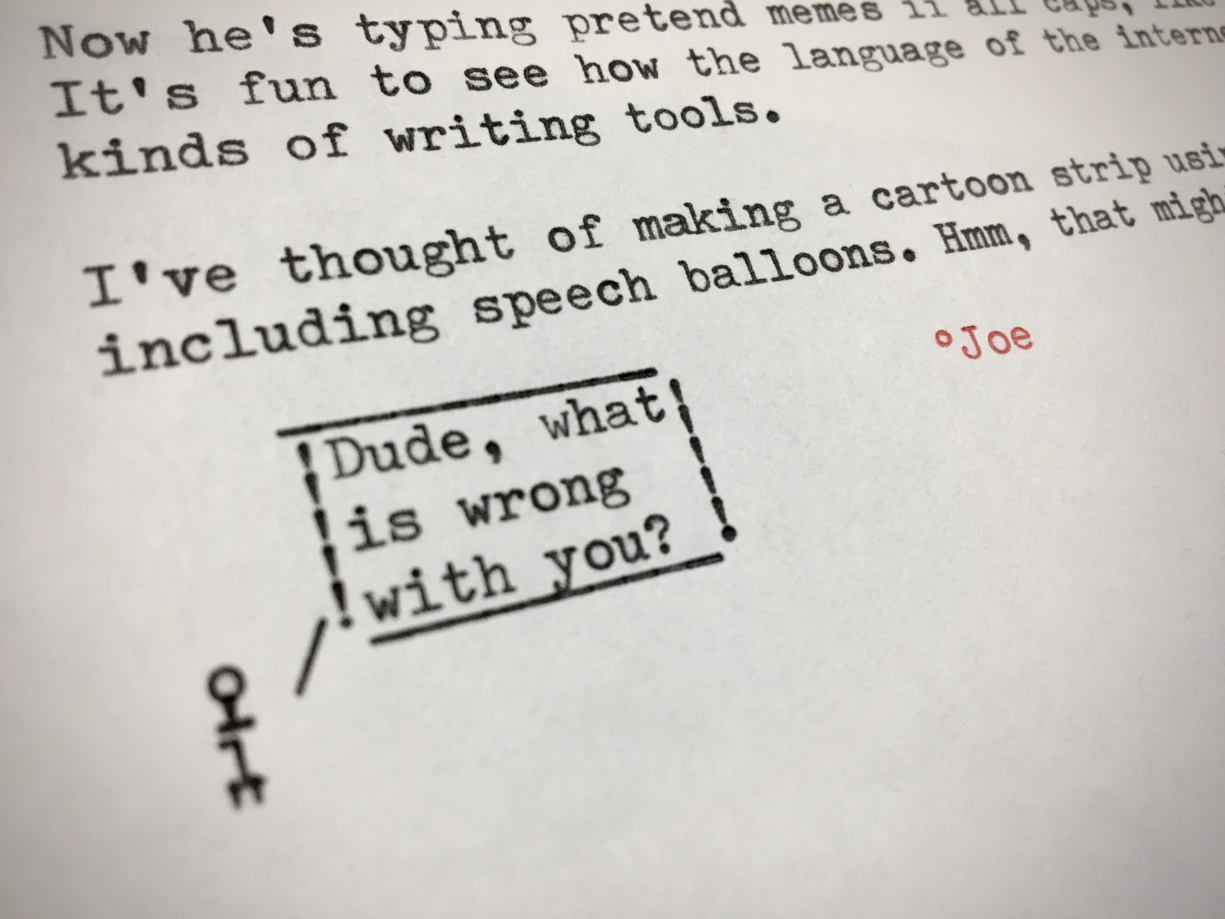
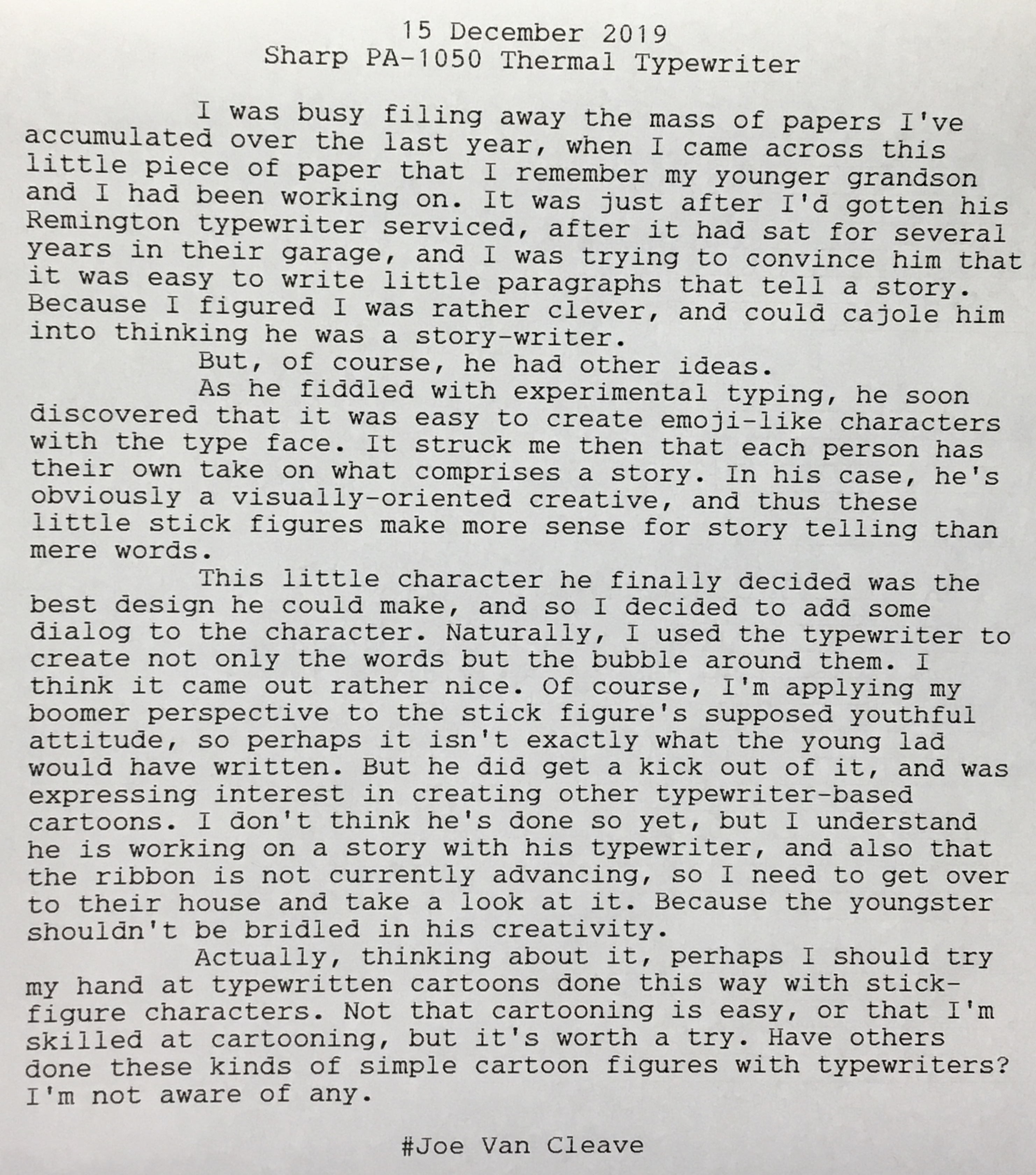
Typewriter Cartoon
Typewritten Cartoons

Naturally, I had to sit down at my Torpedo 18 last night and work on my own typewritten stick figures. While it's easy to make faces, forming an entire body takes a bit more doing. Here are a sampling of various figures, and some suggestions as to who these characters might be.

Typewritten Cartoon Characters

It soon became apparent that what was missing was an inverted "V", to form the legs of the classic stick figure. But my typewriter had merely a standard typeface. What to do? Simple: invert the paper and type the character upside-down, then remove the paper, roll it back in right-side-up, and continue with typing the dialog. Here's a sampling of my first attempts at creating upside-down stick figures. I've drawn boxes around each one I like, with handwritten notation next to each describing the order of the typed characters.

Typewritten Cartoon Characters

And here's my crude attempt at placing these figures into a cartoon-like context. I wonder if, perhaps five years from now, the "snowflake" comment will even make sense to readers of this blog. Gosh, I hope not!

Typewritten Cartoon

These typewritten cartoon figures are directly related to the smiley emoticon characters first derived from text-based computer code. The main difference here is that, with the manual typewriter, I have the ability to overlap characters, combining them into new forms, while also playing with the line advance. Not that this couldn't have been done with early computer code - perhaps a program could have been written to directly control the printer's head, instructing it to move one character backward and overprint a new character over an older one. So, even though our lowly manual typewriters usually produce only monospaced text, we have direct control over their placement.

I dabbled briefly with cartoons, back in the 1980s, with a local group of creatives who called ourselves S.W.A.C. - Southwest Association of Cartoonists. Our leader was a gent named Tom Ebelt, and one of our members was New Yorker cartoonist Danny Shanahan, who lived at that time in the village of Corrales, just northwest of ABQ. He subsequently moved back to New York. I've followed Danny's career since then, and in fact have one of his original pieces, that didn't get published in the New Yorker.

I enjoy the New Yorker's cartoon caption contest, though I'm terrible at thinking up good captions. But what amazes me about good cartoons is it's usually all about the writing, not the drawing. Take the typical New Yorker piece, perhaps a couple sitting at home in front of the television. Without a caption, it's just a cartoon couple on their couch. But with a witty line or two it becomes magic, taking on a life of its own.

That's why I think these typewritten cartoons have some potential. The "art" work is about the most primitive you can get, reminding me somewhat of the Basic Instructions cartoon and how artist Scott Meyer uses computer-generated images to piece together his panels; the difference being that in the case of typewritten cartoons the figures are typeset from a predetermined typeface, rearranged in a creative manner. What makes or breaks typewritten cartoons is the writing itself. Not that I'll necessarily be doing more of these anytime soon, but perhaps I'll post more of these as they strike me, and providing they're of sufficient quality. We shall see.

But how about you: do you make typewritten cartoon figures? I'd like to hear from you. Leave a comment below.

Labels: , , ,

Tuesday, February 14, 2017

Type-A-Sketch

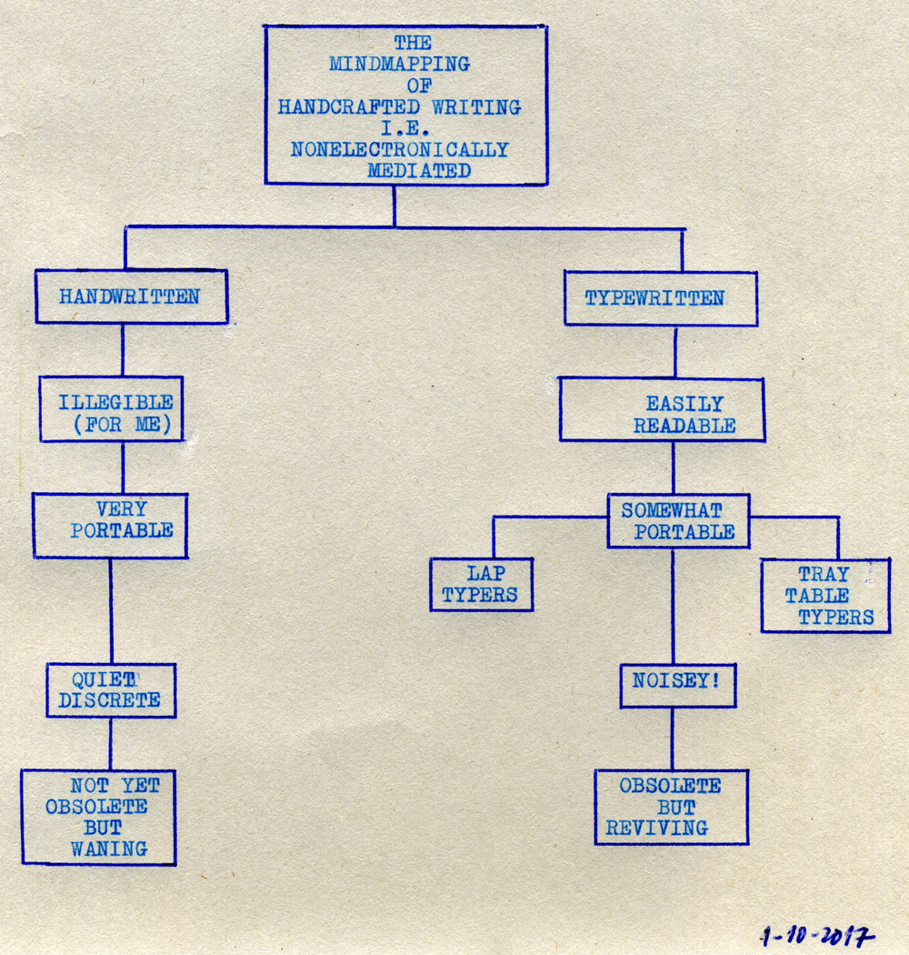
Writing_Flowchart001

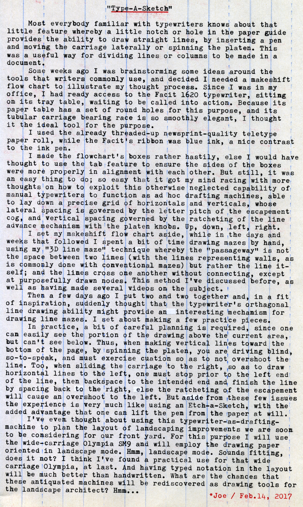
Typecast274

Post-Script: See Typewriter Video Series Episode 56 for more on using the manual typewriter as a mechanical drafting machine.

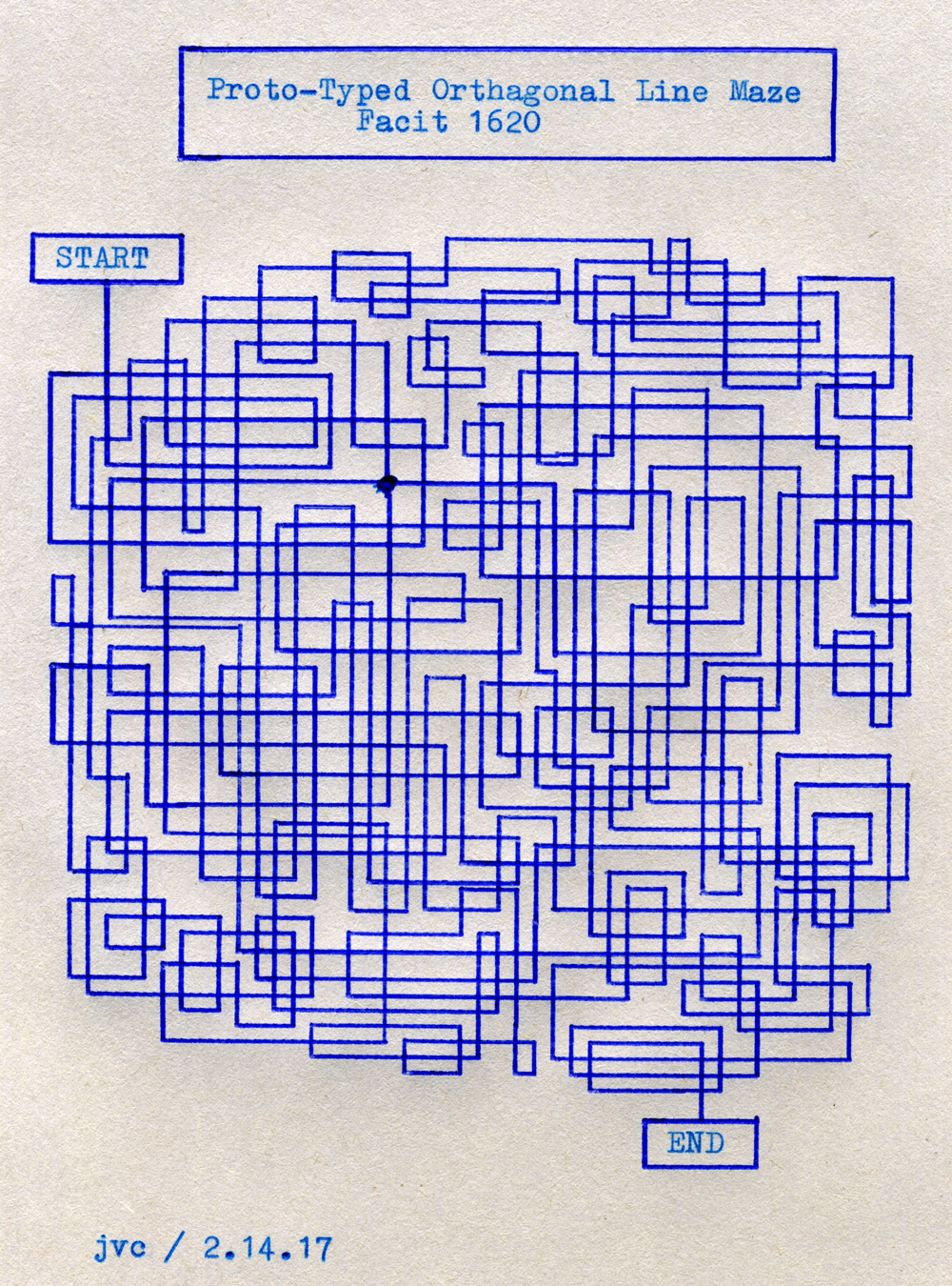
Here's the line maze I drew today, using the Facit 1620 and Bic Cristal blue medium point pen:

Facit_1620_001
As is the case with all of my so-called "line mazes," you follow the line itself, rather than the space between the lines. Conventional mazes use the space between lines as the passageway, with the lines to either side representing the walls of the maze. My line mazes are more like 3D routing diagrams. The lines cross over one another and don't make a turn until you get to an elbow (or corner); lines only connect to one another at a "node." There's only one node in this maze, the bold dot where four lines converge.

You might notice that I had to hand-draw the node dot; I tried typing an asterisk for the node, but the alignment between the typed characters and the pen holes in the paper guide of my Facit 1620 are not exact.

This was more of a test drawing than a really challenging maze. I find using a typewriter as a form of mechanical drafting machine is rather fun. The horizontal spacing of the vertical lines is governed by the character spacing as defined by the escapement mechanism; while the vertical spacing of the horizontal lines is governed by the ratcheting of the line advance mechanism. Thus, the smallest resolution you can draw - the closest the lines can get to each other - is limited by this mechanical, orthographic grid system of the typewriter's mechanism.

You can move the drawing point in any of four directions. Horizontal movements are done by either the space bar, the backspace key or manual movement of the carriage via the carriage release lever. It's best to draw from left to right (move the carriage from right to left), because backspacing causes the carriage to overshoot the end point, due to the nature of the escapement mechanism. Similarly, I find it better to draw vertical lines from bottom to top, since you can see more easily the drawing and where you need to stop.

If your typewriter has more than one notch or hole for a pen in the paper guide, it's best to choose one and stick with it, since the two holes or notches might not be exactly aligned to the grid system of the mechanism, or each other.

I used a ballpoint pen for these drawings, but another type of technical drawing pen would be preferred. As well as better quality paper than the newsprint-quality teletype paper roll I was using.

If you have a wide-carriage machine, this would be ideal for drawing landscape-oriented illustrations on full-sized paper.

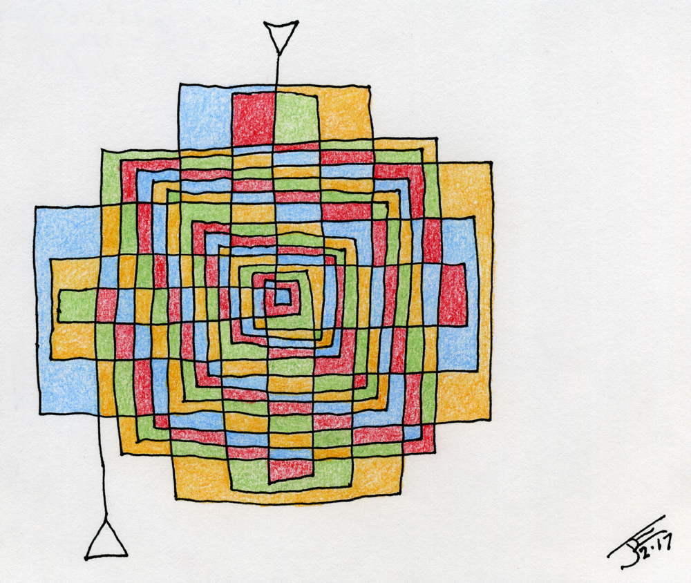
Bonus: Here's a line-maze version of a labyrinth, hand-drawn. It could have benefited from the orthographic alignment of the Type-A-Sketch, so as to make the lines much straighter. Being a labyrinth instead of a maze, it only has one passage, so you can't get lost. Start at either end. As with all line routing networks, the lines cross over one another without connecting. Lines go straight until they bend at an elbow. I rather enjoyed coloring the various cells in. My personal rule is two adjoining cells can't have the same color; similar colors can only touch at their corners. Oh, the title of this piece is "Centripetal Labyrinth with Hysteresis, 1.0." Don't ask me why. I think it has something to do with the way the lines converge on, then fly away from, the center point, like a comet in a highly elliptical orbit. As with all "art-speak," it only really matters to the artist, and the academic community. In this case, there's only me, since no one would seriously consider this to be "art."

Labyrinth001

Typecast via Brother Charger 11, lap-typing in the front courtyard on a cold day.

Labels: , , , , ,