Monday, December 16, 2019

Typewritten Cartoons
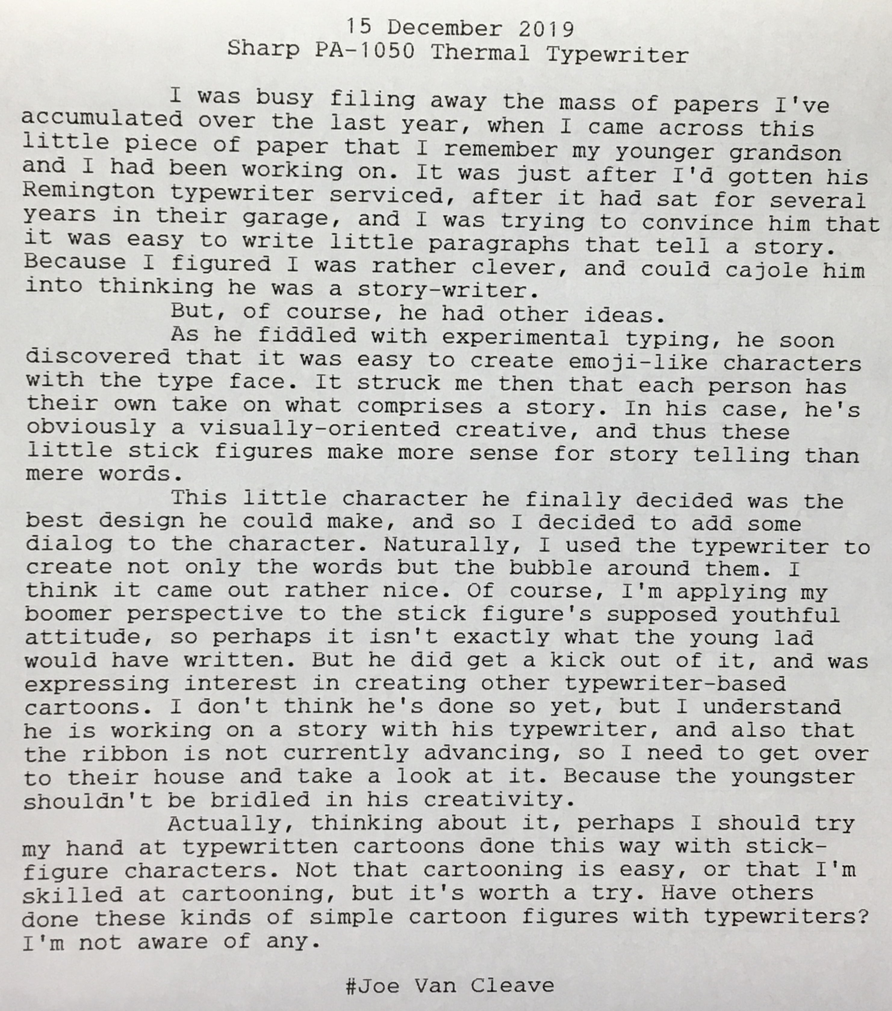
Typewriter Cartoon
Typewritten Cartoons

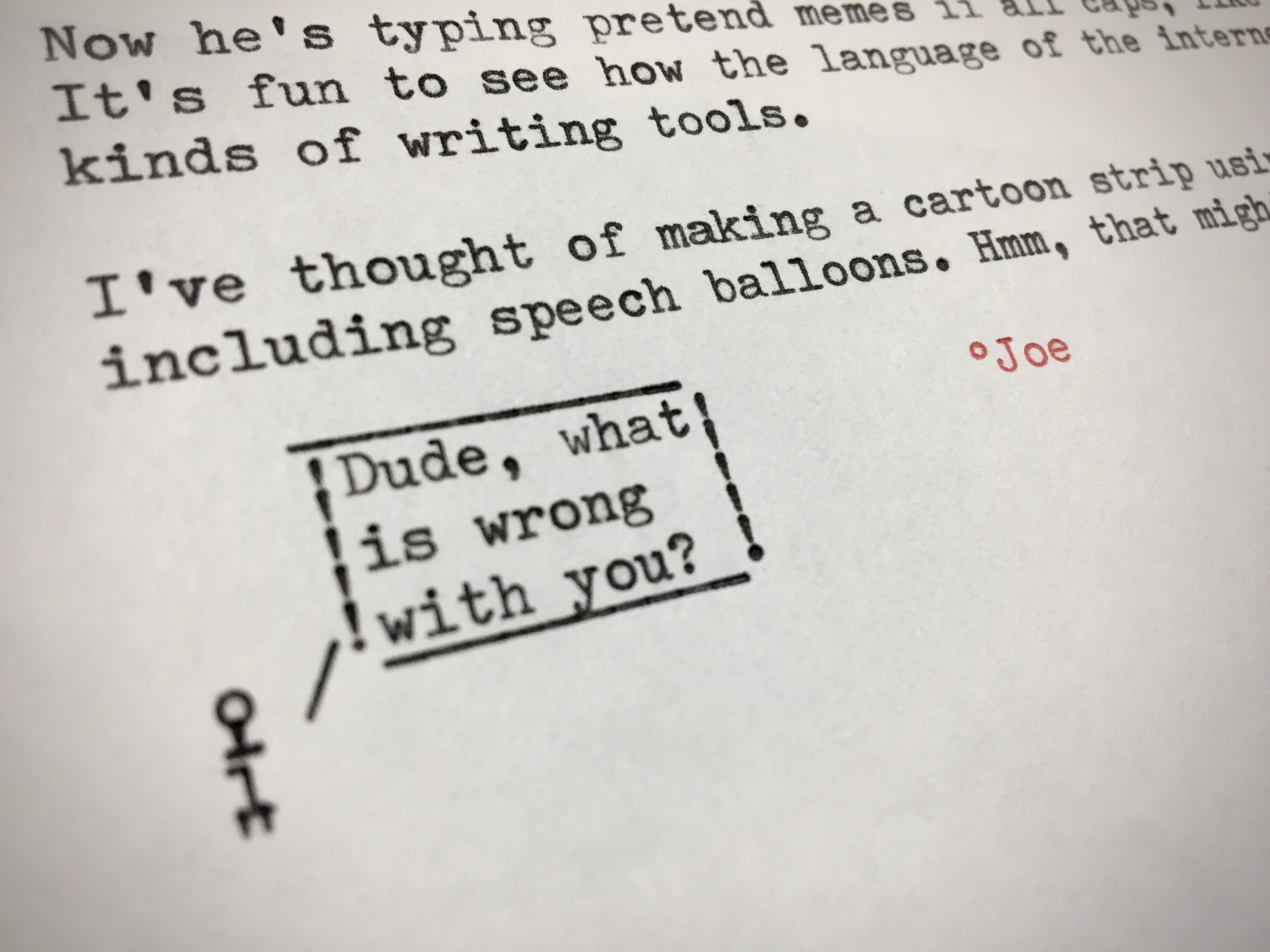
Naturally, I had to sit down at my Torpedo 18 last night and work on my own typewritten stick figures. While it's easy to make faces, forming an entire body takes a bit more doing. Here are a sampling of various figures, and some suggestions as to who these characters might be.

Typewritten Cartoon Characters

It soon became apparent that what was missing was an inverted "V", to form the legs of the classic stick figure. But my typewriter had merely a standard typeface. What to do? Simple: invert the paper and type the character upside-down, then remove the paper, roll it back in right-side-up, and continue with typing the dialog. Here's a sampling of my first attempts at creating upside-down stick figures. I've drawn boxes around each one I like, with handwritten notation next to each describing the order of the typed characters.

Typewritten Cartoon Characters

And here's my crude attempt at placing these figures into a cartoon-like context. I wonder if, perhaps five years from now, the "snowflake" comment will even make sense to readers of this blog. Gosh, I hope not!

Typewritten Cartoon

These typewritten cartoon figures are directly related to the smiley emoticon characters first derived from text-based computer code. The main difference here is that, with the manual typewriter, I have the ability to overlap characters, combining them into new forms, while also playing with the line advance. Not that this couldn't have been done with early computer code - perhaps a program could have been written to directly control the printer's head, instructing it to move one character backward and overprint a new character over an older one. So, even though our lowly manual typewriters usually produce only monospaced text, we have direct control over their placement.

I dabbled briefly with cartoons, back in the 1980s, with a local group of creatives who called ourselves S.W.A.C. - Southwest Association of Cartoonists. Our leader was a gent named Tom Ebelt, and one of our members was New Yorker cartoonist Danny Shanahan, who lived at that time in the village of Corrales, just northwest of ABQ. He subsequently moved back to New York. I've followed Danny's career since then, and in fact have one of his original pieces, that didn't get published in the New Yorker.

I enjoy the New Yorker's cartoon caption contest, though I'm terrible at thinking up good captions. But what amazes me about good cartoons is it's usually all about the writing, not the drawing. Take the typical New Yorker piece, perhaps a couple sitting at home in front of the television. Without a caption, it's just a cartoon couple on their couch. But with a witty line or two it becomes magic, taking on a life of its own.

That's why I think these typewritten cartoons have some potential. The "art" work is about the most primitive you can get, reminding me somewhat of the Basic Instructions cartoon and how artist Scott Meyer uses computer-generated images to piece together his panels; the difference being that in the case of typewritten cartoons the figures are typeset from a predetermined typeface, rearranged in a creative manner. What makes or breaks typewritten cartoons is the writing itself. Not that I'll necessarily be doing more of these anytime soon, but perhaps I'll post more of these as they strike me, and providing they're of sufficient quality. We shall see.

But how about you: do you make typewritten cartoon figures? I'd like to hear from you. Leave a comment below.

Labels: , , ,

Tuesday, December 03, 2019

One Atop the Other

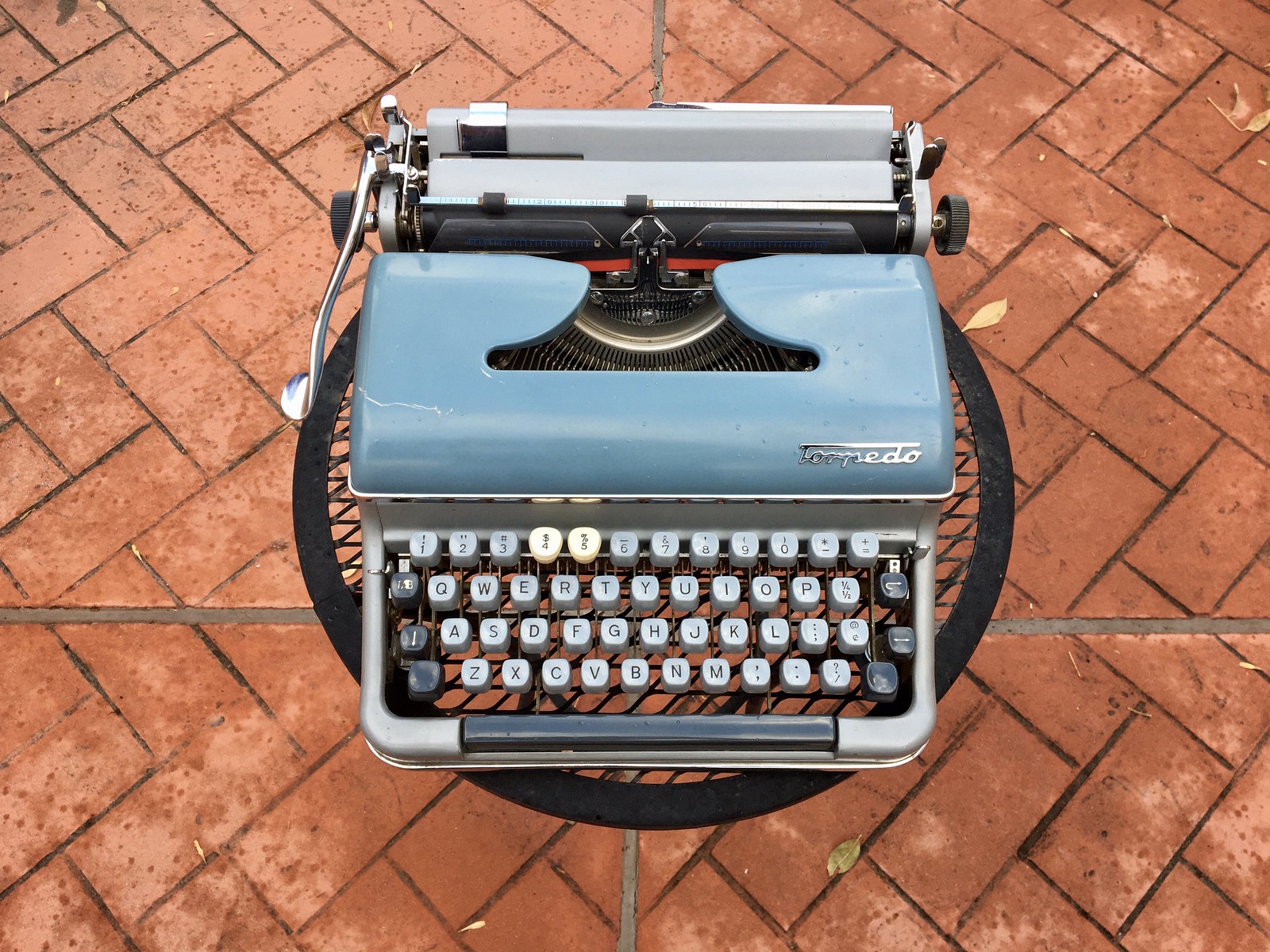
Torpedo 18 Patio Typing
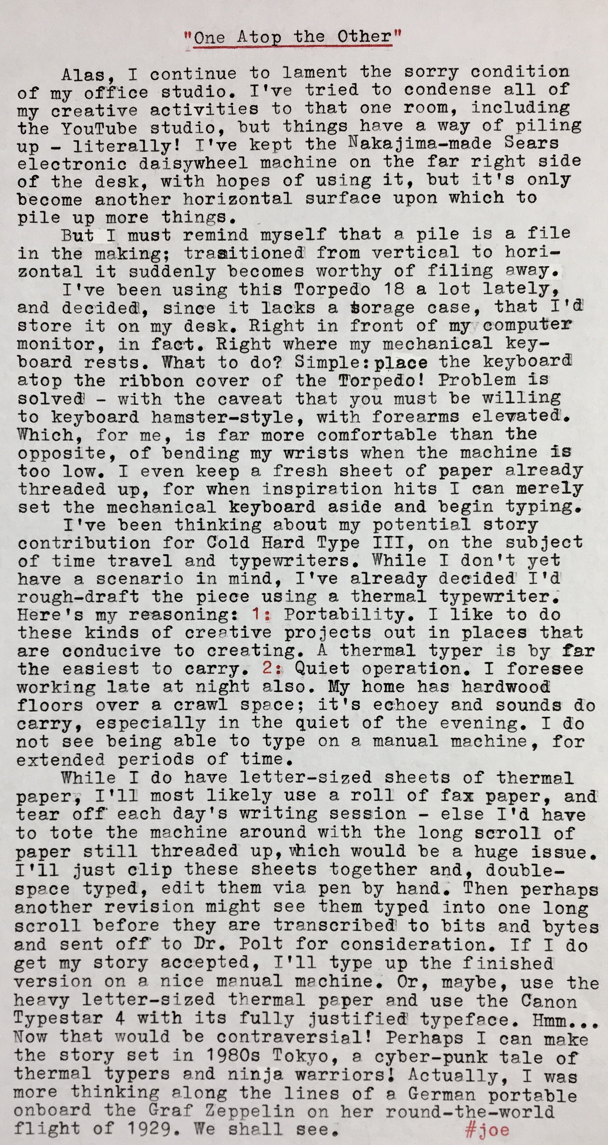
“One Atop the Other”

That "4" keycap on the Torpedo is the only remaining missing cap that's temporarily been replaced with one from a different machine. I intend on carving myself a replica keycap from poplar wood, sanded and finished to be as close as possible to the other original keycaps.

Sunday we had our December meeting of the ABQwerty Type Writer Society. I recently acquired a 12-pack of red/black nylon ribbons, in the DIN size without grommets, for $9.99 from Amazon. They've been nicely dark, well inked. I think a real value in ribbons, I highly recommend them. Here's my review of them:


Today, Andrea and I rode the recently opened ART bus (Albuquerque Rapid Transit) from Nob Hill, through downtown, to the west side and back. This has been a project that's been several years and tens of millions of dollars in the making, that runs on Central Avenue, the old Route 66, from Tramway Blvd on the east to Coors on the west, while also making a stop in the uptown area, the closest it comes to our suburb. Much controversy and economic upheaval has accompanied the project, including torn up streets and many small businesses along Central that have shut down or moved. Small businesses are a fragile economy, which the city didn't seem to appreciate during the construction phase.

From now until the end of the year the city is offering free rides. We boarded in Nob Hill near Kelly's Brewery and rode west to Coors, then hopped onboard a return bus and stopped downtown, where we walked around and I recorded video and still photos. Then we caught another eastbound bus and ended back in Nob Hill, where we ate lunch at a tacoria, where it was two dollar Tuesday. It was rather ironic having to drive our private vehicle across town so we could then ride the bus.

The busses were originally intended to be electric, battery-powered, but the city had issues with the electric busses not meeting contract requirements around battery range and recharging time; plus, they were very expensive. They also didn't want to spend even more money on electric light rail lines. So they finally reverted to propane-powered, two-section, 60-foot long busses. They are modern and new inside. I hope they stay that way. Once the city starts charging for rides, an all-day pass will be around $2. I'm thinking it might be fun to drive down to the rather close Uptown area and pick up the ART bus for a day of coffee shop typewriting and street photography downtown.

Here's the video of today's ride:

Labels: , , , ,

Monday, November 25, 2019

Early Thanksgiving

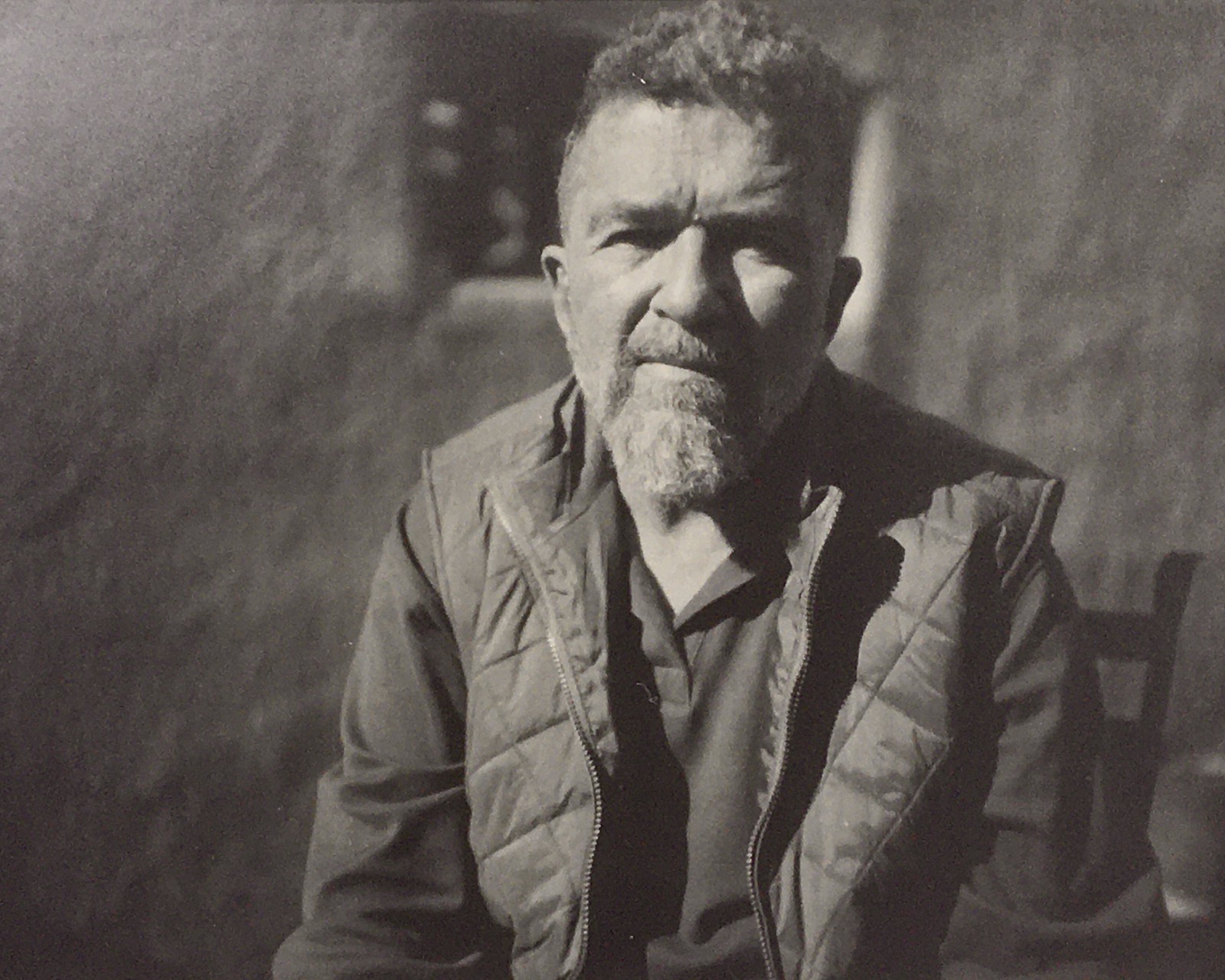
Selfie, Kodak Ektar 127mm on Cameradactyl OG, reversal processed Arista RC grade 2 semi-matte paper
“Early Thanksgiving”

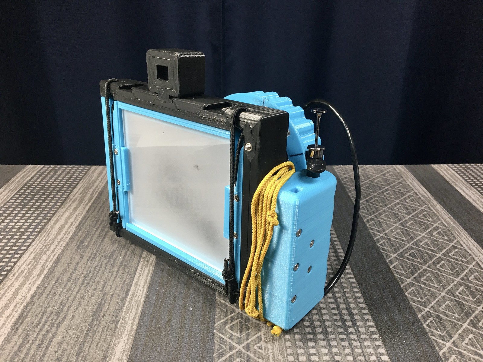
The Cameradactyl OG with Kodak Ektar 127mm F/4.7 lens:

Cameradactyl OG with Kodak Ektar 127mm F/4.7 lens

Rear view showing view screen, 1:1 finder and close-up focusing string:

Cameradactyl OG with Kodak Ektar 127mm F/4.7 lens
The shutter release cable feeds through a hole in the grip. There's also a slot in the grip for a camera strap.

There are three mounting slots for the 1:1 finder, I prefer the middle slot, to reduce parallax error.

The large blue lens mounting ring up front is also the helical focuser. I have lines marked on the focus ring to indicate infinity focus, along with three closer distances, equivalent to three knots tied in the yellow focusing string.

For the self-portrait at the top, I preset the focus ring for the closest position, then placed the first knot of the string against my temple, adjacent to my eye, then stretched the string taught. A 36" shutter release cable permitted me to trigger the shutter from that position. Exposure was metered at ISO 3 + 3 stops, which came to F/5.6 at 1/2 second in bright sun. The direct positive print was processed using the citric acid / hydrogen peroxide method, using the same chemicals I've been using for a few months.

Here's a close-up of the newly acquired Ektar 127mm lens, with the front ring removed to gain access for degreasing and cleaning. I was able to get the speeds back pretty close to normal, but the bulb position still doesn't work; but I can still use a dark slide over the lens while in the preview mode instead.

Kodak Ektar 127mm F/4.7 Shutter

Typecast via Torpedo 18:

Torpedo 18

Labels: , , ,

Wednesday, November 20, 2019

Torpedo Typing

Torpedo 18
“Torpedo Typing”

Here are the parts to each original foot, with the new foot mounted to the machine:

Torpedo 18 Before and After Feet

The rectangular brackets are mounted on the top and bottom of each foot, then mounted to the chassis with both shoulder screws. I was originally hoping to find a square furniture caster with a deep enough recess in the middle that I could use these brackets and screws; but none I could find were deep enough. I'm happy with these round rubber feet, however, and they prove very grippy on smooth surfaces, just like a rubber typing pad. I did have to add some spacer washers between the tops of the rubber feet and the frame of the machine, so the shoulder screws would remain recessed sufficiently so they won't scratch the tabletop.

I'm at the place where I'm more comfortable with typographical errors in my typecasts. I don't know why it's taken me this long. I was probably holding onto some affectation of the typewritten piece as a work of published perfection; whereas in actual fact I'm an imperfect typist (as well as an imperfect writer, thinker and speller) who's learning to embrace the "organic" look of human imperfection. Er, at least that's my excuse.

Actually, I think there's something valid here. In the heyday of the typewriter as a tool for the professional business world, perfect copy was an expectation, administered by professional typists who were compensated to do just that. But in this post-typewriter world, we can hold onto our imperfections as work-in-progress, somewhat akin to how a quick pencil sketch, in its brief roughness, doesn't compare to a finished painting. Typewritten pieces like this one are akin to jottings or doodles - they communicate an idea, but imperfectly so. Their value is in their immediacy. And I like that they reveal something of the process involved.

In fact, one of my favorite blogs is Vinnie McFeats' The Untimely Typewriter. I revel in each posting, as they exhibit the look of an experienced typist who knows his way around a manually typewritten page, replete with corrections in all their glory; no affectations present here. I don't think there's an ASCII character for a double-struck or X'd-out correction; these are markings unique to the manual typewriter. They're like the sound of gears mashing on a non-synchronized manual transmission - it's the way they're supposed to work.

Labels: , , ,

Monday, November 18, 2019

The Aero-Artiste and Pinholio of Flight

“The Aero-Artiste and Pinholio of Flight”

The Cameradactyl Pinholio:

Cameradactyl Pinholio Self-Developing Pinhole Camera

A sample image, exposed and processed in-Pinholio.

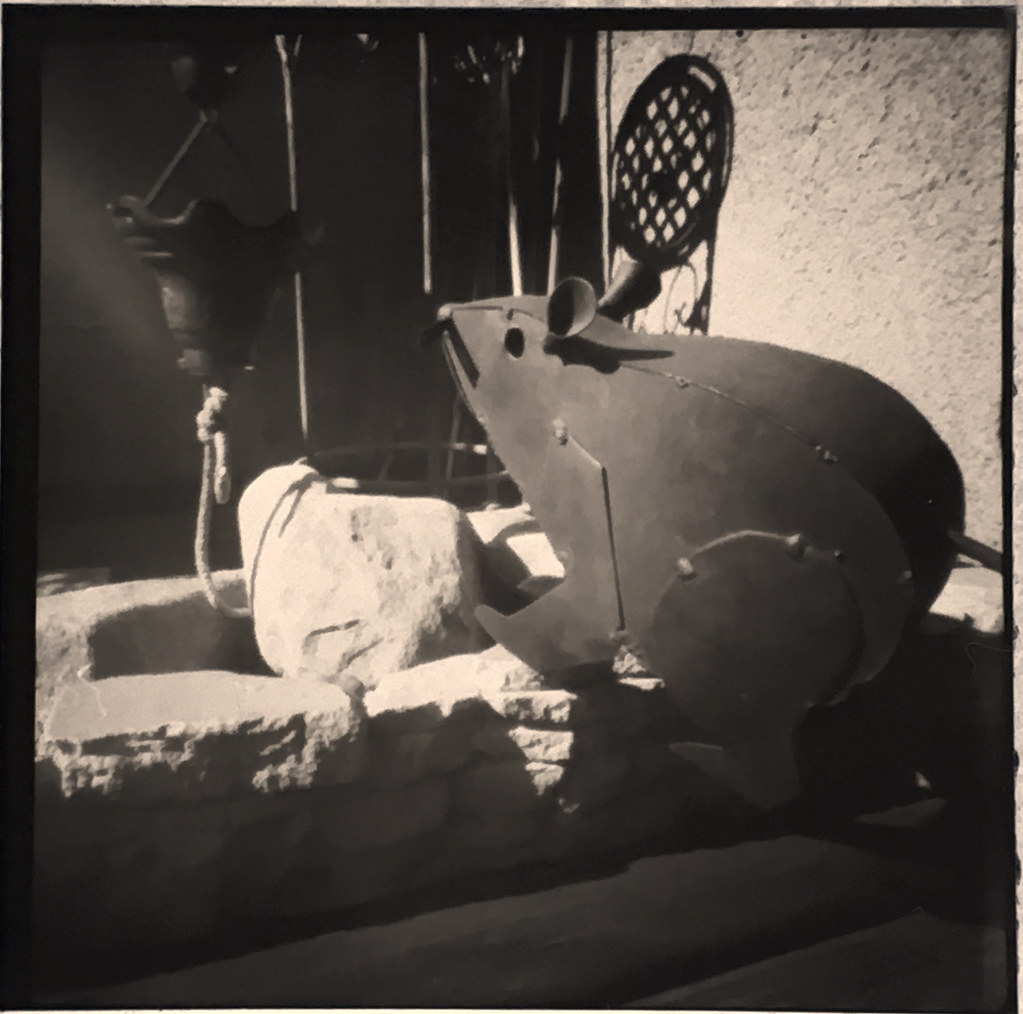
Brass Rat, Paper Negative Inversion, F/250 Pinholio Camera

I just finished replacing the worn feet of this Torpedo 18 with some hardware store rubber feet and decided it needed a test typing, as I’d recently installed a dark and inky adding machine ribbon. So I grabbed this grid paper, upon which was a bit of cyphering I’d done for the video, and proceeded to let the Muse have her way.

I love these late-night, impromptu typing surprises using such fine machines like the Torpedo. It looks like it’s been through the ringer, but can it type!

Torpedo Typewriter

Labels: , , , , ,

Tuesday, November 12, 2019

Fall 2019 ABQ Type-Out and Torpedo 18

Torpedo Typewriter

I'm past due for a blog update, so here's a combined posting including two separate pieces.

fall type out

Several weeks ago we had our fall Type-Out event hosted by Pennysmiths Paper. Here' my report, typed on Adobe Rose, the Royal QDL:

“Fall 2019 Type-Out”

Here's my video of the event:


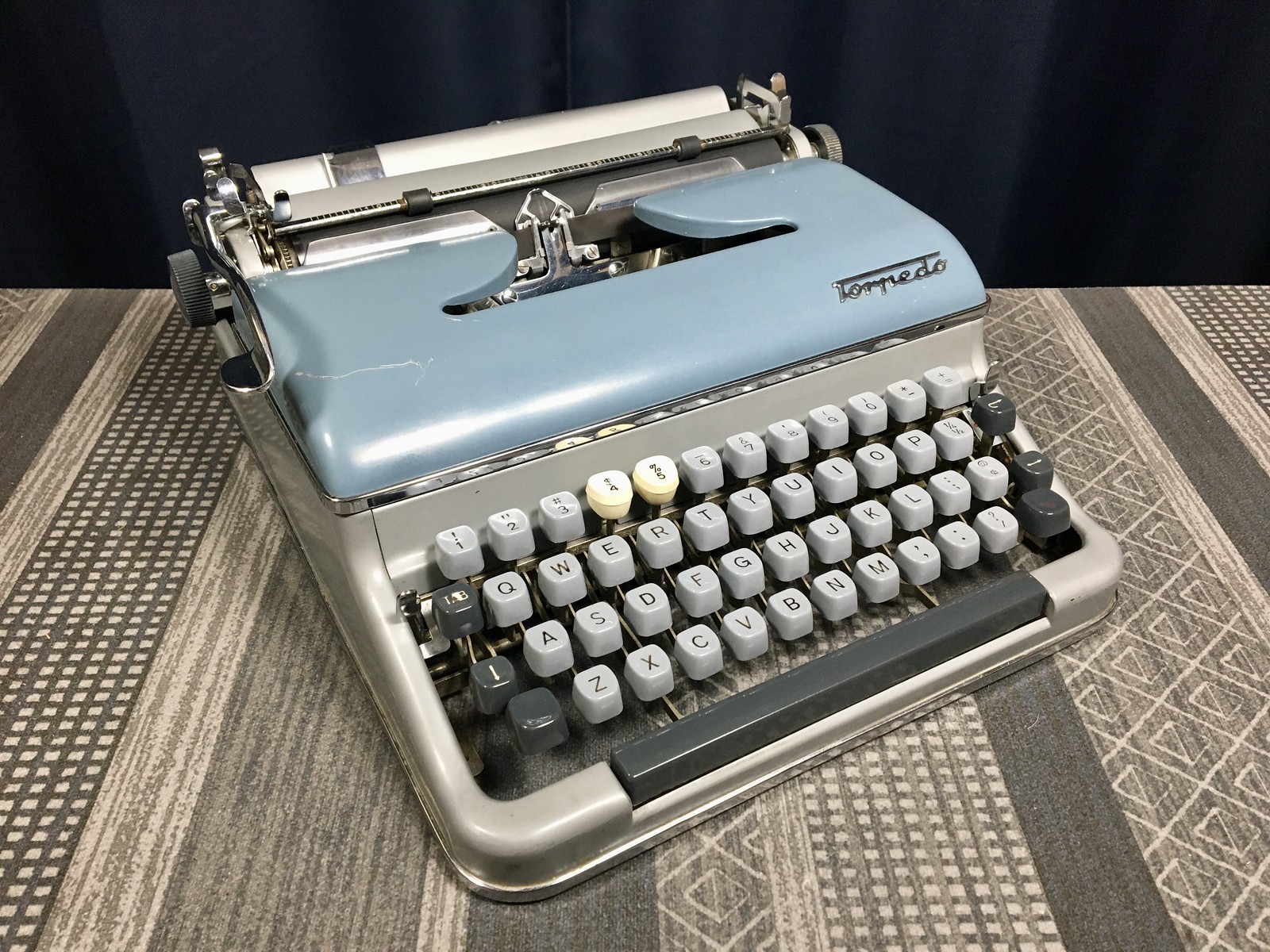
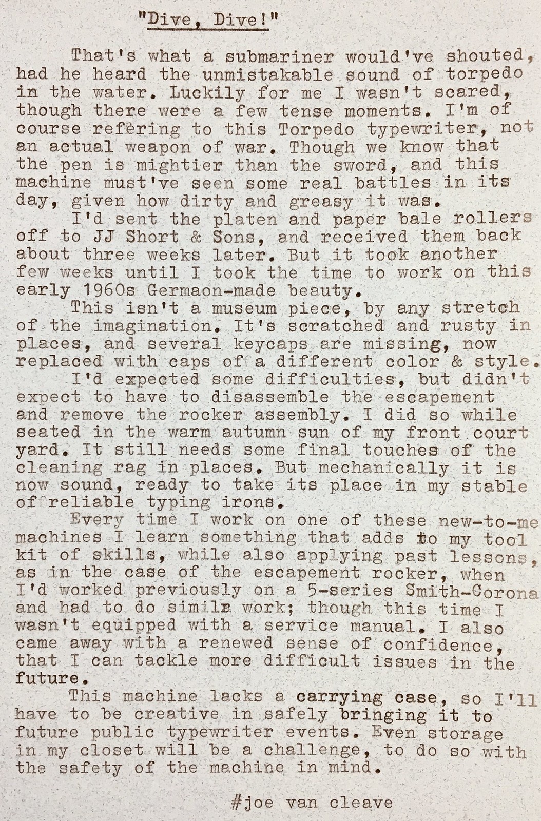
Several weeks ago I received from JJ Short & Sons the re-covered platen for my Torpedo 18, that Kevin Kittle had given me a few months ago. This machine was in less than pristine condition. I spent the last few days working on installing the platen and getting the machine back to good working order. Here's my report:

“Dive, Dive”

And here's the video on servicing the Torpedo:


If I interpret the data correctly, the Typewriter Data Base indicates this machine was made in 1961. By appearance and comparing with photos on eBay I'm pretty sure it's a model 18. The machine came with no case or literature, though the rear plate indicates Remington Rand, made in Western Germany.

I like the feel of the keys and the action. Hopefully it'll remain a reliable machine to use, which implies I need to put it through its paces, as often with these extensive repairs, especially ones involving the escapement, it's best to reserve judgement until you've spent some time with the machine, as intermittent problems can arise. For example, since creating the video, I've noticed the carriage is a bit sluggish when tabbing, evidence that the tab brake needs more degreasing. And that newly opened brown nylon ribbon is a bit light of imprint; I'm thinking of swapping it for a black/red. I happen to have some adding machine ribbons that I want to try out. These are shorter than the standard 16 yard typewriter ribbon, and come in smaller sized plastic spools, so I'll have to do some respooling; but they're supposed to be heavier inked than typewriter ribbons. I'd like to see if the light imprint is the machine or the ribbon.

Labels: , ,