Monday, May 17, 2021

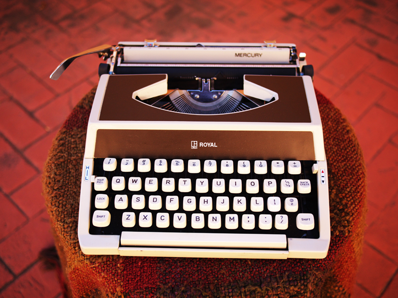
Royal Mercury Patio Typing & DIY iPad Mini Holder Box

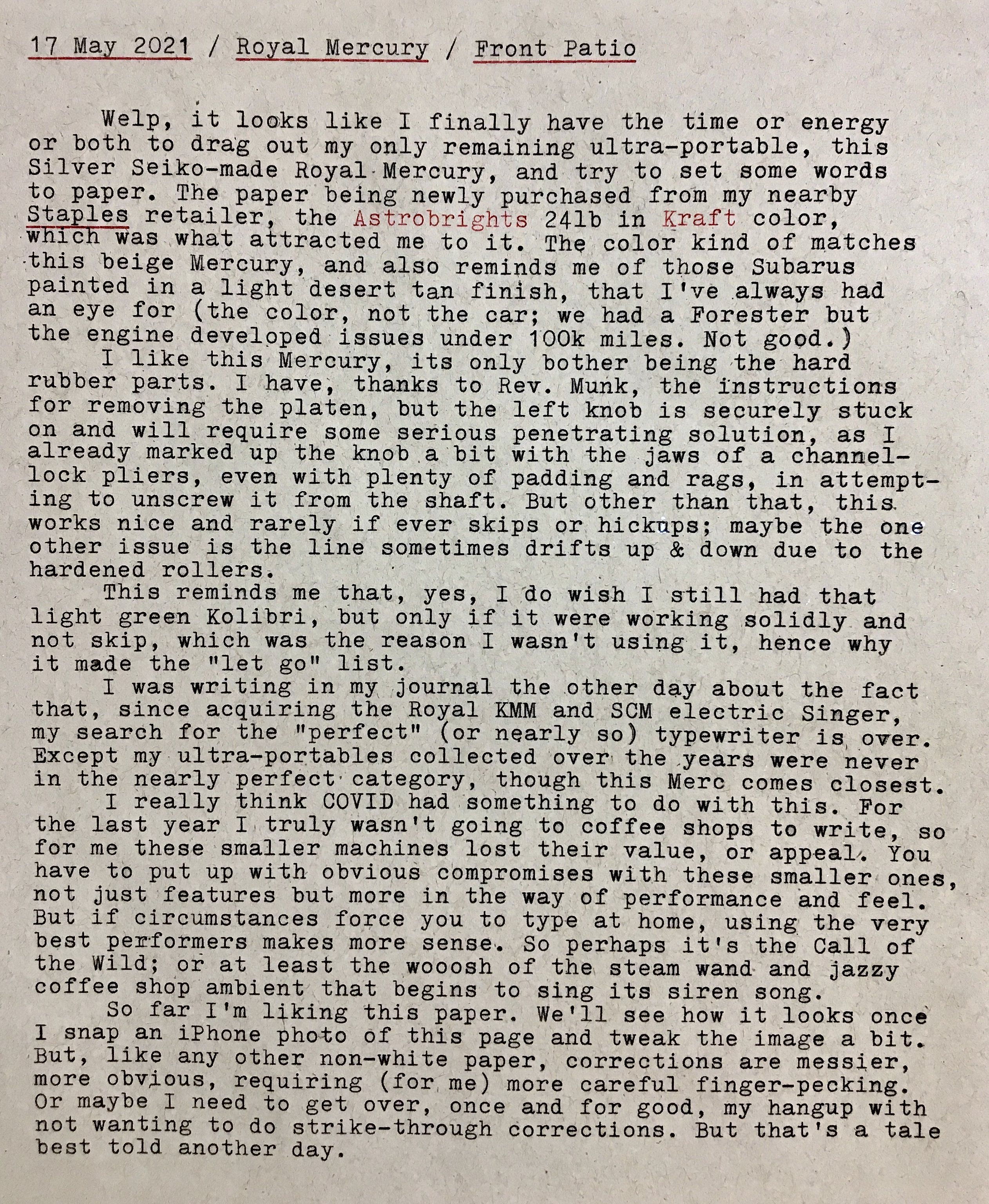
Royal Mercury & Astrobrights Kraft 24# Paper
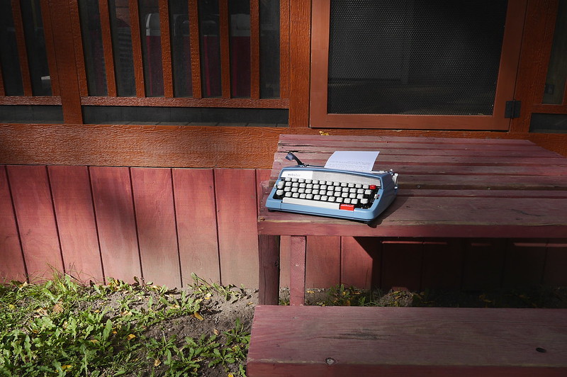
The blue patio table umbrella gives the Merc an unnatural hue, but it's really a bland beige.

Blog 17 May 2021 Page 1
Staples Astrobrights Kraft 24# Paper
The Astrobrights Kraft paper cover sheet, atop one of my favorite clipboards.

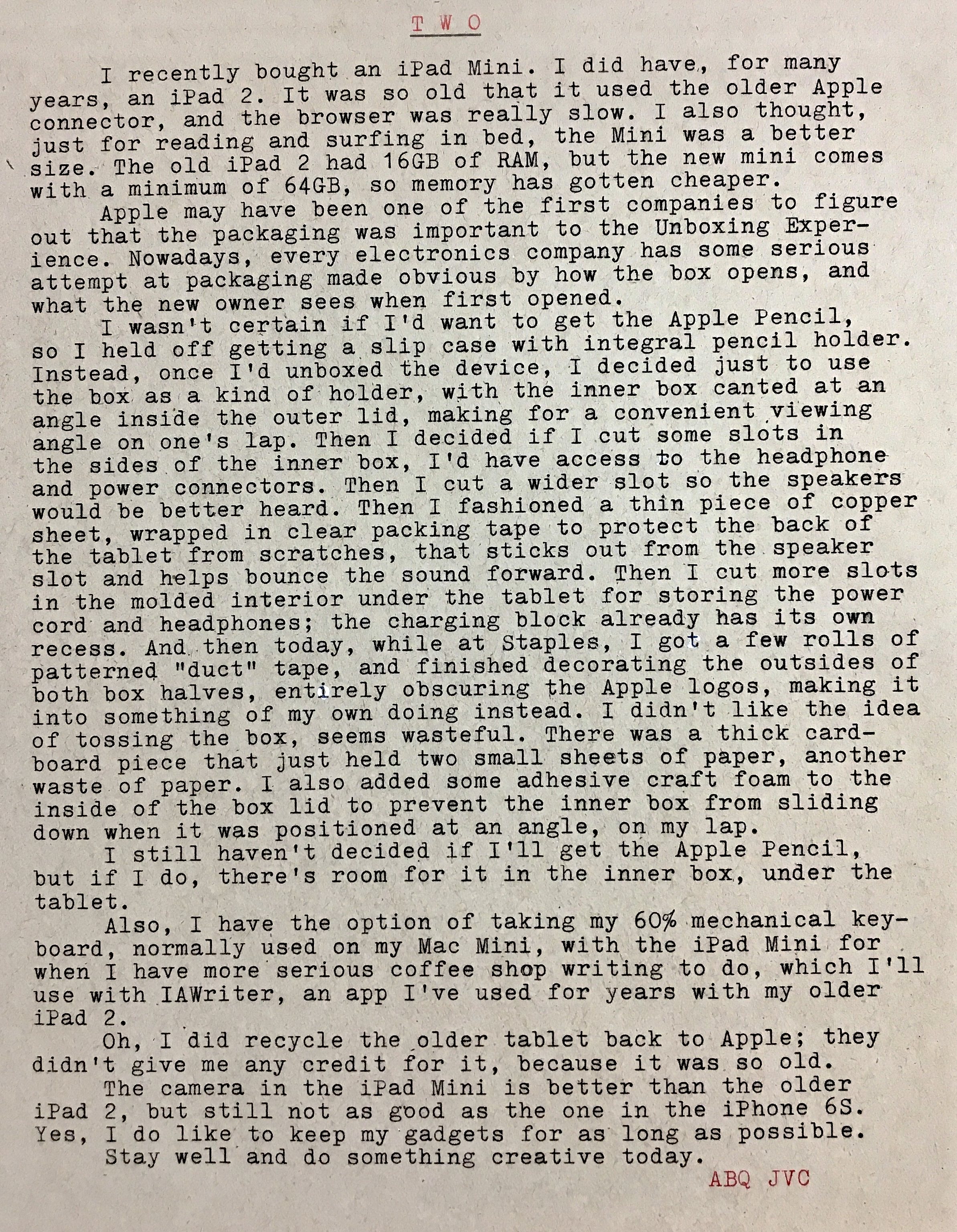
Blog 17 May 2021, Page 2

iPad Mini Box
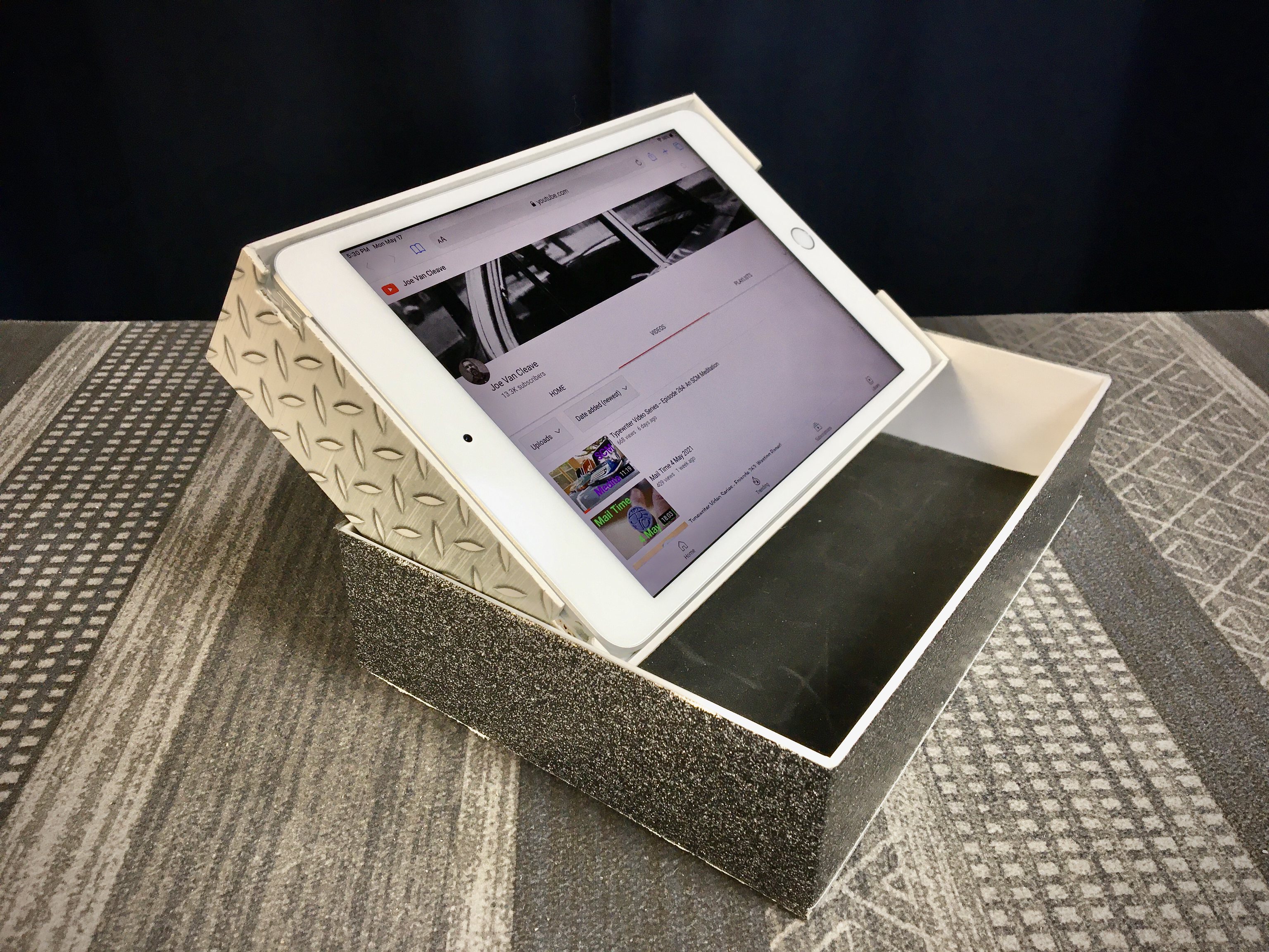
The inner box positioned for ideal laptop viewing.

iPad Mini Box
The slots cut in the side of the inner box for headphone jack and power button access.

iPad Mini Box
Slots cut into the interior for headphones and charging cable storage.

iPad Mini Box
The copper sound-bouncer plate in position, ideal for watching (and listening to) more typewriter videos of course! Also note the black craft foam inside the outer box to prevent the inner box from sliding around while positioned at the ideal viewing angle.

The Duck-brand "boiler plate" patterned silver tape really sticks well, but the 3M/Scotch-brand sparkly dark gray tape not so much. Go with the Duck brand, if you have notions of decorating your tablet's original container box.

The clipboard shot above reminds me that I need to make a review video about my clipboard collection. Because you can't have too many clip boards. And with a piece of hardware store masonite board and a large binder clip, you can make custom-sized clipboards too!

Labels: , , ,

Tuesday, July 21, 2020

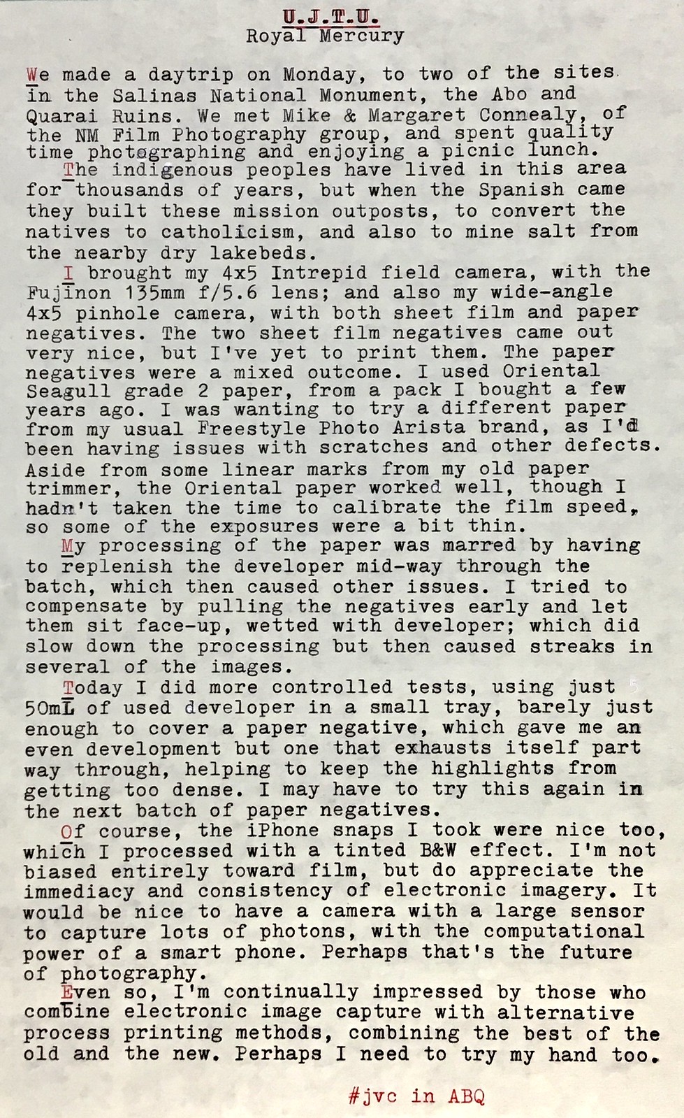
U.J.T.U.

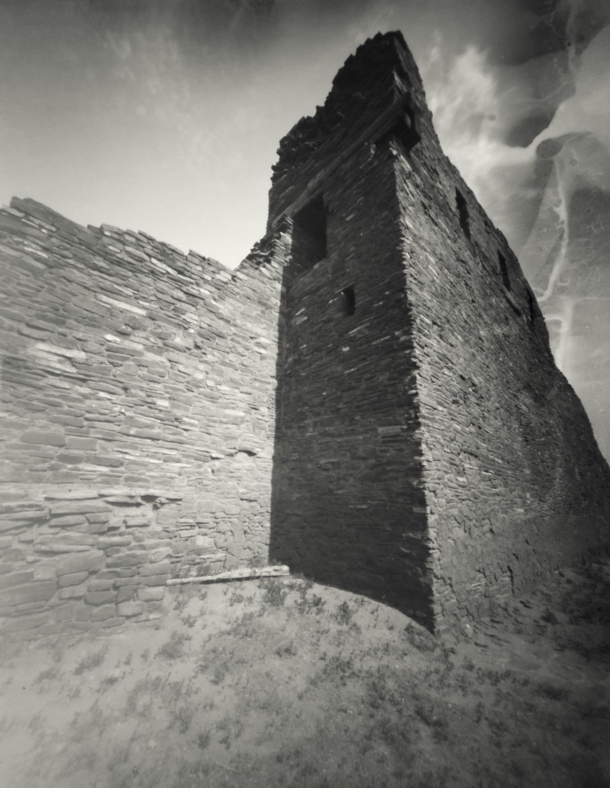
Quarai Ruins, Salinas National Monument, New Mexico
Update Just To Update

Here's one of the paper negatives from the wide-angle pinhole camera, with "processing artifacts" in the sky.

P1050680

I actually like it, though I can't take credit for an accident. This is one of those examples where a true artist would know how to embrace serendipity in their process; whereas myself, as more of a technician than artist, just sees fault. I think it's important that photographers learn to inhabit that space where the unpredictable arises as a result of a continual process of experimentation. It's all too easy to get wrapped up in the classic 20th century photographic techniques, that were refined more for commercial purposes.

My mistake was sloshing an unmeasured quantity of fresh developer in the tray as a replenishment, which then proved too strong, as the subsequent negative got too dense too fast. Then, to compensate, I pulled the next negative out after only 20 seconds and let it sit face-up, in an attempt at compensating development (where the shadows continue processing but the highlights slow down), but this resulted in the uneven tones.

As I mentioned in the typecast, today I did a controlled experiment, using only 50mL of used developer, merely enough to barely submerge a 4x5 negative in a 5x7 tray, and with sufficient agitation (intermittent but thorough) the result was rather nice.

P1050687

Note the compensating effect, as the sky retains some detail that might otherwise be lost. This technique certainly deserves more testing.

Here's another iPhone image I like:

Quarai Ruins, Salinas National Monument, New Mexico

Here I purposefully exposed for the clouds to retain some detail (since digital sensors can so easily over-expose the highlights), then pulled up the shadows and adjusted the tones afterward.

Typecast via Royal Mercury.

Labels: , , , ,

Tuesday, November 13, 2018

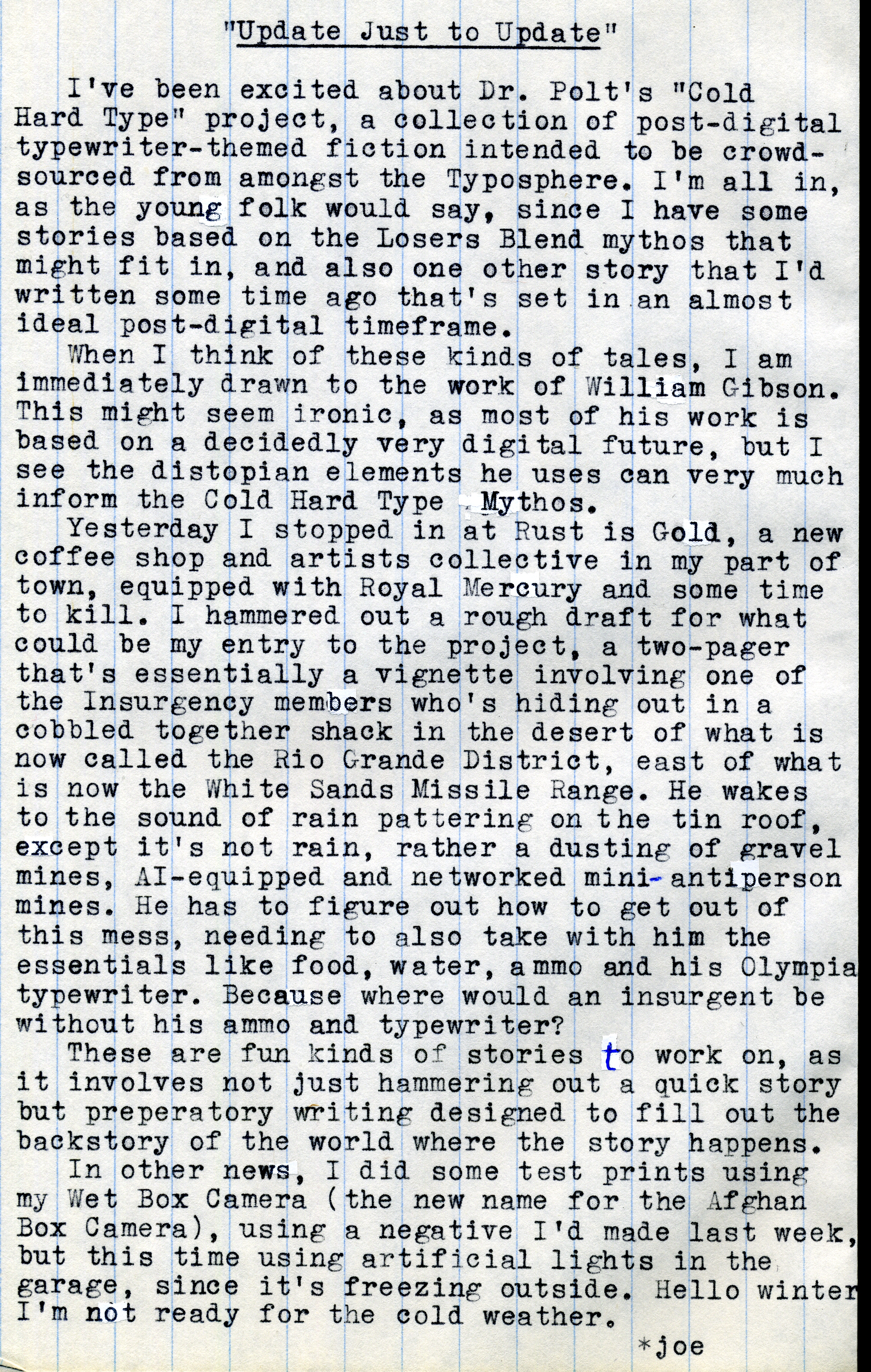
Update Just to Update

P1010185a
Typecast063

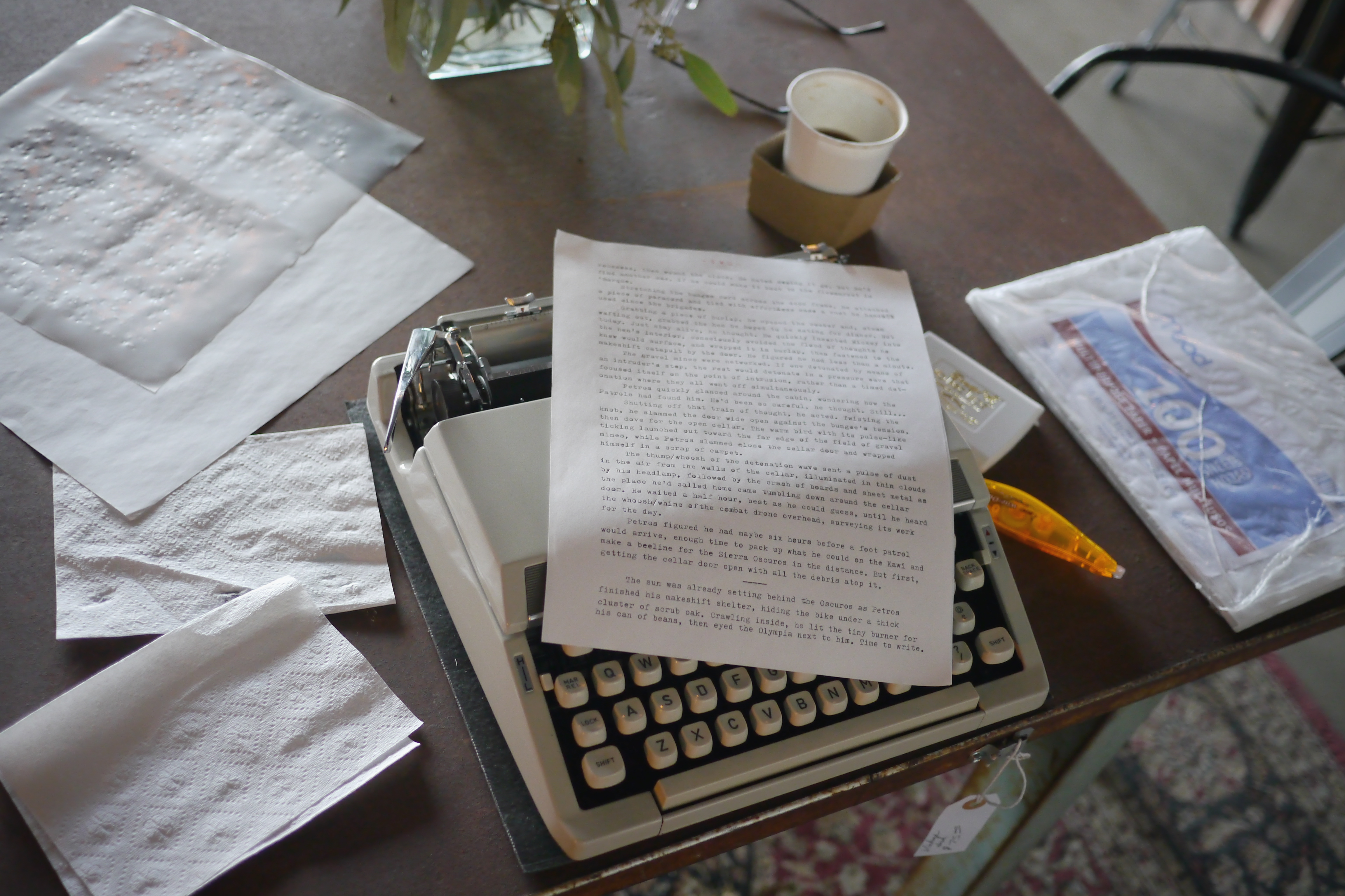
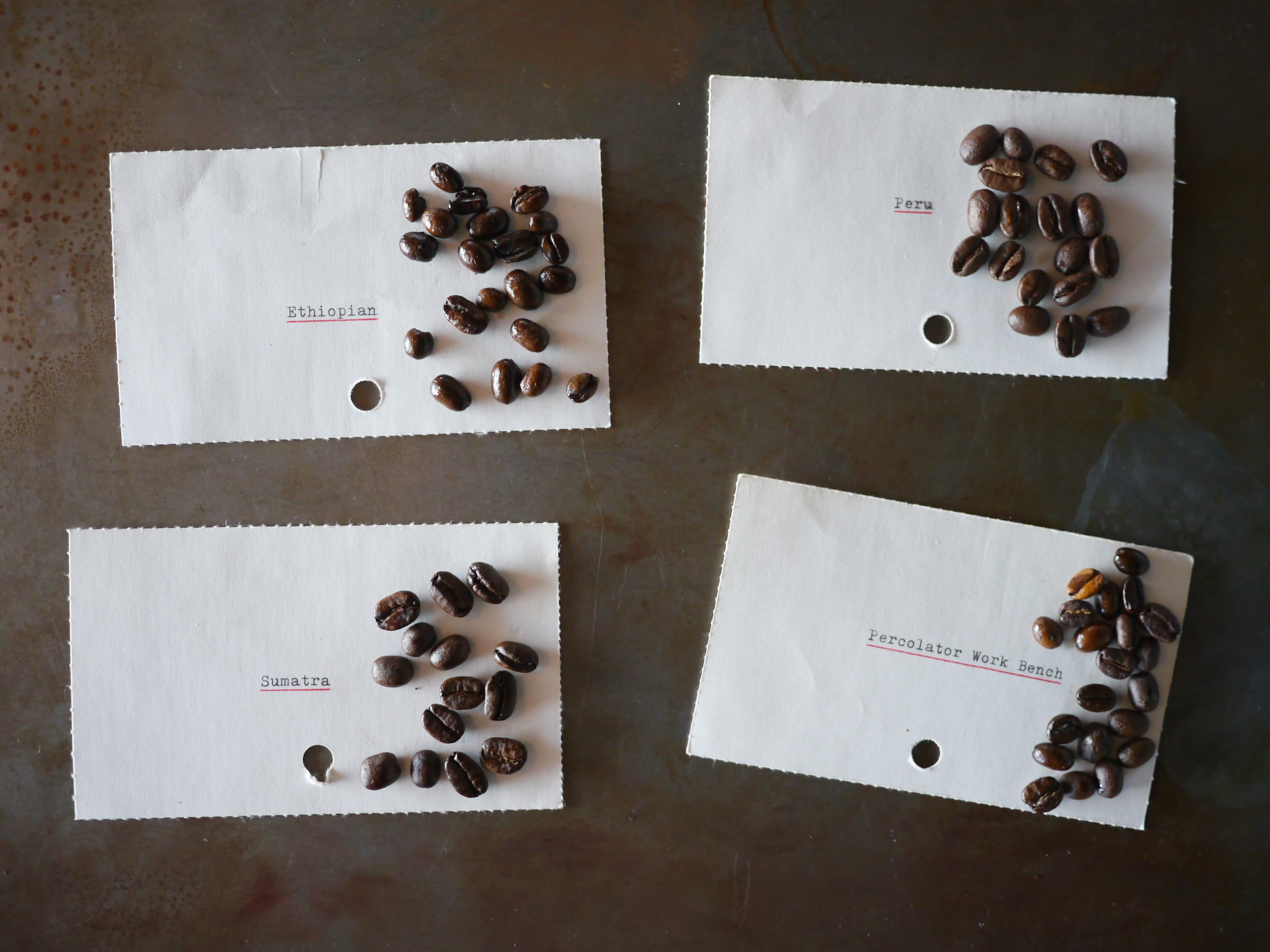
Post-Script: I had a pleasant distraction while writing my treatment for the Cold Hard Type project, which was that the co-owner of the Rust is Gold coffee shop asked me to type some index cards with names of coffee beans that they roast, for a photo shoot she was doing. I was happy to oblige.

P1010175a

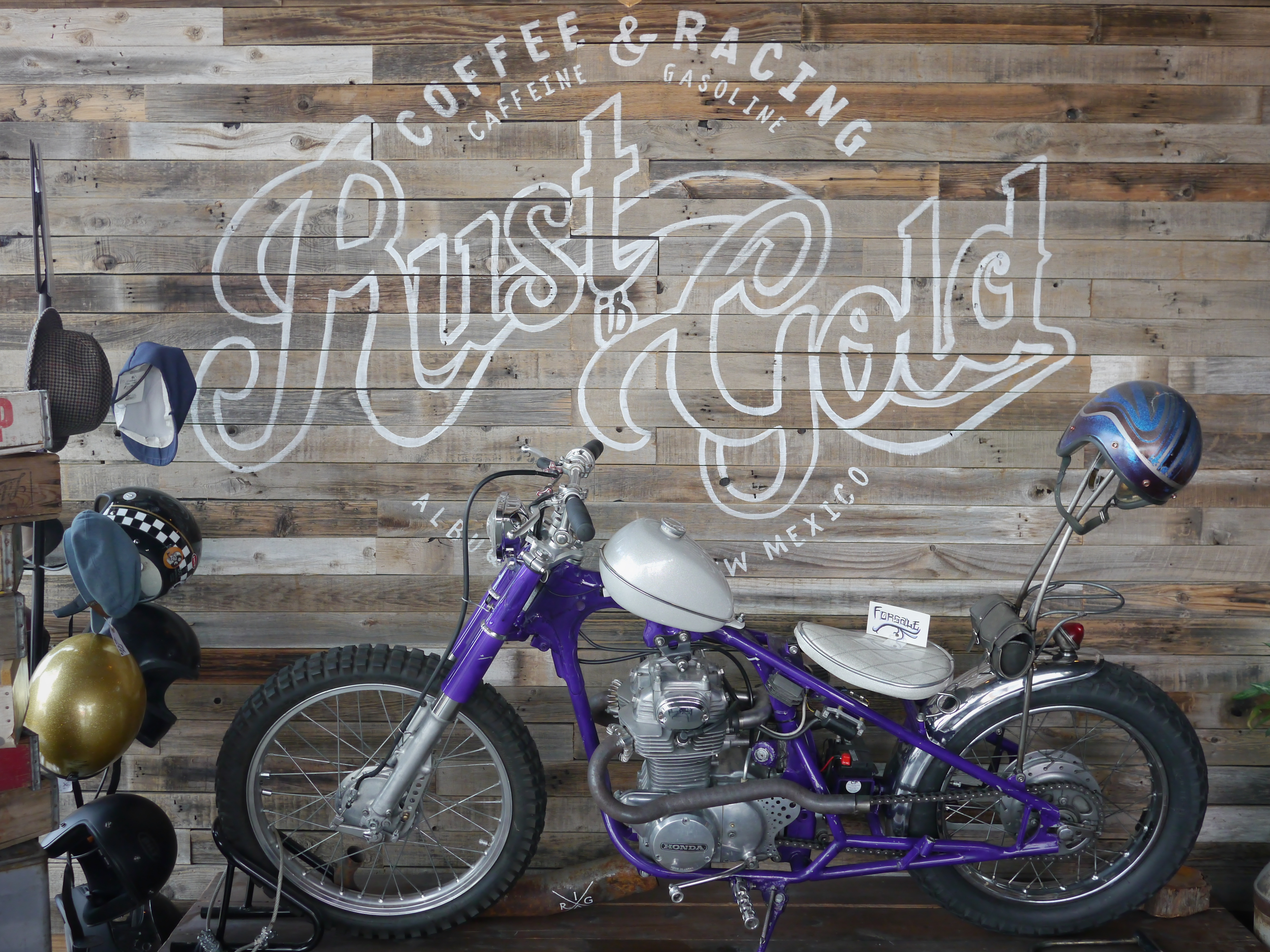
They have a cool motorcycle display, that changes every once in a while, as a local club meets there.

P1010182a

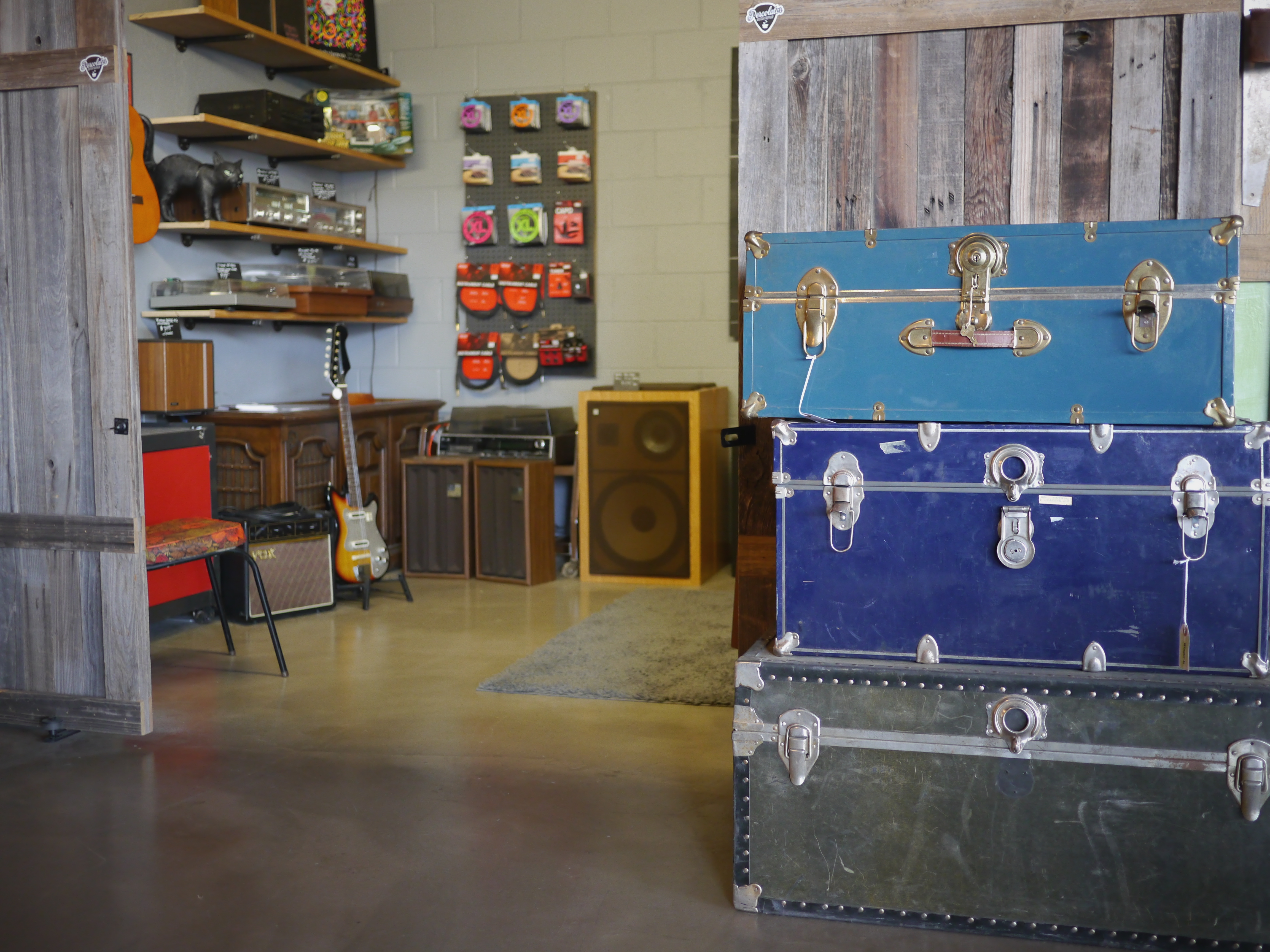
One of the adjoining booths sells '70s HiFi and guitar stuff. Pretty cool.

P1010189a

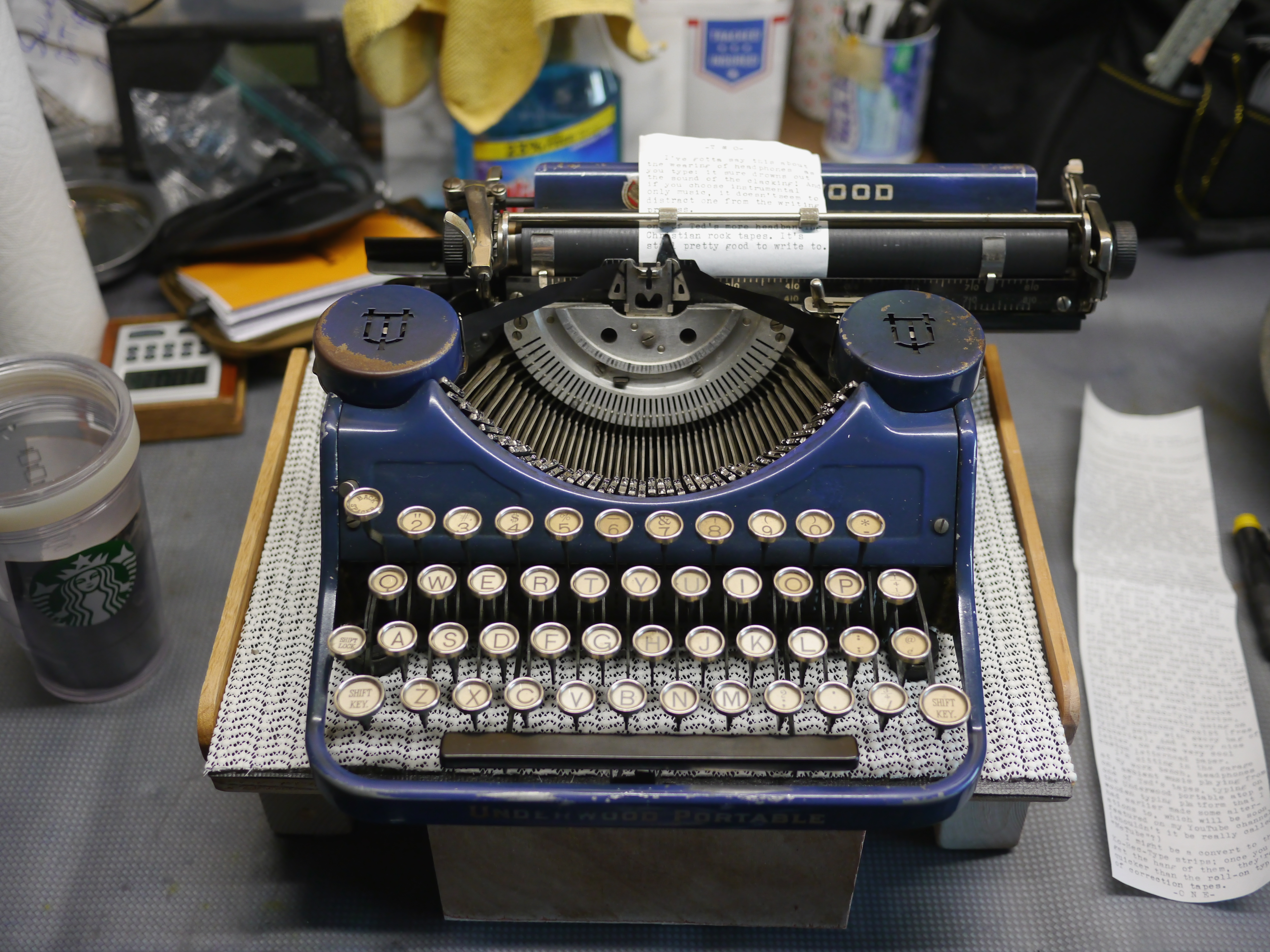
As you can see in the top photo, I wrote my treatment on the Royal Mercury (the more recent one I'd acquired), but this typecast today was written on the old Underwood Portable.

P1010158a

Yesterday, while working on the video about the typing platform, I pushed my office chair back and tipped over the folding tray table, with Underwood atop it, which crashed to the floor. Luckily it is hardwood with a rug on top. The machine doesn't appear harmed at all, which surprised me. Gotta be more careful!

Labels: , , ,

Sunday, November 11, 2018

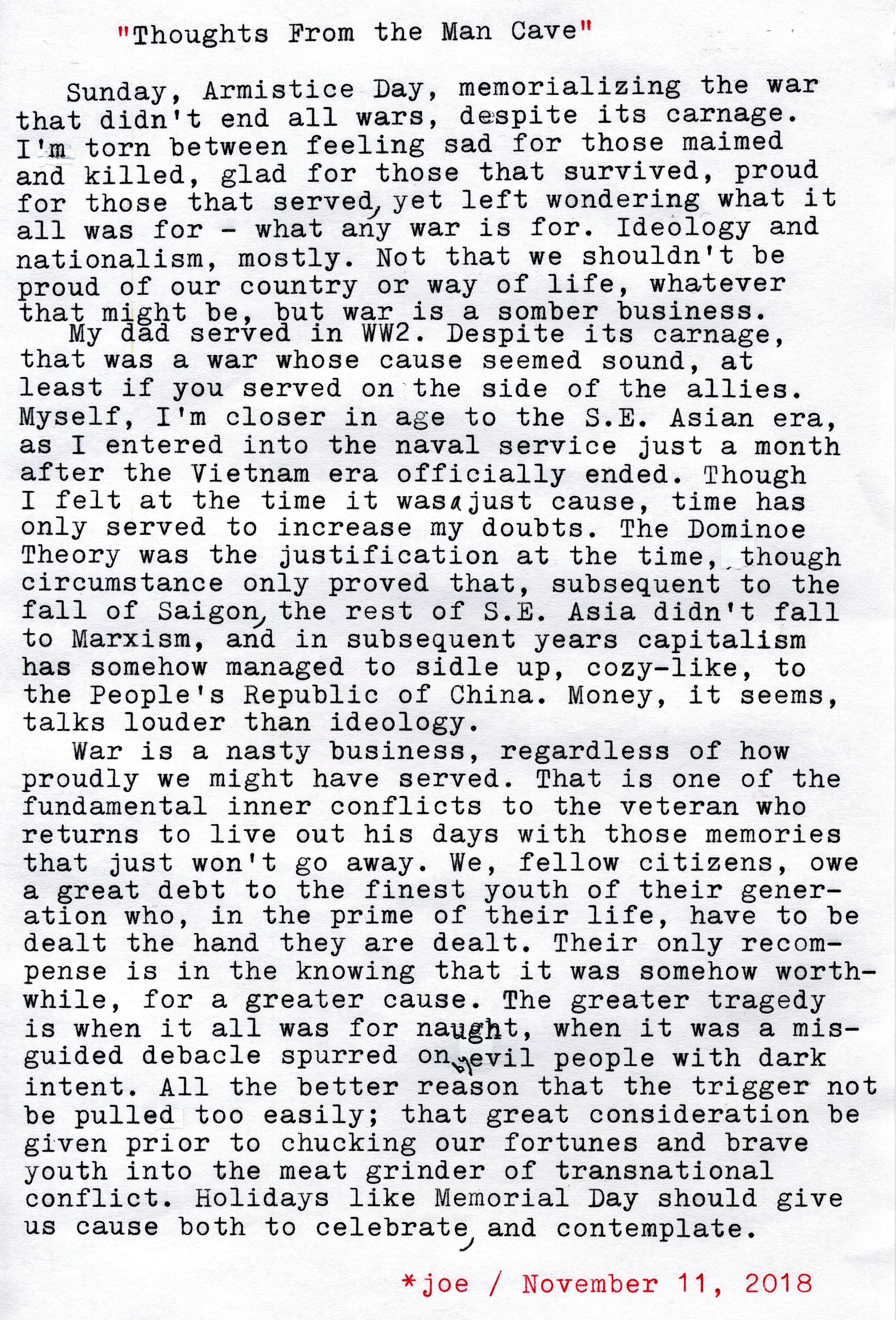
Thoughts From the Man Cave

P1010172a
Typecast062

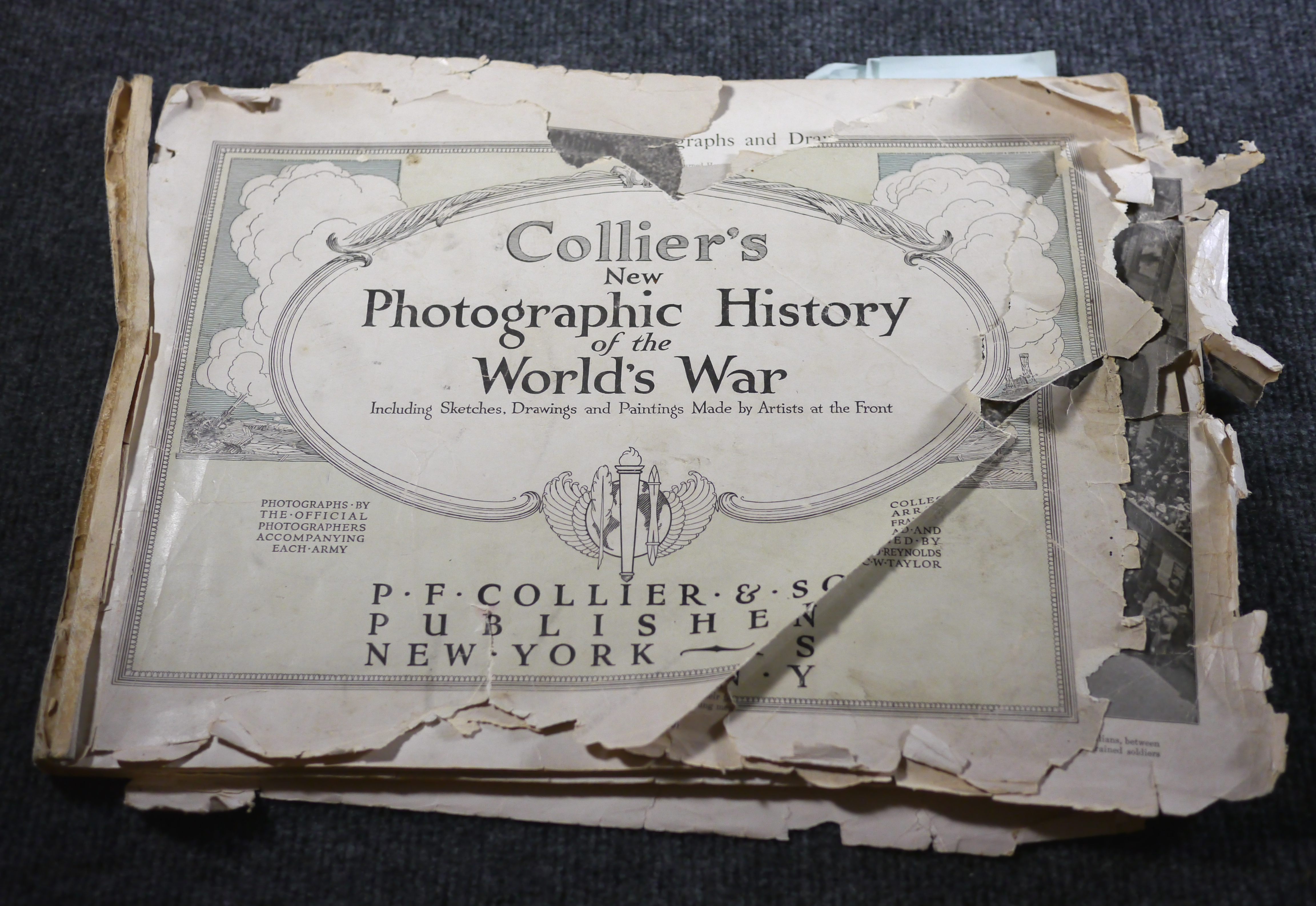
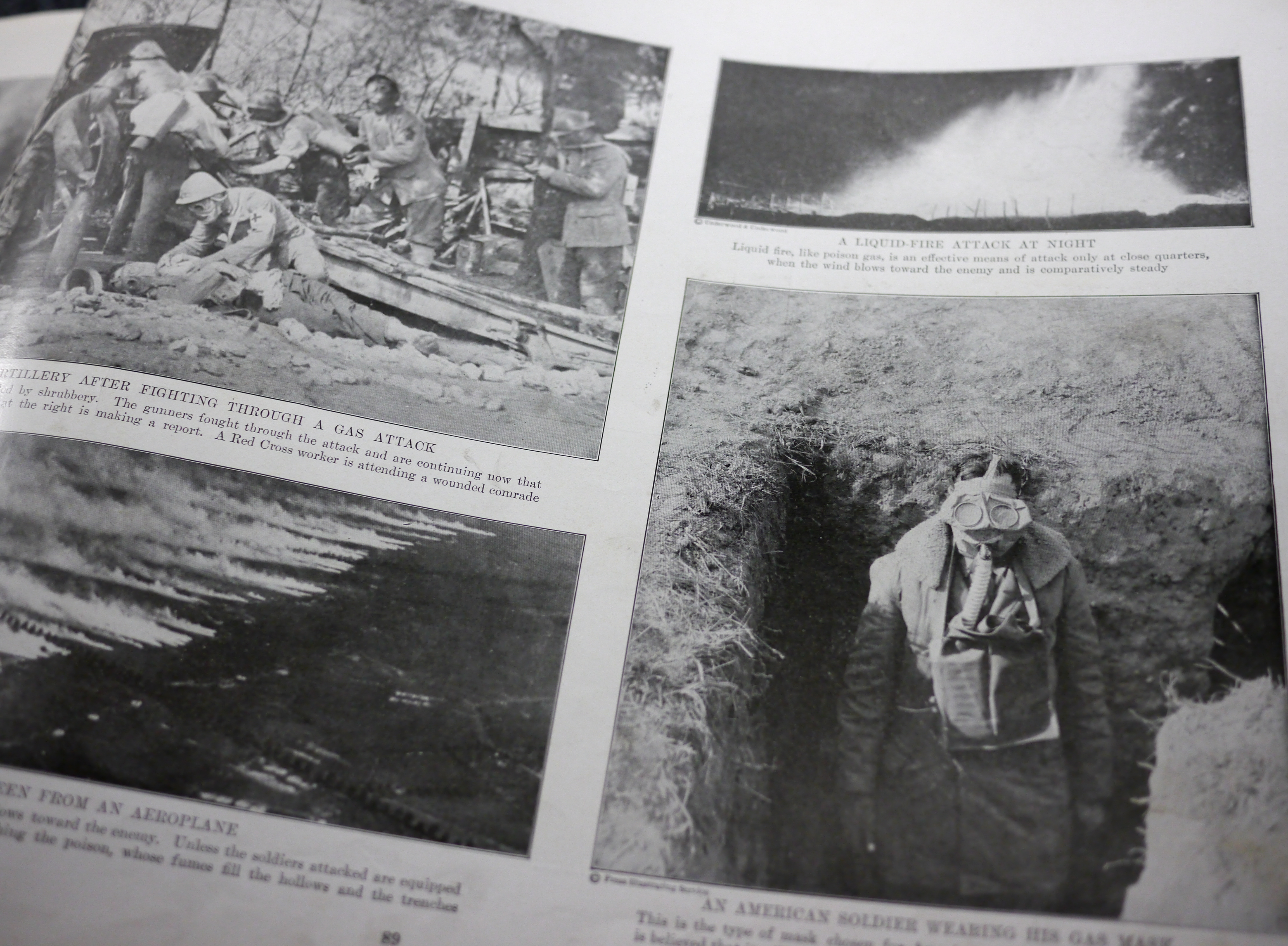
Post-Script: I was given this worn copy of Collier's New Photographic History of the World's War some years ago, by a colleague at work. It was in dire need of restoration back then, and hasn't improved with age. I recently saw a copy in better condition at an antique store, but for some reason didn't purchase it, which I now regret.
P1010170a

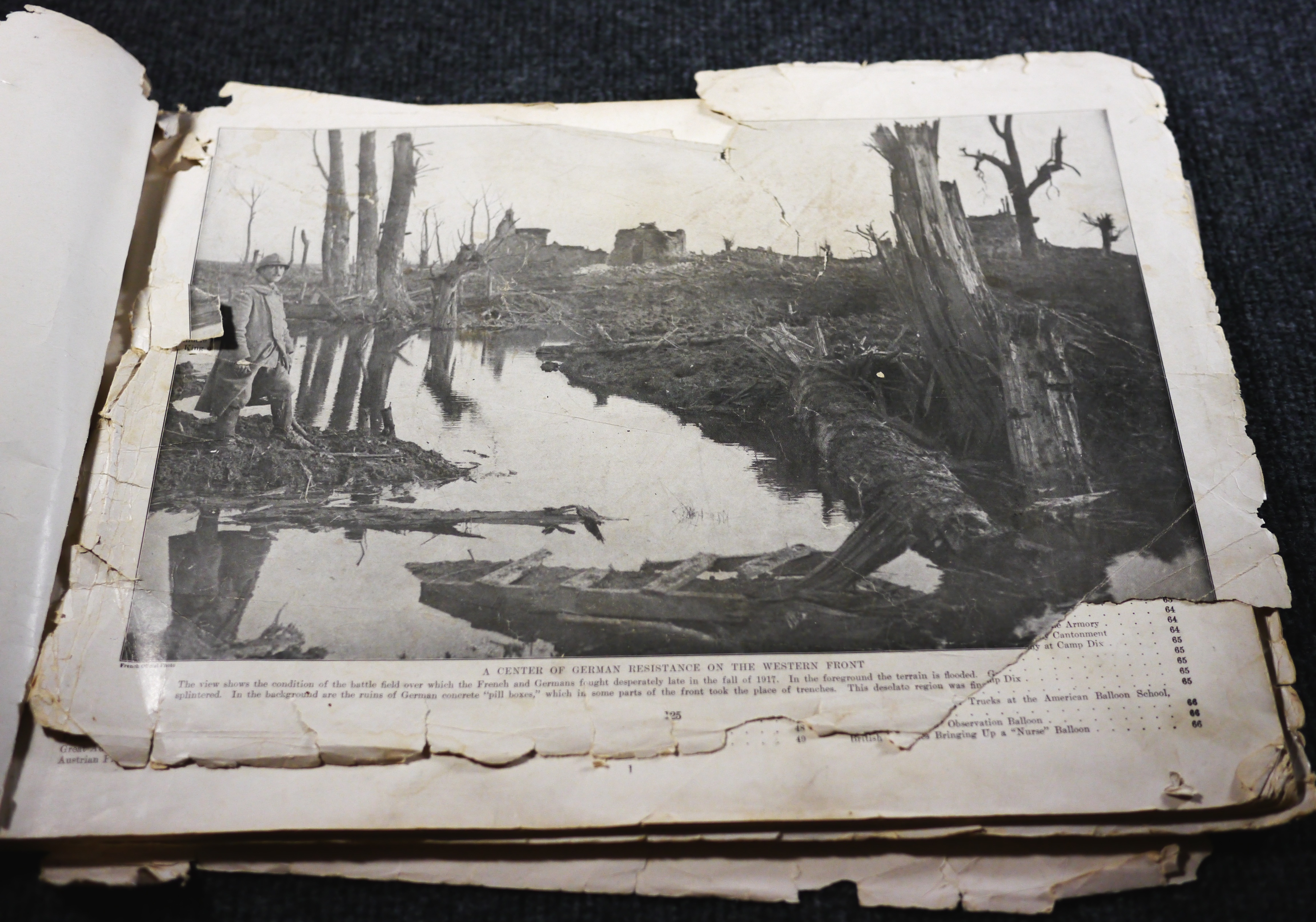
This book isn't reportage or journalism, but rather a collection of propaganda images - "Photographs By the Official Photographers Accompanying Each Army" the cover reads. Here you won't see explicit dead corpses of once vital youth, though that was certainly a reality. There is instead a hint of the horrors, as we see troops wearing gas masks, and aerial photos of gas attacks from a distance and the flare of napalm - "liquid fire," as the caption reads.
P1010168a

The book's intent, as I see it, was a carefully trod path between mere nationalist patriotism and the horrible realities of industrial-scale warfare upon the fragile humanity of young soldiers. It hints at the unspeakable while honoring the dead with images of parades and brave youth, doughboys and bemedalled officers alike.

One eye-opening fact I gleaned from this book was the reliance upon draft horse in the logistics of the war. Page upon page of horse drawn wagons and carts seemed at first out of place with what I thought I knew about the conflict, until I stopped to consider the newness of motorized transport in the second decade of the new century. One wonders about the need for supplying feed, and care, to these armies of horses, and the carnage they inevitably must have underwent.

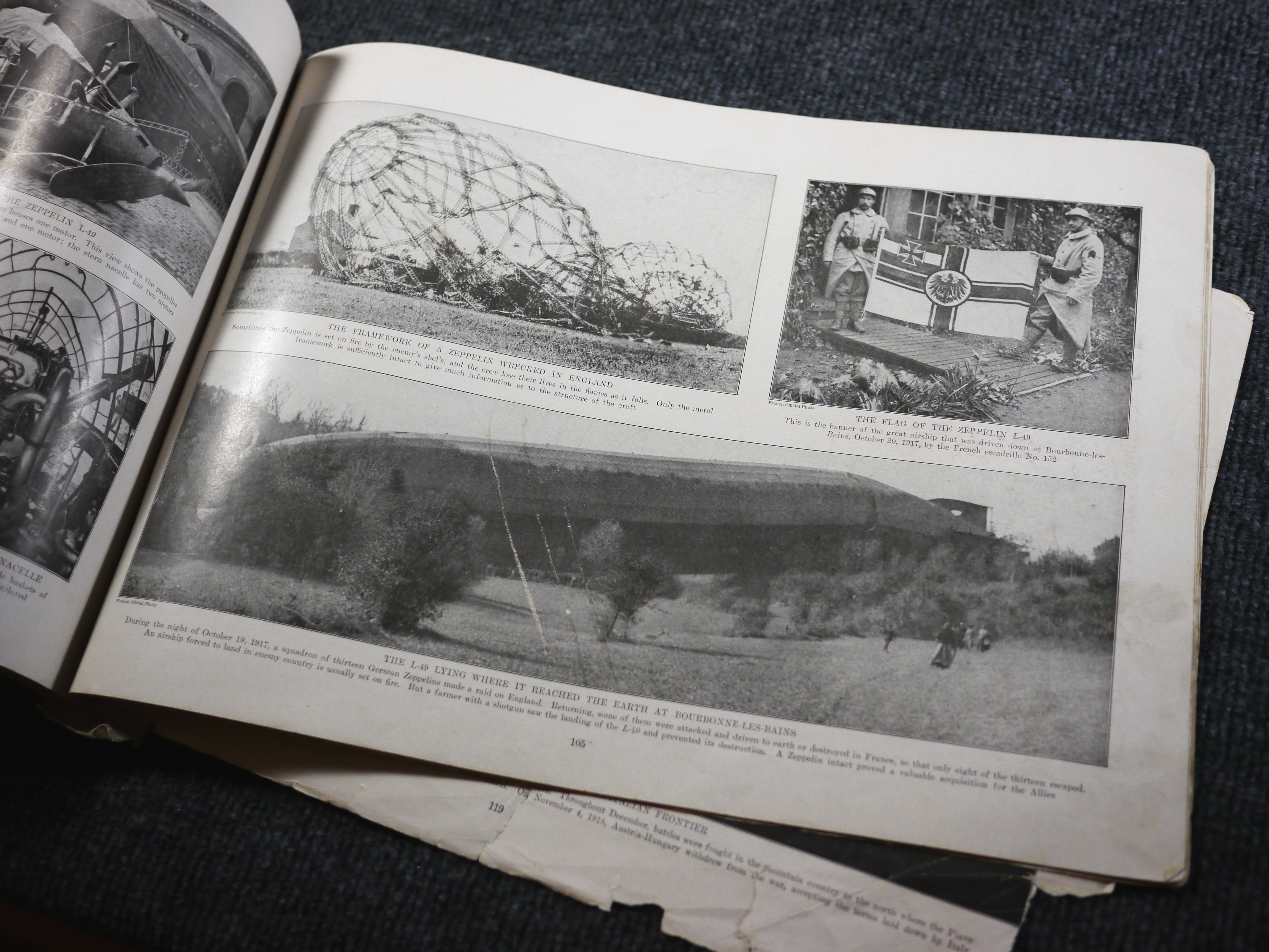
Another interest I've had in that conflict was the Zeppelin airships. Here we see the wreckage of the L49, which landed essentially intact and provided the allies with vital intelligence, later serving as a model for the U.S. Navy's U.S.S Shenandoah. It has been speculated by airship historians that the reason the Shenandoah later broke apart in a violent line squall over Ohio was because the L49 that she was patterned after was a so-called "height-climber" model, specially lightened so as to increase her ceiling but also rendered structurally weaker. The German pilots evidently knew how to fly her in the dense lower atmosphere to stay within safe structural limits, but perhaps the U.S. Navy was a bit more cavalier in their pilotage of the Shenandoah; at least, that is what is speculated by experts such as Douglas H. Robinson.
P1010173a

None of my immediate family served in the Great War; my great-grandfather was too old, and my grandfather was a rancher and thus exempt from the draft. Some years ago, there was a series on PBS (Public Broadcasting Service) here in the States about the Great War, within which it was speculated that the remainder of the 20th century, up to and including the fall of the Soviet Union, was really aftermath, unsettled issues, arising as a result of the Great War. Perhaps. History is complex, more so than we can comprehend within the grasp of our limited purview. But it certainly was a foreshadowing of even greater horrors later in the century.

Though it was billed as "The War to End all Wars," it didn't live up to that title. Somehow, we've managed to sweep the horrors of previous conflict under the rug of today's new crises, along with the broken lives of past survivors, and concoct reason enough to engage in the next war.

PPS: On a brighter subject, I enjoyed typing with my recently acquired Royal Mercury, which remains in pristine condition - though it has a bit of a line slipping problem, perhaps caused by hardened pressure rollers. Which reminds me that there is no perfect typewriter, we just have to learn to live with a certain level of imperfection.

I'm sorry I was unable to attend the Phoenix Type-In today, as I couldn't get free time to depart on Saturday to get over to Phoenix in time for the event. But my best wishes remain with the Arizona contingent of the Insurgency, hoping you all had a great time.

Labels:

Monday, September 24, 2018

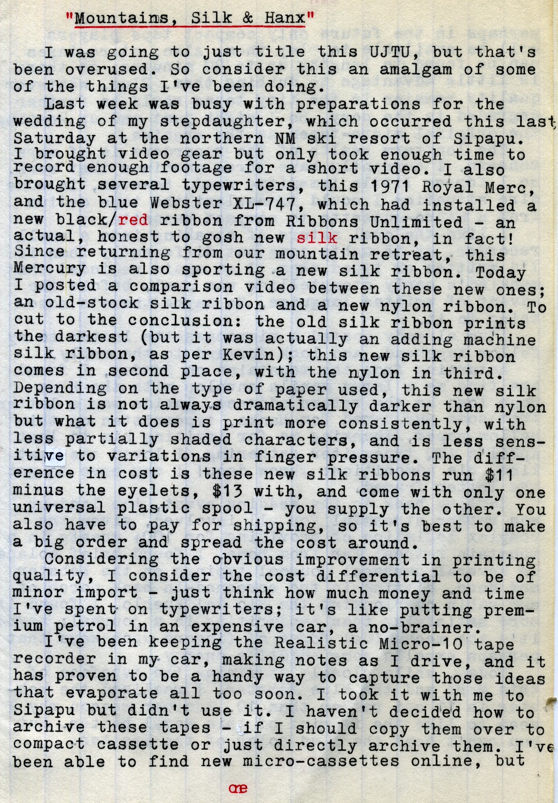
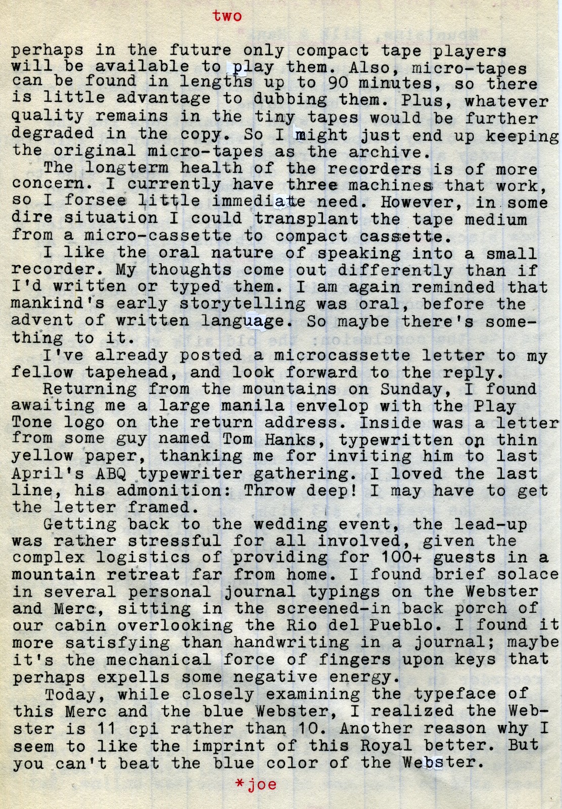
Mountains, Silk & Hanx

P1040432a
Typecast048
P1040433a
Typecast049

Post-Script: The wedding event was wonderful, a huge affair that involved lots of planning and last-minute stress, as these kinds of things often do, but worked out great. The staff at Sipapu Ski Resort did a great job in hosting the event, and the bride and groom, along with their friends, were instrumental in tailoring the wedding to their individual taste.

Here's a short video about me taking several typewriters on the trip:


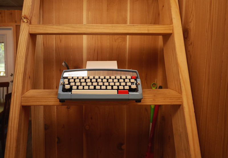
And here's a video about the new silk ribbons now being used in both the Webster XL-747 and Royal Mercury, purchased from Ribbons Unlimited:


Labels: , , , , ,

Tuesday, September 04, 2018

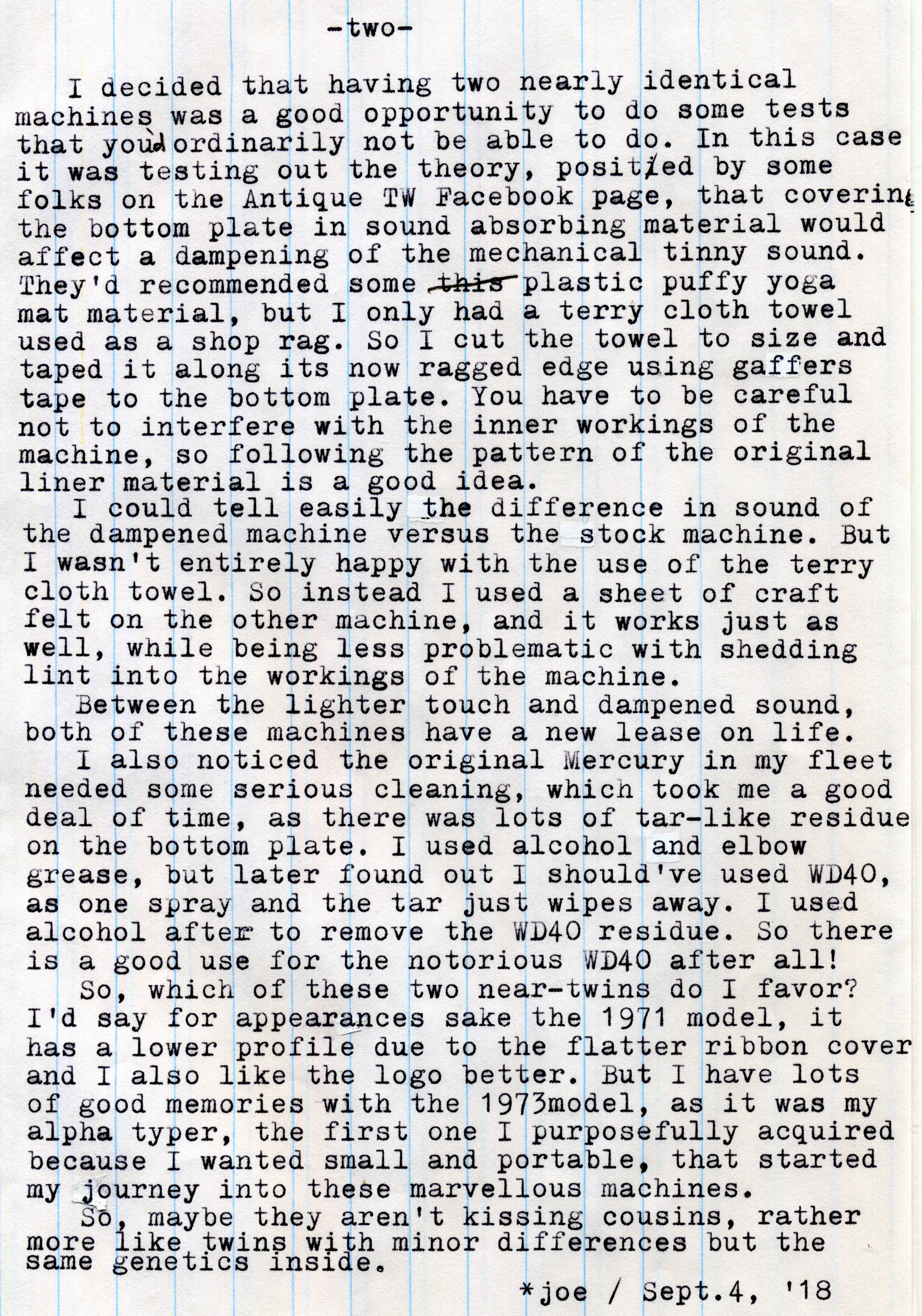
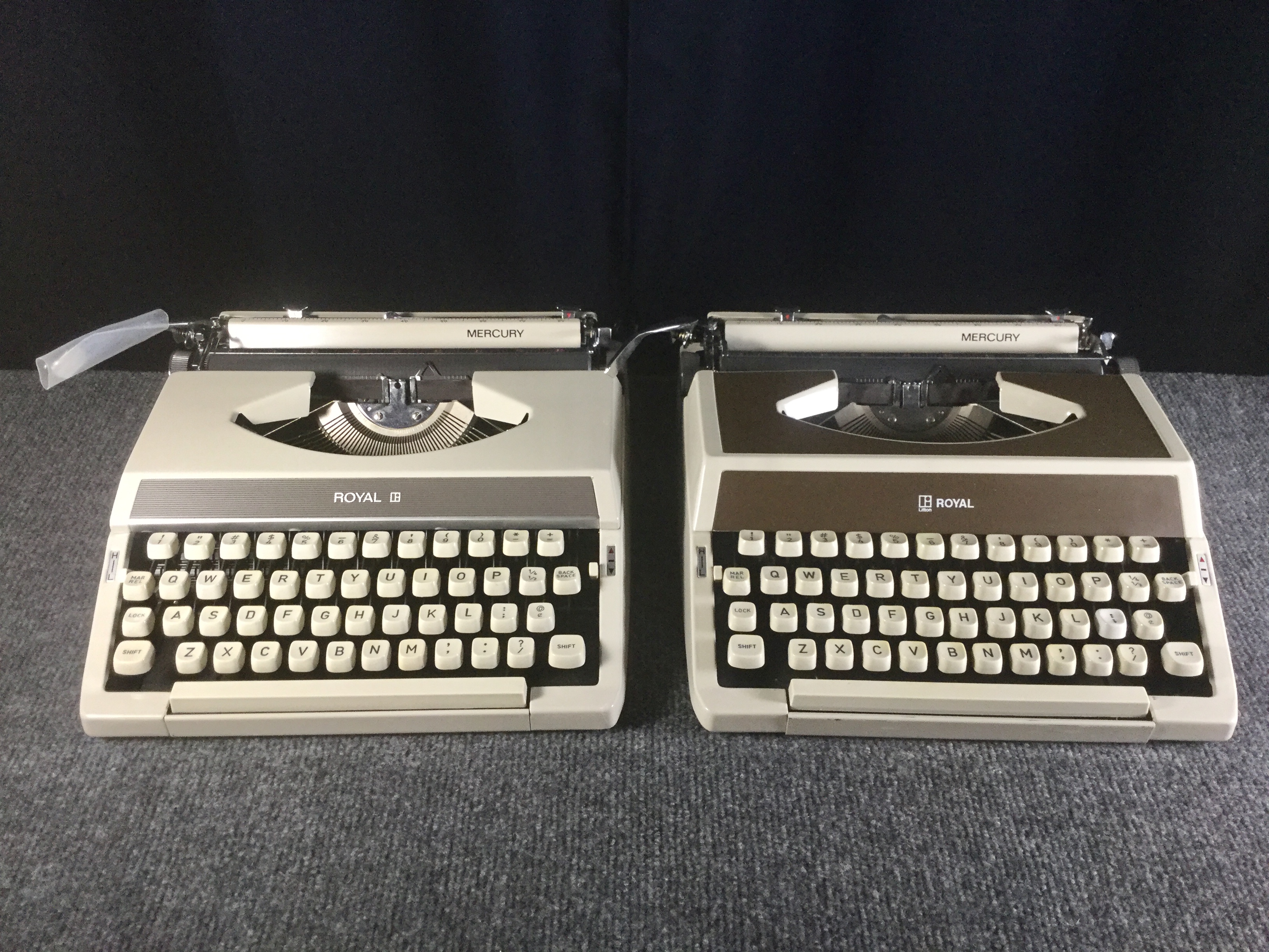
Kissing Cousins or Typer Twins?

Royal Mercury Kissing Cousins
Typecast045
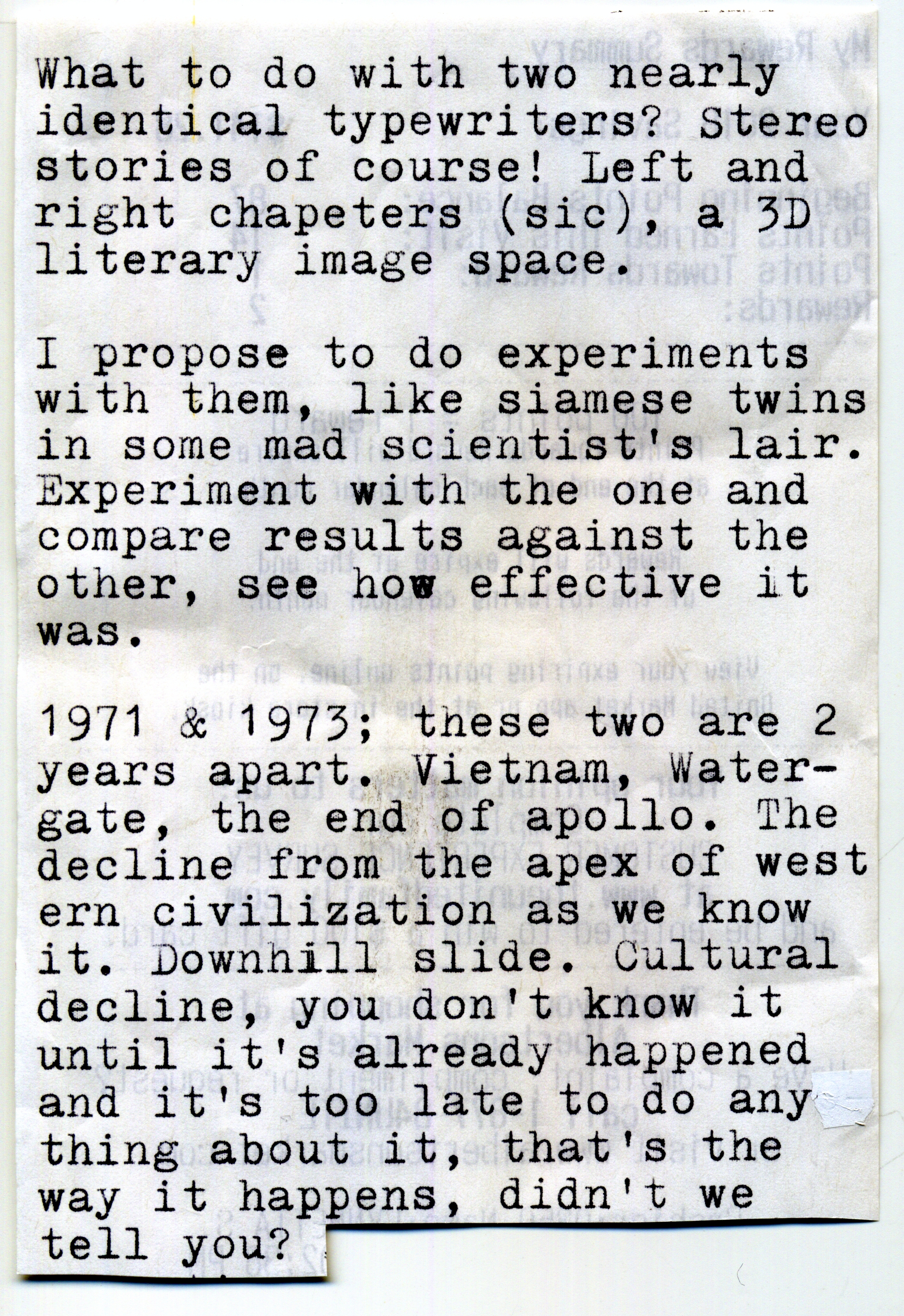
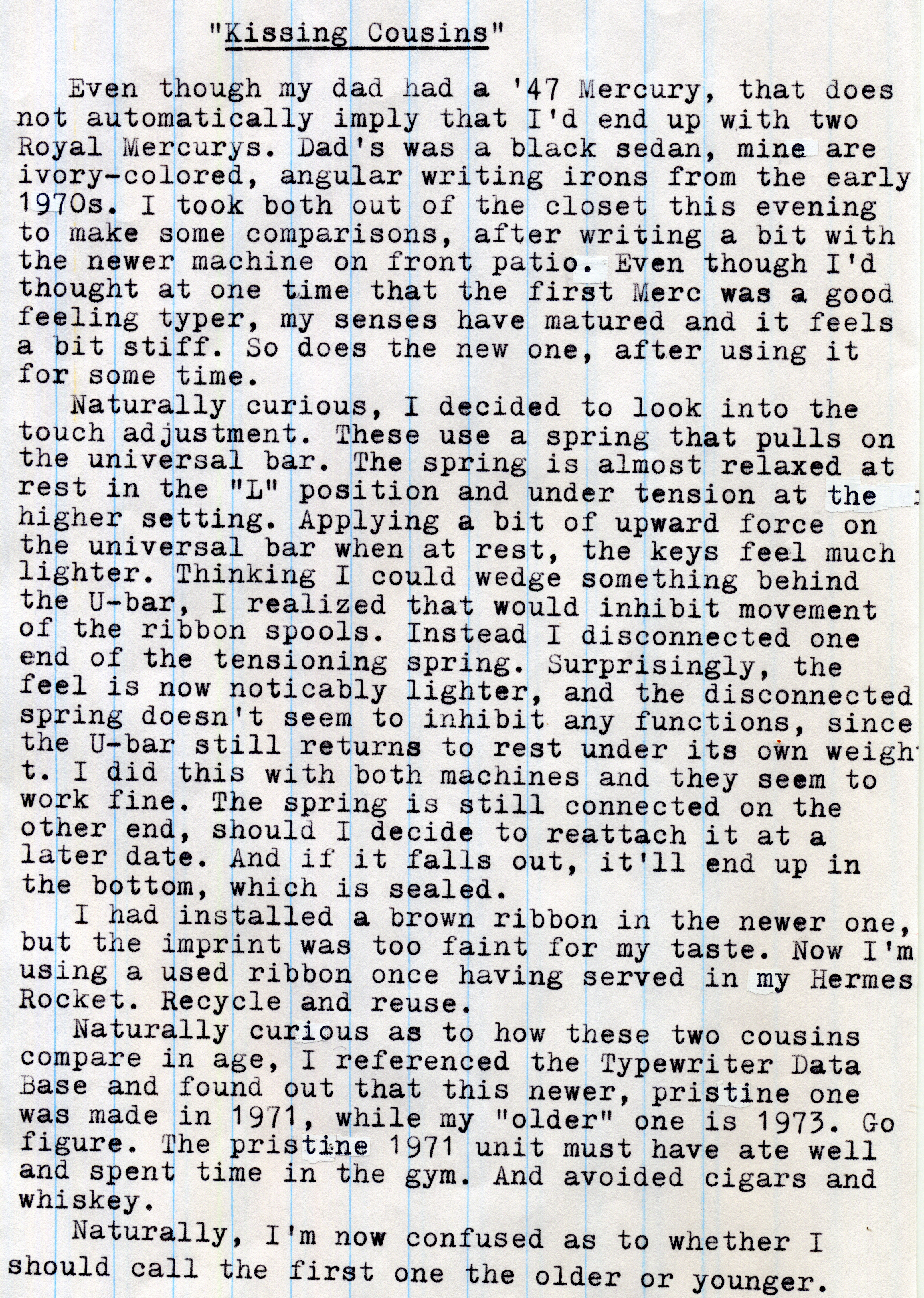
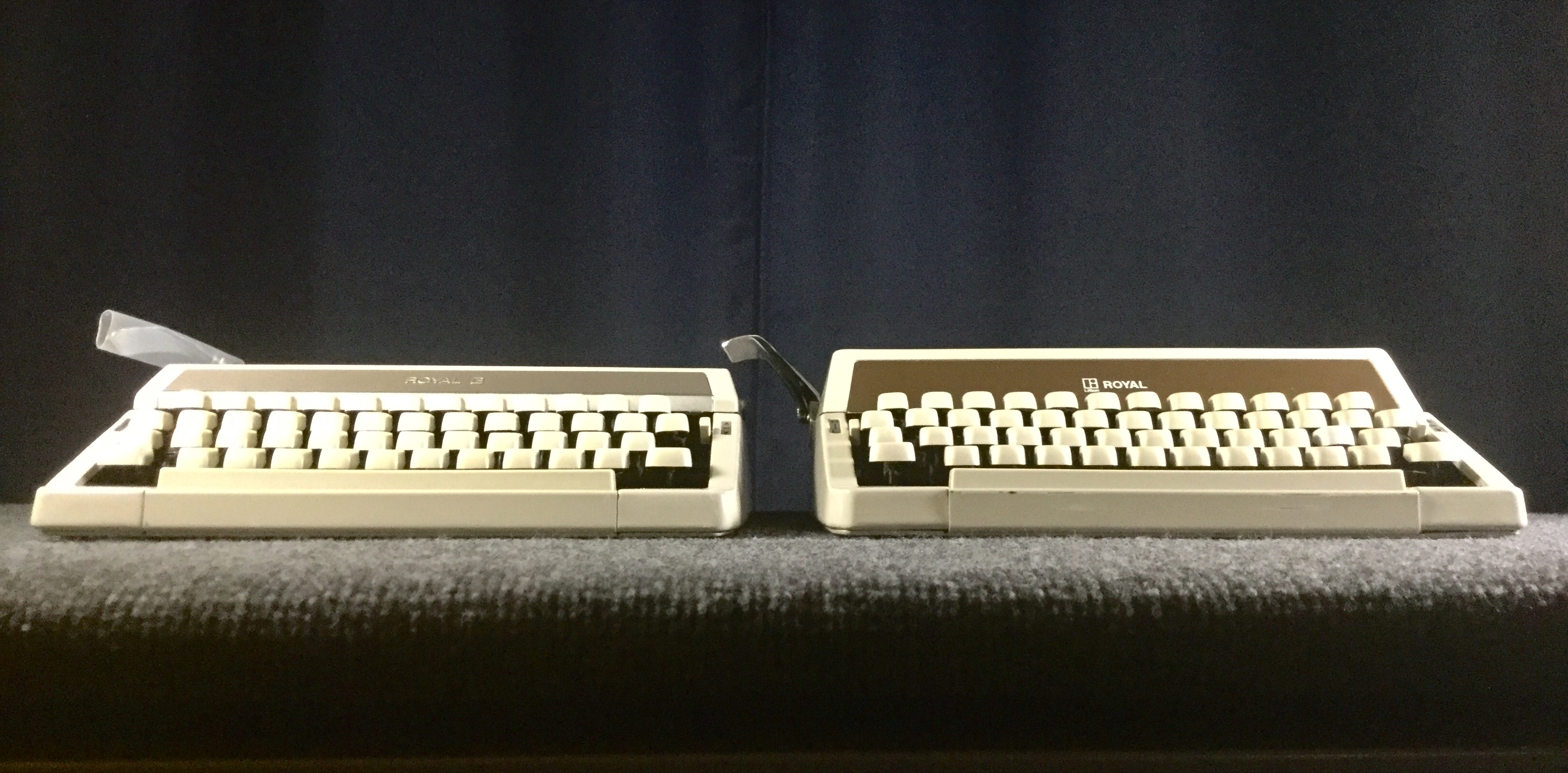
1971 versus 1973 Royal Mercury
Typecast046

Post-Script: I started this twin typer video on Sunday but was interrupted by Labor Day festivities; then had to do some maintenance on my main evaporative cooler unit (replacing the fan bushings and motor). It started out with me breaking out the 1973 Mercury that's been in my collection since the mid-aughts - my "alpha" machine, the first one I can with certainty claim to have acquired because I was getting the typewriter bug and wanted a small portable; which I haven't used very much in the last few years and it needed more attention than I'd realized. I ended up doing a thorough cleaning and degreasing on it, in the process of making the video.

Naturally, a comparison between both machines was in order. The 1971 model, new to me, had a bit easier touch; but now the other one feels better after the attention it's received.

These machines were designed the way they were designed. You shouldn't expect them to have the touch of a different, lighter, machine. But the trick I did to the touch adjustment, disconnecting the spring that attaches to the universal bar, did affect a noticeable change. Which reminds me that my Brother Charger 11, lacking a touch adjustment, always felt a bit lighter in touch than the Brother-made Webster XL747 that has a touch adjustment; perhaps it's due to this same issue, that at the lightest setting the touch system always gives more tension to the universal bar than without. I'll use both of these Mercs for a time and see if I'm happy with them this way.

Since I now have these two nearly identical machines, I figured some experimentation was in order. The natural thing would be to compare sound-deadening methods. There has been some recent talk on the Facebook Antique Typewriter Group about using various materials in the bottom of the machine to absorb sound and prevent it from reverberating upward. With the 1973 model I used a terrycloth shop rag, cut to size and taped along its edges to the inside of the bottom panel using gaffers tape. Compared to the unaltered 1971 model I could notice a real difference, more in the muting of the bright metallic sounds, rather than an overall lowering of the volume. Then I used a sheet of craft felt in the bottom of the 1971 model and it seems to have about the same degree of sound deadening. Nothing dramatic, but a real improvement. Since this is an ongoing experiment and easily reversible, I can always take these out and try different materials in the future.

This is the essential tradeoff when you like ultra-portable machines: you have to be willing to accept less than ideal mechanics for lightweight and small. Hence the tinkering with trying to gain back something in the way of better touch and sound. But there's always the fact that these small machines are easy to grab and bang out a quick note on, like the other night when I typed this on the back of an Albertsons grocery store receipt:

Typecast047

This is getting to be a habit, saving up 3-1/8" wide thermal-printed store receipts that are blank on the reverse side. Free typing paper, for short ditties or poems. Nothing profound or earth shattering, but highly convenient, promoting that stream-of-consciousness creativity that can, on occasion, produce surprising results.

Here's episode 130 of the Typewriter Video Series, on these two siblings.

Labels: , , , , ,

Wednesday, August 29, 2018

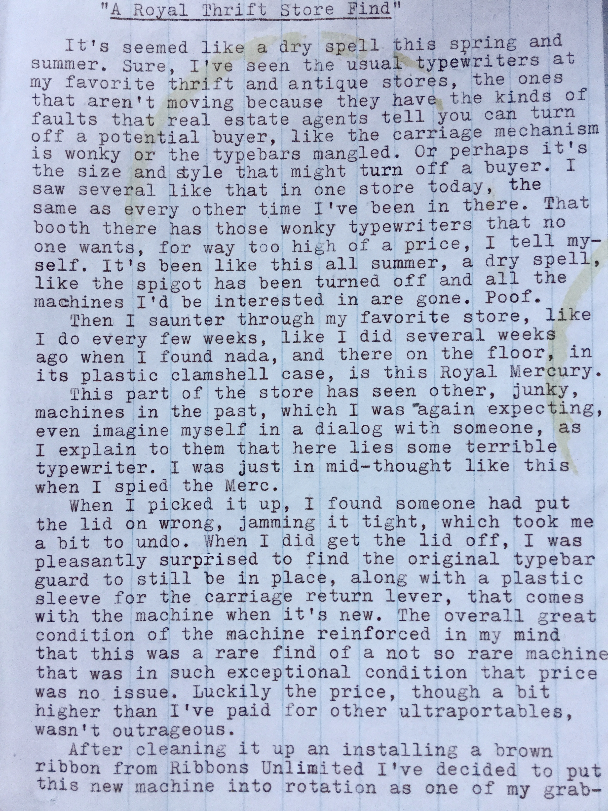
A Royal Thrift Store Find

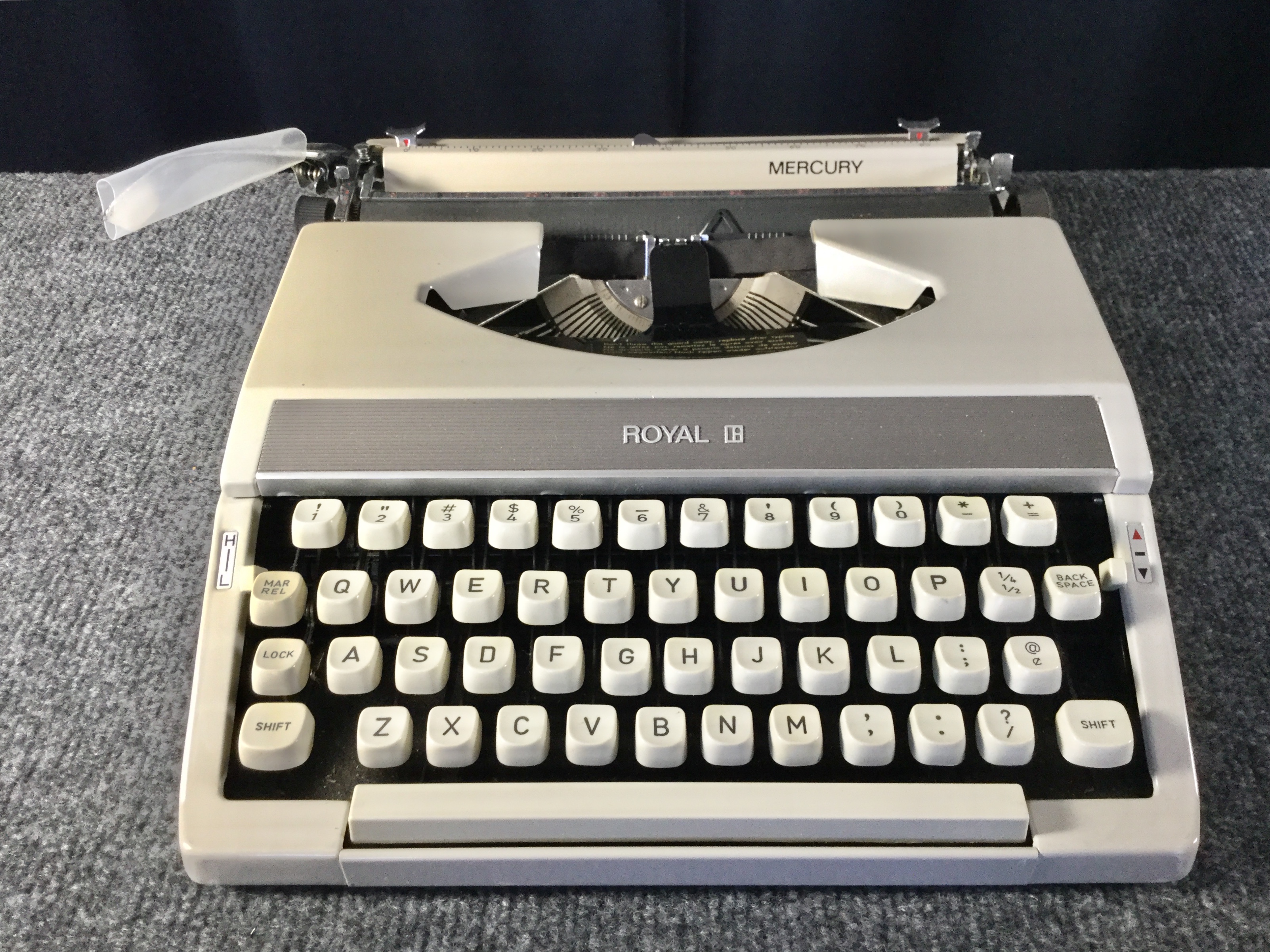
Royal Mercury
A Royal Thrift Store Find, Part 1
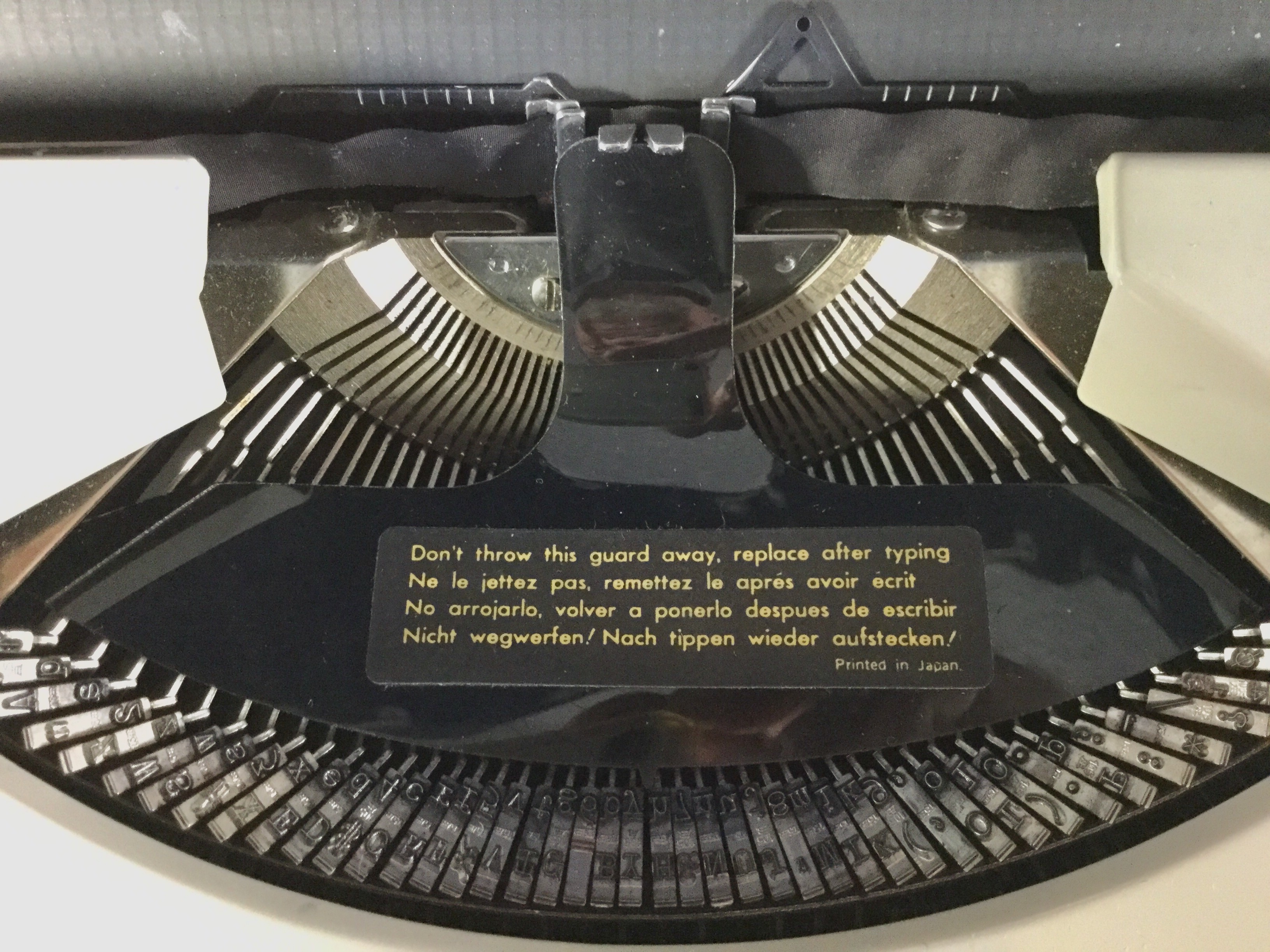
Type Guard
A Royal Thrift Store Find, Part 2

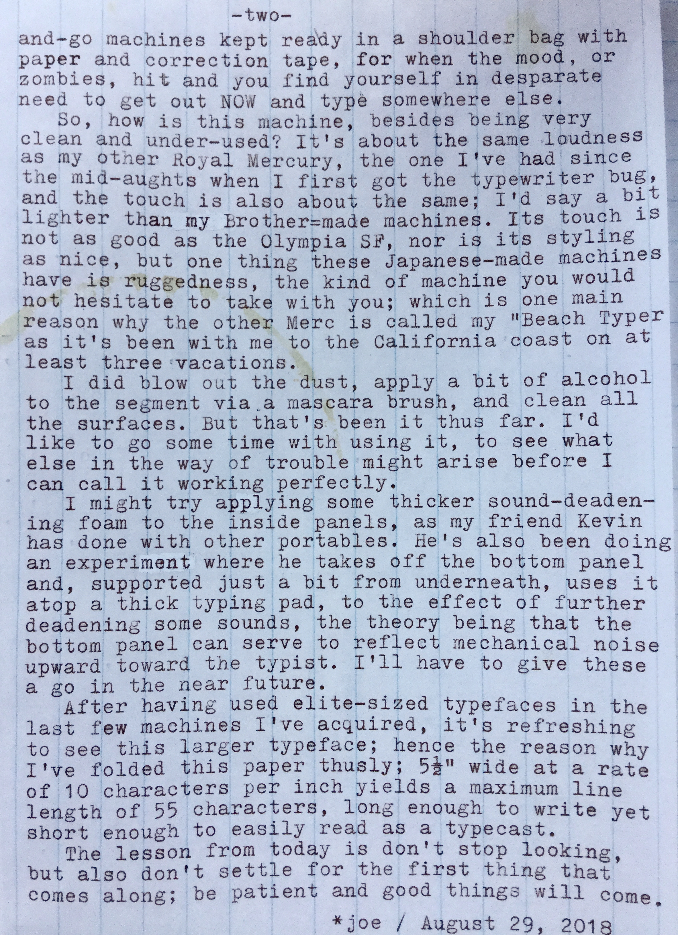
Post-Script: I snapped the photos of the typecasts via the camera in my little iPod Touch, out on the patio whilst smoking a cigar. The light wasn't ideal, and the iPod's native photo app provides little control of the tones, hence the blue hue. And you can see some field curvature from the lens. The lines of type are actually very straight and uniform, not curved as seen here. Not as good as a real scan, but much more convenient. I could get a third-party app that provides for more control over the final image. I do a bit of tweaking to the photos, then can email them directly to my Flickr Photostream, from where they can be linked to the blog.

There actually are typewriters available at my local thrift/antique stores, it's just the usual stuff I'm not interested in, either because of condition or, more often, that they aren't the type of machines I'm interested in. I'm attracted to ultra-portables. Today I saw an Underwood 11, in pretty good condition, at least most of the functions worked, since these are rugged machines. Still, there were some condition issues mechanically, and they were asking $125 - not unreasonable for an antique standard machine. But I don't have a place to keep a standard machine, all my machines are portables that can be stored away in a closet in their case. There's been a Remington Noiseless in the same seller's booth for over a year, it's very tempting, except there are serious mechanical issues with the line advance mechanism. A deal-killer for me.

It's fun to revisit these same stores and see the same machines awaiting a new home. No, I don't feel sorry for them, like you would if wandering through the kennel, seeing those sad puppy eyes in the face of the death chamber. These are just inanimate machines, right? Right? Hmm...

This machine was so special because of its pristine condition, and it was almost identical to my first typewriter enthusiast purchase, back in the mid-aughts. Here's a snap of that first machine, my beach typer:

P1100810a

As you might tell, the alpha Mercury has a bit of brown tones to the ribbon cover, while this new machine has silver trim on the front.
Here's a video I made today about this new find:


So now I can immediately imagine another video where I do a side-by-side comparison between both machines. Dang, it never ends, does it?

Labels: , ,