Sunday, July 01, 2018

Skyriting at The Standard Diner
Skyriting at The Standard Diner
Typecast024

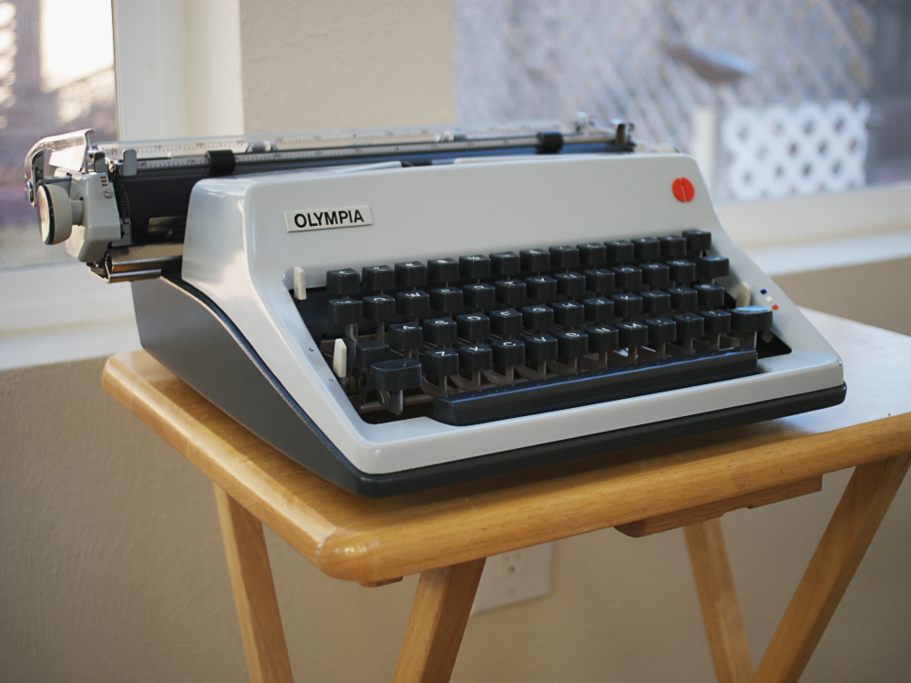
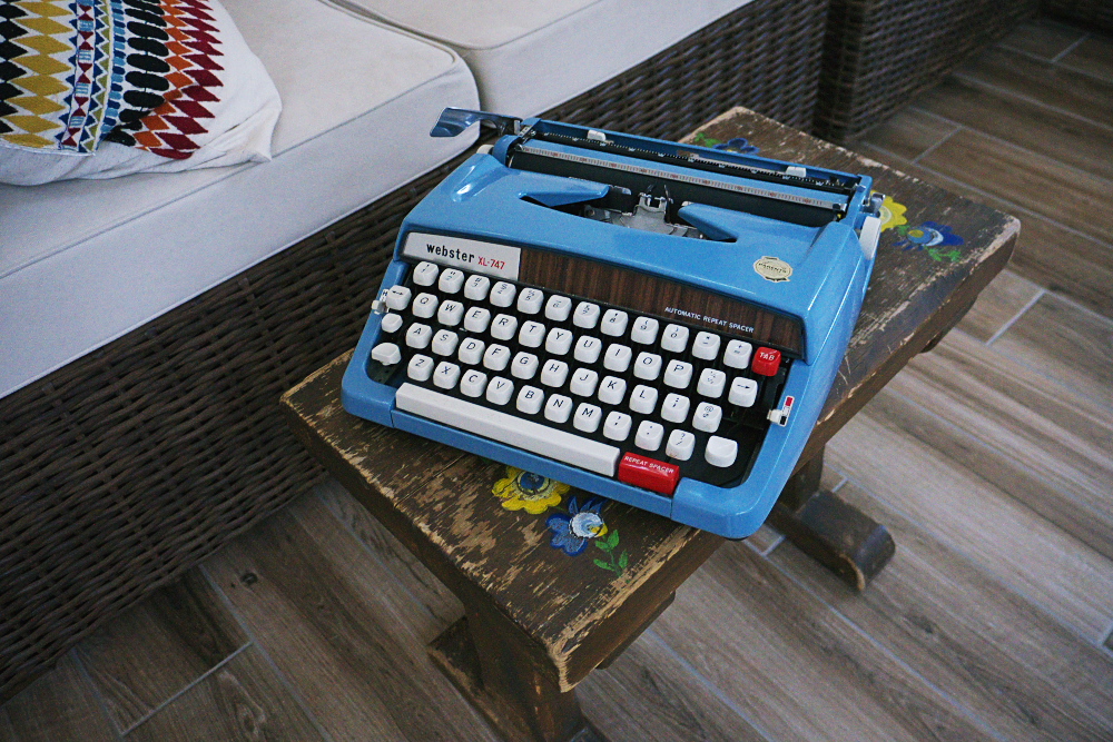
Post-Script: I carried the Skyriter in my green shoulder bag that normally holds the blue Webster XL-747; I can easily tell the Skyriter is lighter than either the Webster or my other shoulder bag typer, the Olympia SF. While the wide cloth strap is okay when motor-scootering, I'd prefer the padded computer bag strap I use for the Nekkid Hermes 3000 carrying box. It was a warm day, so wearing a summer shirt and shorts felt pretty good on the scooter.

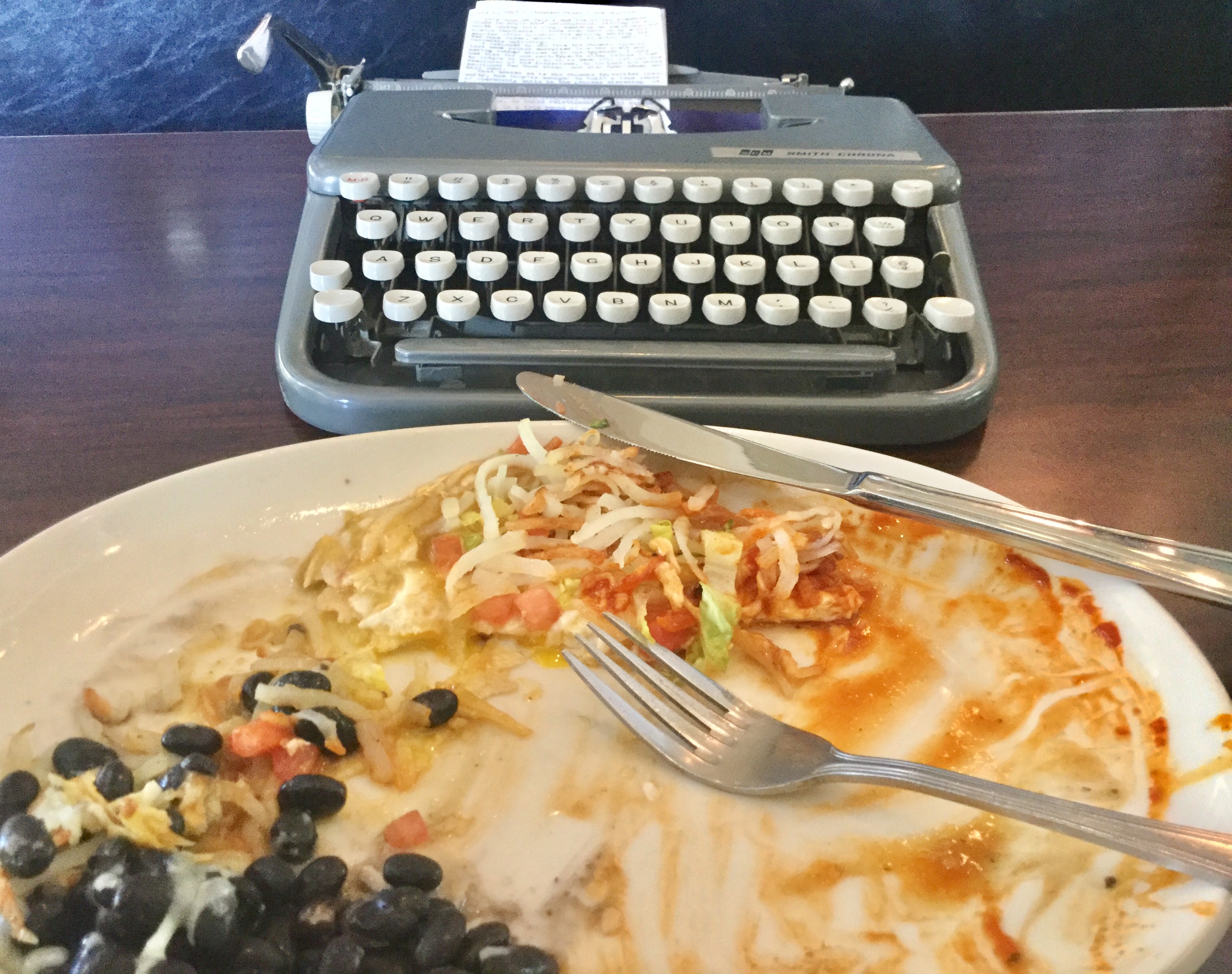
I've liked eating at the Range Cafe for years, so it's nice to know that The Standard Diner is owned and operated by the same family. While my favorite breakfast at the Range has been their huevos rancheros, made with blue corn tortilla and featuring pinto beans, white cheese and fried/baked potatoes (and ordered with red & green Chile - what we call "Christmas"), The Standard Diner's version has a white corn tortilla, black beans and hash browns. I really loved it, especially mixing both chile sauces into the hash browns and breaking the eggs over it. Yes; you can blame me for your sudden appetite.

Sitting in the high-backed, padded booth, I didn't find the Skyriter's noise especially bad; although I think I grasped a bit of conversation across the room involving the word "typewriter," so perhaps they were talking about me? Hmm...

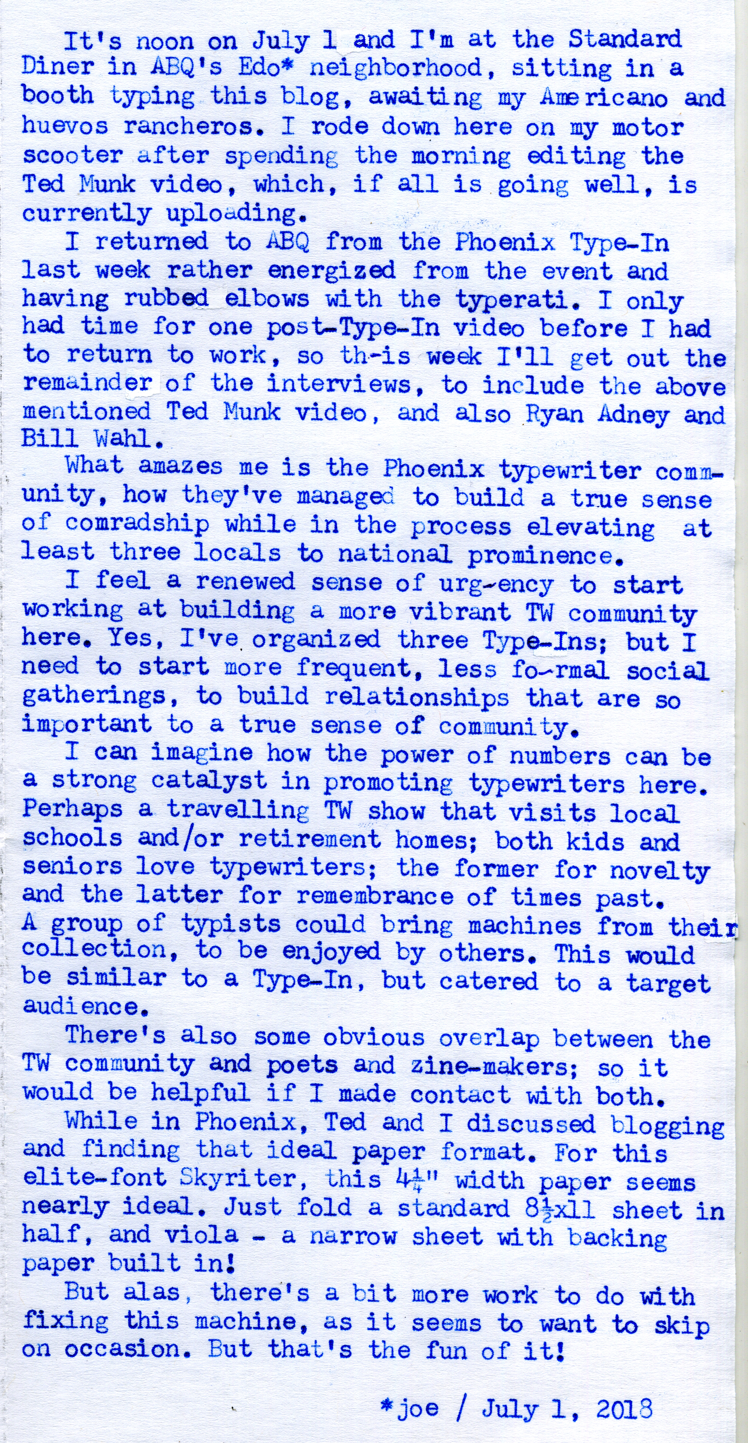
Regarding this issue of narrow-width typecasting, so as to make the words more prominent on-screen, Ted has mentioned the use of 3-1/8" wide thermal paper as a good medium. I'd like to try it, but will wait until I can find some cheap rolls at the thrift stores; otherwise I'd have to spend lots more money on a 6-pack of rolls, enough paper to probably last me a lifetime. For elite-sized font machines, this range of 3-4 inches seems almost ideal for the purpose.

I also remember reading on their menu that The Standard Diner has an old typewriter back by the restrooms, though I didn't take an opportunity to check it out. Which gives me reason to return once again, perhaps with better video equipment than the little iPod Touch. Even so, perhaps that makes this venue a bit more typewriter-friendly.

Now, regarding motor-scootering. Yes, riding two-wheeled vehicles is intrinsically riskier than being enclosed in a metal cage, especially in today's world of phone-distracted drivers. What would be a fender-bender crash in a car can easily become a trip to the hospital, or morgue, on a motorcycle. Even so, there's a particular enjoyment to riding. Always wearing a helmet is an essential habit, even in hot weather; though I find the helmet keeps the sun off the fair skin of my ears and face; while in the winter it keeps my head and neck warm.

There are also some good defensive driving habits to invoke when riding, that you normally wouldn't consider if in a car. Visibility is a primary issue, especially when passing cars or going through intersections. Staying out of blind spots is something I'm always conscious of, which involves momentary speed changes to put myself in a more visible position relative to neighboring vehicles. Watching a neighboring vehicle's lane position and speed can give you clues as to their intent to suddenly change lanes. Even on such a diminutive vehicle like my Honda PCX-150 scooter, my head height relative to the road is easily as high as a medium-sized SUV. Regardless, when being followed by a vehicle I try to stay in the left side of the lane, so I'm directly in front of them, in their central zone of vision. When passing through intersections where there's a left-turning vehicle in the opposite turn lane, I will adjust my lane position to the right side so they can see me as early as possible. And watching for cars jumping out from side streets is easier if you watch the spoked rims of their front wheels, where you can more easily detect slight rotational motion indicating they're beginning to roll forward. All these are tactics I've learned that help me stay safe.

If I ever feel especially nervous about riding in traffic (which I usually don't, since I learned to ride on scooters in city traffic), I have the advantage, in northeast ABQ, of taking side streets to almost anywhere else in this part of town, like I would if on a bicycle. That is the essential advantage of living in a grid-like city, the network of side streets between major roadways.

Here's the Ted Munk interview video. Stay tuned on my YouTube channel for the upcoming interviews with Ryan Adney and Bill Wahl.


*About downtown Albuquerque. My grandparents' old house in on Edith near Central, just two blocks up from The Standard Diner.

Labels: , , , , , , , , , , ,

Sunday, August 07, 2016

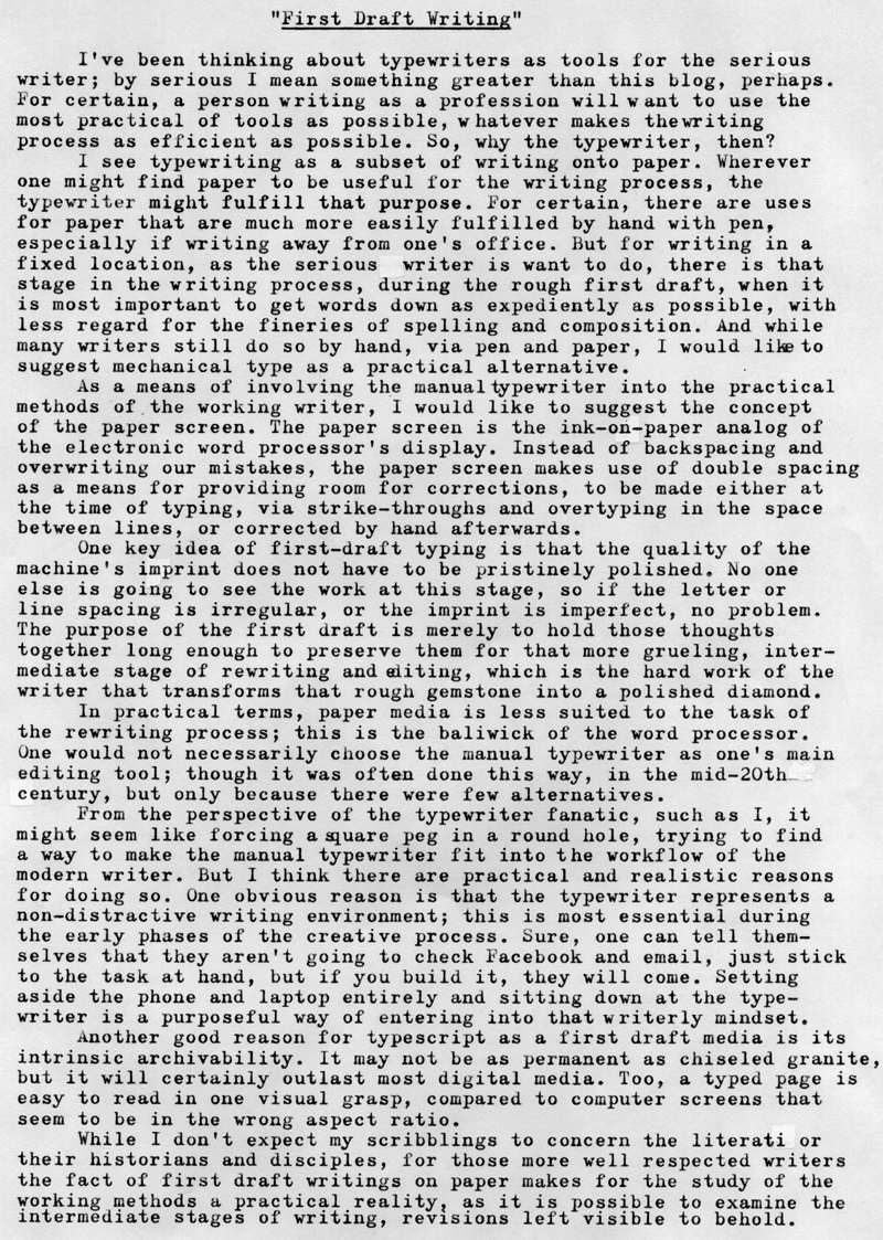
First Draft Writing

P1080148a
Typecast187
P1010508a
Typecast188

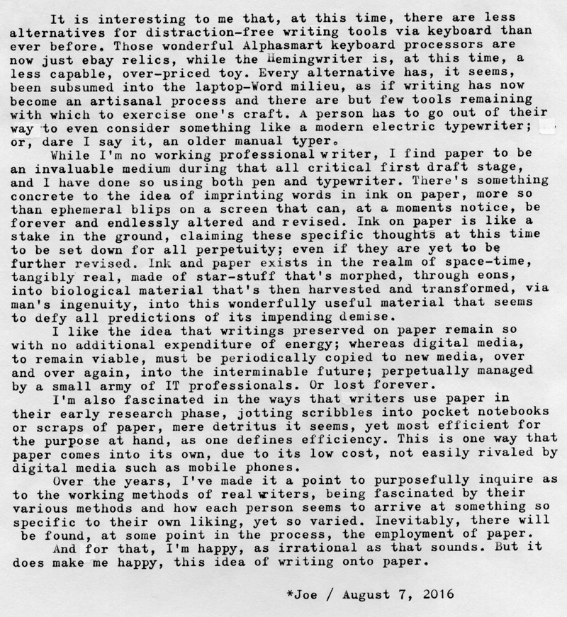
Post-Script: I'm reminded that there are a number of writing applications that purport to make the writing process via laptop computer less distractive. Yet at the same time I can't help but think that it's not a problem with Microsoft Word, but rather with the computing platform itself, wirelessly and incessantly connected to the World Wide Web.

Alternatively, since I'm not a working writer, perhaps I don't know what I'm talking about. But the times I've been the most creative have been those times when I've purposed myself to sit down and write. It's a specific decision a person makes, despite the risk of so-called writer's block. To sit down and put words on paper. Yes, on paper. I do think the paper helps to make the thoughts tangible, though that might be a mere psychological trick. But whatever works.

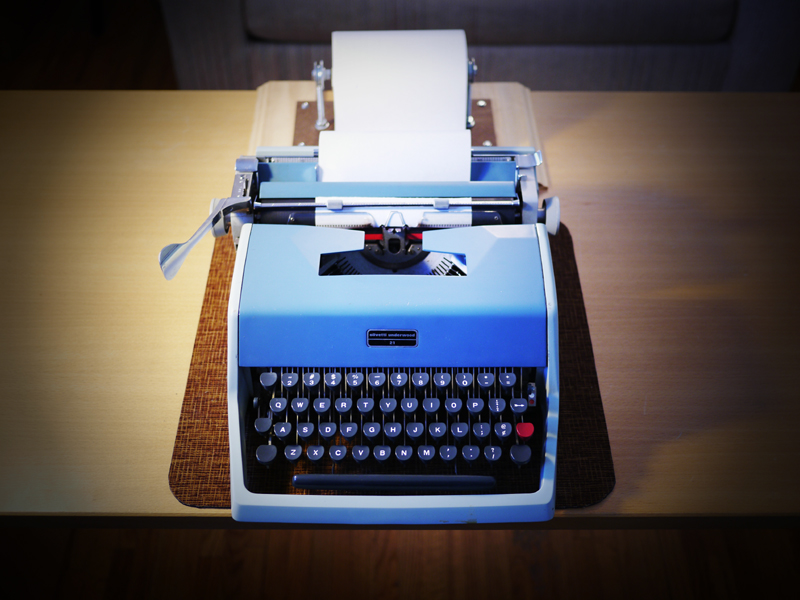
I've included as the second photo my old Underwood Olivetti 21 and the L.A.R.O.P. - Little Ass Roll Of Paper, the junior-sized version of the Jack Kerouac-inspired endless scroll. I had to find this narrower (6" wide) white paper at Napa Auto Parts, used for masking cars prior to being painted. It's white, but isn't letter-writing perfect for taking typewriter ink; but for first-draft writing it's sufficient, if you need the narrower size; and the first-draft writing process with the endless roll of paper is remarkable. Set your machine to double line spacing, set the margins about one character in from either edge, and start typing. And don't stop. Just keep putting words on paper and slinging the carriage back and forth, and before you know it, there's a long tail of paper hanging off the back of the machine, piling up on the floor, and you find yourself with a sizable amount of words written to paper. When you're done, either accordion-fold the scroll into page-sized pieces or cut it up and bind it together; whatever works for you. The double spacing means you can immediately begin proof-reading and revising what you've typed, via pen or pencil. I've found this to be the most efficient way to get words down on paper using a manual typewriter; and the narrower size makes it easier for the scroll to slide back and forth sideways with the carriage motion, compared to a full-width scroll of paper.

Labels: , , , , ,

Tuesday, July 19, 2016

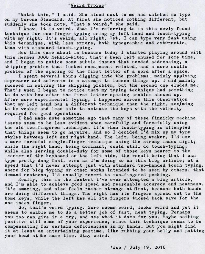
Weird Typing

DSCF5055a
Typecast182

Post-Script: I think this weird typing discovery came out of some intensive typing sessions this last week, during which I was purposefully touch-typing a lot on my newly acquired Corona Standard, whose ergonomics are wonderful and exhibit none of the issues the Hermes 3K showed. Wanting also to rapidly type on the Nekkid-Riter led to my discovering these subtle problems needing fixing, which in turn led to the fact that, at least for mechanical typewriters, I'm now weird typing. Interestingly enough, when I try this same weird typing technique on my PC keyboard I get none of the good effects. It's certainly a mechanical issue between my hands and the machine; something I've come to term "cybernetic," since manual typewriters are one of those few devices that truly operate as an intimately connected system of body and machine.

Regarding the last blog article, about Type-Texting, I haven't yet taken the time to practice, as I've been consumed in my spare time with YouTube videos and some film photography. But I've finished the book "Track Changes," an authoritative history of the word processor, and I garnered lots of thoughts along the way about typewriters and their place in the modern writer's work-flow; which I might write about in the coming weeks. Some of those touch-typing session, alluded to earlier, involved brainstorming some of my thoughts on this subject.

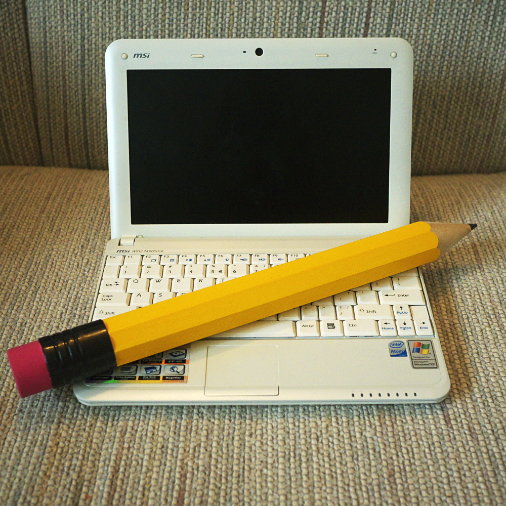
Inspired by the book on word processors, I dug out an old MSI Wind netbook computer that's been sitting in a cabinet for the last five or six years. Its WiFi is essentially nonfunctional, but it does have installed a version of Open Office, so it's essentially a non-Internet connected word processor. I did a bit of writing with it too, fleshing out some of those manually-typed pieces done on the Corona, and so I've used this as an opportunity to experiment with combining typescript into an otherwise all-digital writing process.

Labels: , , , , ,

Tuesday, May 24, 2016

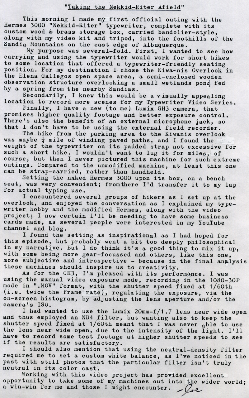
Taking the Nekkid-Riter Afield

DSCF4845a
Typecast172

Post-Script: Because of a technical glitch, this video didn't include any footage of me actually typing. I had attempted a time-lapse sequence of me typing, set to record a frame once every ten seconds. It seemed to have recorded the sequence correctly, since it played back in-camera as I intended; but once I imported the footage to the iPad it was merely a large set of still images. I obviously haven't done my homework regarding how these things work. Instead, I should have used the camera's 300% speed mode, which would have accomplished nearly the same effect but rendered as a conventional video clip.

Overall, I'm still satisfied with using the iPad as an editing platform, but am aware of the need to expand my library of background music, since I'm currently stuck with iMovie's default theme music selection. I need to find a good free-ware music source.

Here's a link to this week's video. I hope you enjoy it.


Typecast via Hermes 3000 Nekkid-Riter. I attempted some touch-typing with this article, which might be obvious due to numerous typos and general sloppiness. Near the end of the piece I set the touch selector from "2" to "3" and noticed, with this particular machine, that it seemed to perform better on a heavier setting. Obviously I'm not going to become a better manual touch-typist without more practice, but having the machine properly set up is also important.

Labels: , , , , , , ,

Tuesday, May 10, 2016

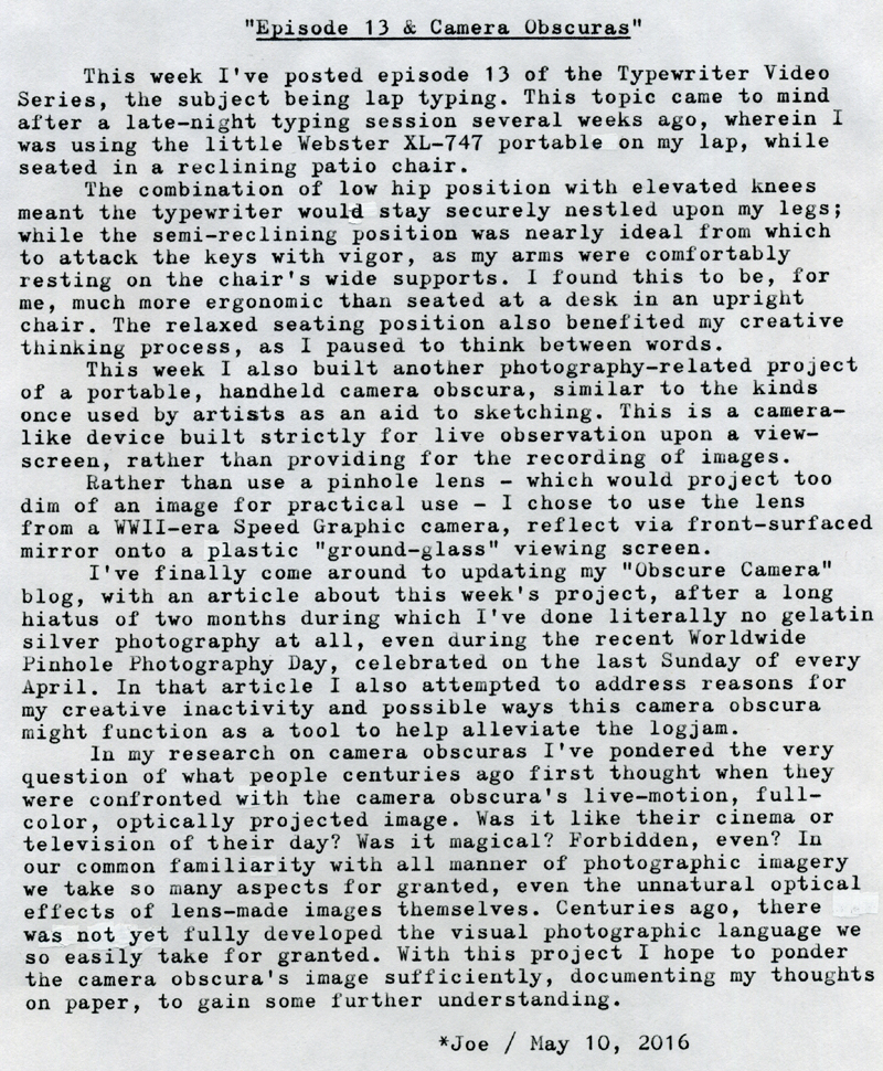
Episode 13 & Camera Obscuras


Typecast170

Post-Script: My Obscure Camera blog article is here.

Here's the website for Worldwide Pinhole Photography Day. Be sure to check out all the gallery images from pinhole photographers around the world.

Typecast via Hermes 3000 "Nekkid-Riter."

Labels: , , , , , , ,

Sunday, May 01, 2016

Teutonic Type-Off

P1110922a
DSCF2499a
P1110647a
Typecast167
DSCF4845a
Typecast168

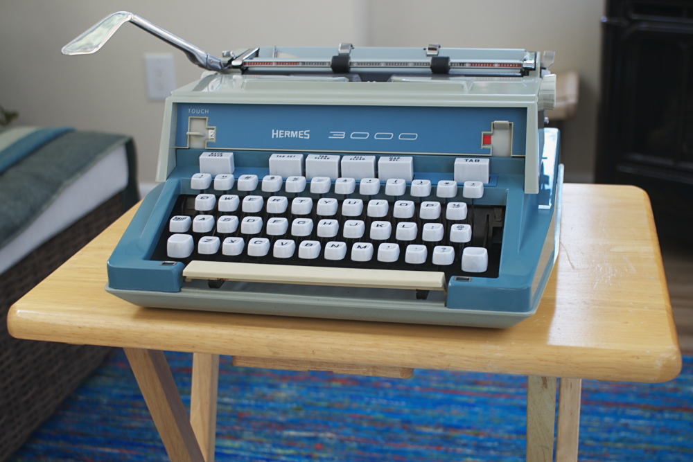
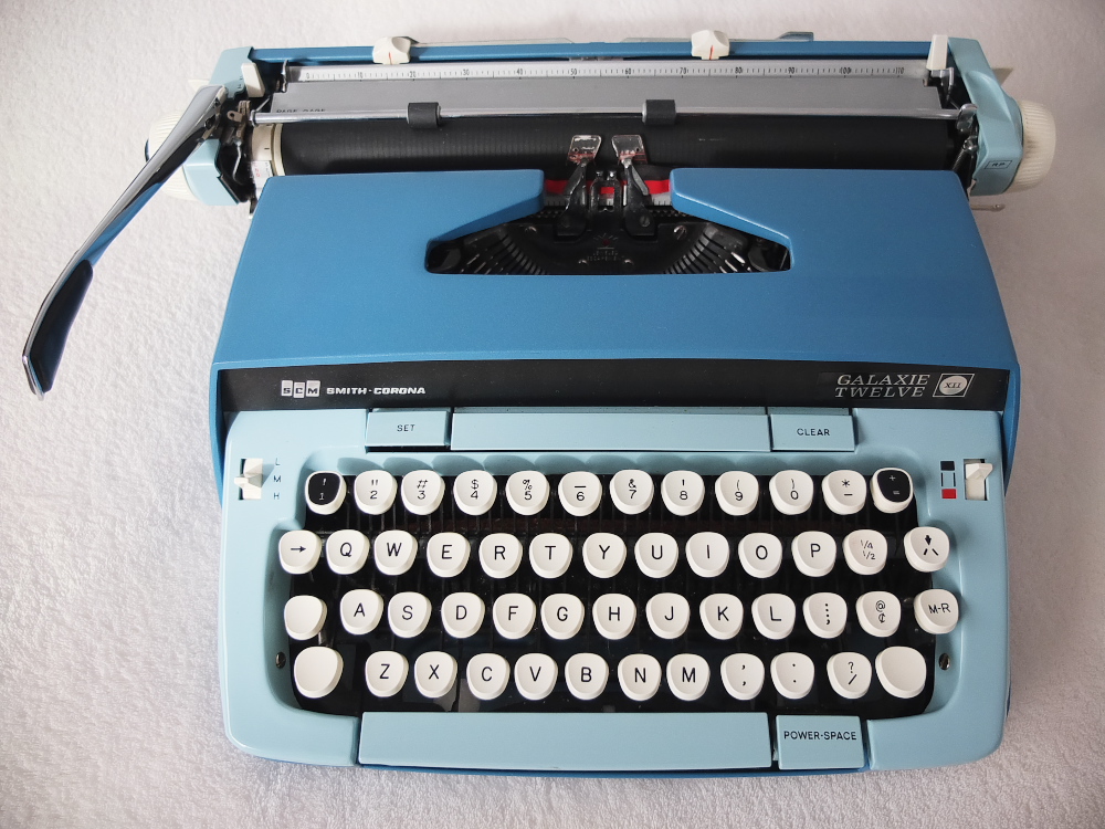
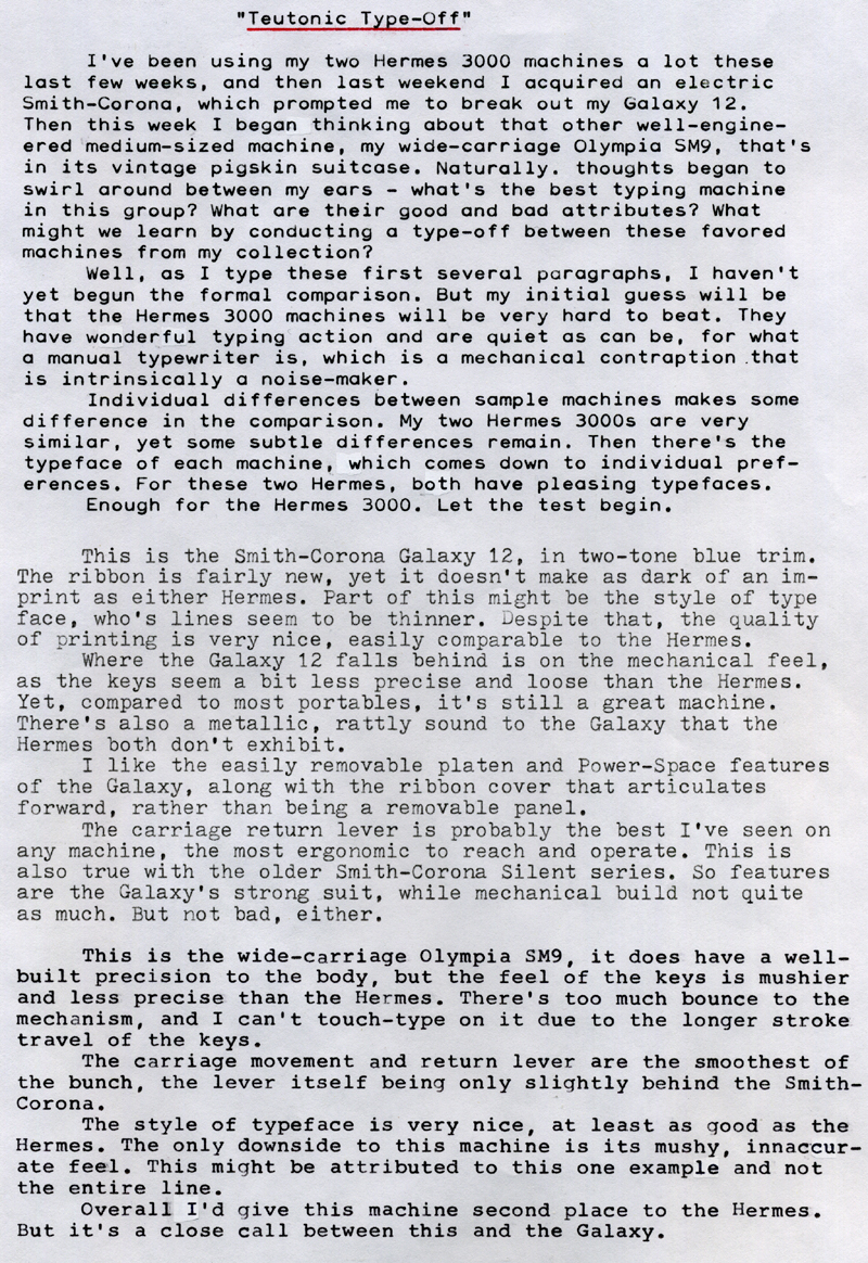
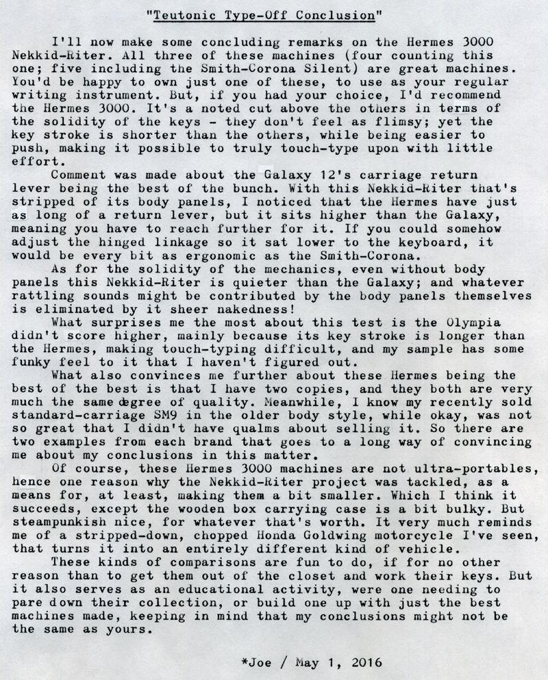
Post-Script: Yes, I know the title's inaccurate, since neither the Hermes nor Smith-Corona can accurately be termed "Teutonic;" but I needed an alliterative title and that was the first thing that came to mind. This was a fun comparison to do on a windy and cold Sunday morning. As I indicated in the concluding remarks above, it serves as an informational test that might help me decide for or against any potential future typewriter purchase I might consider. I don't see myself buying another Galaxy-series machine, for example; not because they're bad machines, but because I already have a nice one, and they're rather large - and both H3Ks are more preferable. I'd rather, if the opportunity presented itself, consider another Silent or Silent Super model, in a different typeface and body color, since these are smaller, more portable machines. And should another Hermes 3000 come my way, I'd be hard pressed to pass it up, especially if it had a different typeface.

Another thing to consider in conclusion are the sample-to-sample variations between otherwise nearly identical machines. While there are subtle differences between my two Hermes 3000s, they're pretty close together in quality, which is as one would expect of a machine made to exacting standards - as long as they've been treated gently throughout the years. The Nekkid-Riter, it should be noted, came to me in much worse condition than the blue H3K, which was purchased from a typewriter shop some years ago. Despite those differences in condition and provenance, both machines type very nicely, which says something significant of their design and construction.

Typefaces are another point of comparison, even between identical models, as evidenced by my two Hermes presented herein. This becomes another reason to consider purchasing what would otherwise become a redundant member of one's collection, if the typeface were more pleasing as compared to a machine already in one's possession. This was one main reason why I decided to sell off the older, standard-carriage Olympia SM9, as the typeface was less pleasing to me.

This might be a fun test to do with my ultra-portable machines, so look forward to that in the coming days.

Labels: , , , , , , ,

Wednesday, April 27, 2016

TWVS Episode 10 & Taking a Spill


This week's episode of the Typewriter Video Series covers the subject of fitting typewriters into a larger writing lifestyle, and especially with handwritten notes and rough drafts.

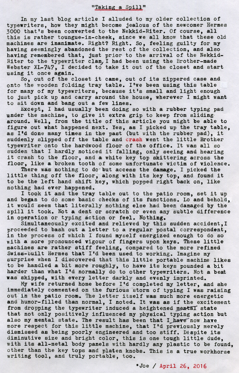
Meanwhile, the following blog article was inspired by a little incident last night involving my Webster XL-747 portable typewriter.

P1100763a
Typecast166

Post-Script: Certainly those Hermes and Olympias are more refined writing tools than the diminutive ultra-portables like the Webster. What matters most importantly to me are typing action and quality of imprint. While the Webster has a nice, dark imprint, its typing action was much stiffer than the bigger machines, yet I kept wanting to make it a favorite among my collection because of its small size, bright color and that it has the repeat spacer feature. Now, after last night's episode, I really do have a newfound respect for it. While those European models mentioned previously might be more refined, they would not have survived a drop to the floor without suffering extensive damage, I'm almost certain, if for no other reason than their heavier weight and, in the case of the newer body style of Hermes 3000, the extensive use of plastics in the body panels.

My enthused typing that followed was a watershed moment for me in my relationship with typewriters as writing tools. Never before had I experienced an excited, emotional period that also had with it an exuberant physical response. It was that more energetic typing action on my part that fueled my mind to break free from convention and write more spontaneously, almost conversationally. Since the letter was private, and has already been posted, I can't share it with you; but perhaps at some point in the future I'll get in the same frame of mind and post a typecast in the same vein.

While recording practice scenes in my Man Cave shed for this latest video, I happened upon the idea of writing sheds and their relationship with typewriters. This I think will be excellent subject matter for a future video in the series.

Typecast via Webster XL-747.

Labels: , , , , , , , ,

Monday, April 25, 2016

Nekkid-Riter Storage Box + More

DSCF4925a
Typecast164

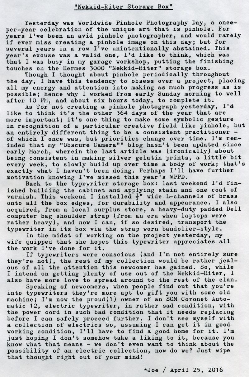
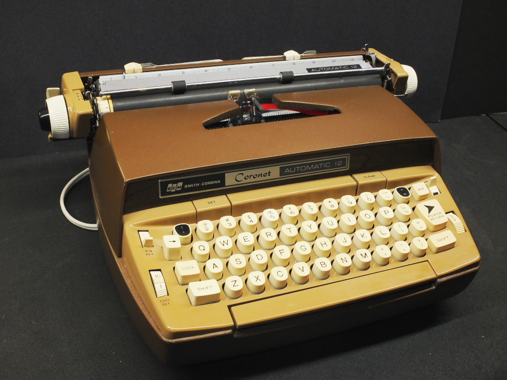
Post-Script: Typecast via Hermes 3000 Nekkid-Riter. I wrote that last paragraph partly in jest, earlier today after having completed the storage box for the Nekkid-Riter. But later on, I decided to take a look at the electric Coronet Automatic 12. I used an old extension cord to replace its original power cord (that was spliced in two places, badly frayed and with an intermittent open near the plug). Upon powering it on, lo and behold it works! I spent the next hour or two cleaning, degreasing and lubricating. The insides are still not entirely clean, since I only hit the critical areas where debris and residue might affect the machine's operation, rather than spotlessly cleaning every surface.

The carriage rails were grinding, so a thorough cleaning, degreasing and re-oiling has smoothed it out nicely. I spent a lot of time cleaning the type slugs with alcohol, swabs and toothpicks, the result being that, with its new ribbon, it types very nicely. The body and storage case were filthy, so plenty of window cleaner, swabs and paper towels were consumed, but the results are enticing.

I'm not certain I like the chocolate-brown color, but I suppose it's less drab than that of my older Smith-Corona Silent. I was originally thinking about calling it the "Brown Streak," from its speedy operation and color, but my wife, in her wisdom, convinced me that this term might be misconstrued as being somewhat scatological. Yes, it's a fast typer; darned if I can't throw words on paper at a speedy clip. This is certainly an office workhorse machine, but it's rather loud; I can only imagine what an office of these machines sounded like, back in the mid-20th century. I suppose if the room were clouded in cigarette smoke (which they often were), it might dampen the racket. Actually, it's not quite as loud as my brother's Hermes 10 electric (that, you might recall, is on permanent loan to the Guild Cinema).

The rear, hinge-side of the case is badly rusted. It looks like it sat up on end in a wet environment. This is one of the few circumstances where I had no qualms about applying some WD-40, followed by a wire brush and plenty of paper towels. It's better than it was, certainly.

So, am I going to keep it? I suppose ... if someone were to twist my arm ... perhaps. I can imagine if, needing to put some high volume of words down on paper at a speedy clip, and the noise were no objection, having one electric typewriter wouldn't be so bad, especially one having the wide carriage and ergonomics of this series of SCM, and with a standard cloth ribbon. But that's it! No electric collection for me, no sir!

Here's a glamor shot of the new clan member. I still need a name for it, something combining its chocolate appearance with speedy operation. It does have that two-tone espresso/coffee look, so perhaps some caffeine-themed name would be appropriate. Jitters? Hmm ... I'll think more about it.

DSCF4927a

Labels: , , , , , , , , , , ,

Tuesday, April 19, 2016

Typing Paper Musings

DSCF4916a
Typecast162
Mead001
Typecast163

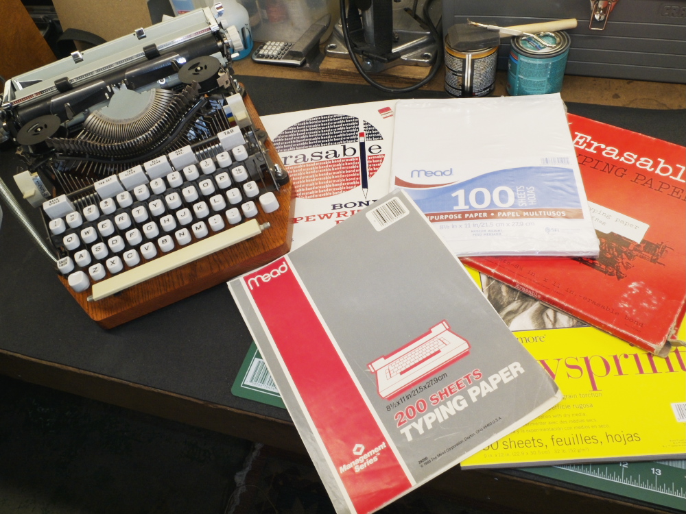
Post-Script: I'm certain that most every contemporary user of manual typewriters has some favored kind of paper, and can brag about its specific qualities. But until you've found, as I have, a pack of legacy-era "genuine" typing paper, in some thrift store perhaps, you don't know that most other kinds of paper pale in comparison. Know too that I'm not referring to "erasable bond" typing paper.

The typing papers I've found receive ribbon ink remarkably well; so well that they can transform an otherwise faint-printing machine into a bold typer - which thus serves to further reinforce my contention that the quality of paper is important to the typing experience.

These papers, while receiving ink so well, do so without being excessively thick or ragged. They appear thin and crisp, and thus roll through a typewriter's platen and rollers with ease.

I'm really surprised that quality typing paper has not received more attention from manufacturers looking for new niche markets to exploit. Imagine if film photographers enjoyed fondling their mechanical cameras but could care less what kind of film they used (read some posting on Rangefinder Forum, for example, and you'll see that photographers are a picky bunch). Most typists seem a bit more laid back, as if "whatever paper I find is okay with me" were the mantra.

Perhaps this serves as proof that typewriters are not as much a hipster affectation as we might expect, for if they were, we'd see a plethora of artisan-crafted typing papers to choose from. And that wouldn't be such a bad thing.

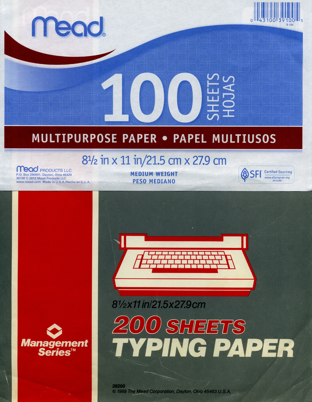
In the second photo, I've scanned the new Mead multipurpose paper, while below it is the lower half of the legacy Mead typing paper. Note the UPC code for both products differ only by one digit. If you search online for the new paper, most websites list results whose photos are actually of the older paper's label, which indicates to me that the product has only recently been re-branded.

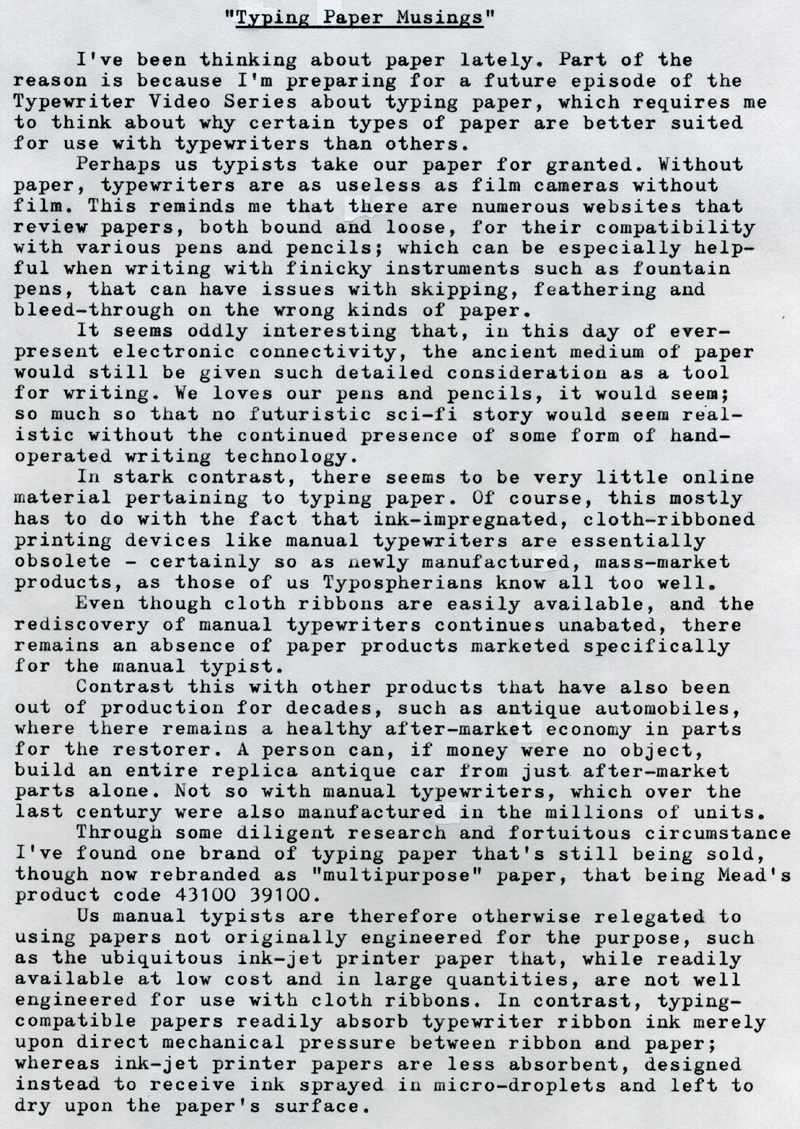
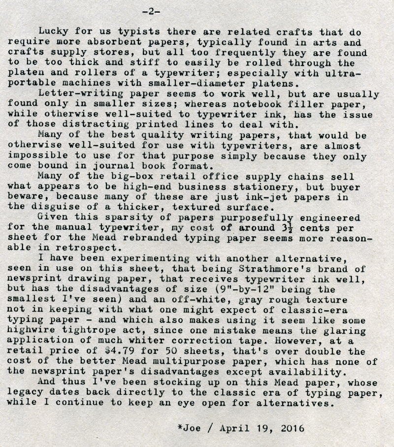
The first page of the piece was typed using the newer Mead paper, while the second page was typed using the Strathmore Newsprint art paper. It's a bit more gray than the scan might indicate, but seems to take ribbon ink rather well; and its toothiness seems to actually keep the type slugs clean, so it has that going for it. The downsides are the cost, the gray color which makes it difficult to hide any corrections, and the size.

Typecast via Hermes 3000 Nekkid-Riter. The storage box is essentially complete, so I'll post an article next week about it.

Labels: , , , ,

Monday, April 18, 2016

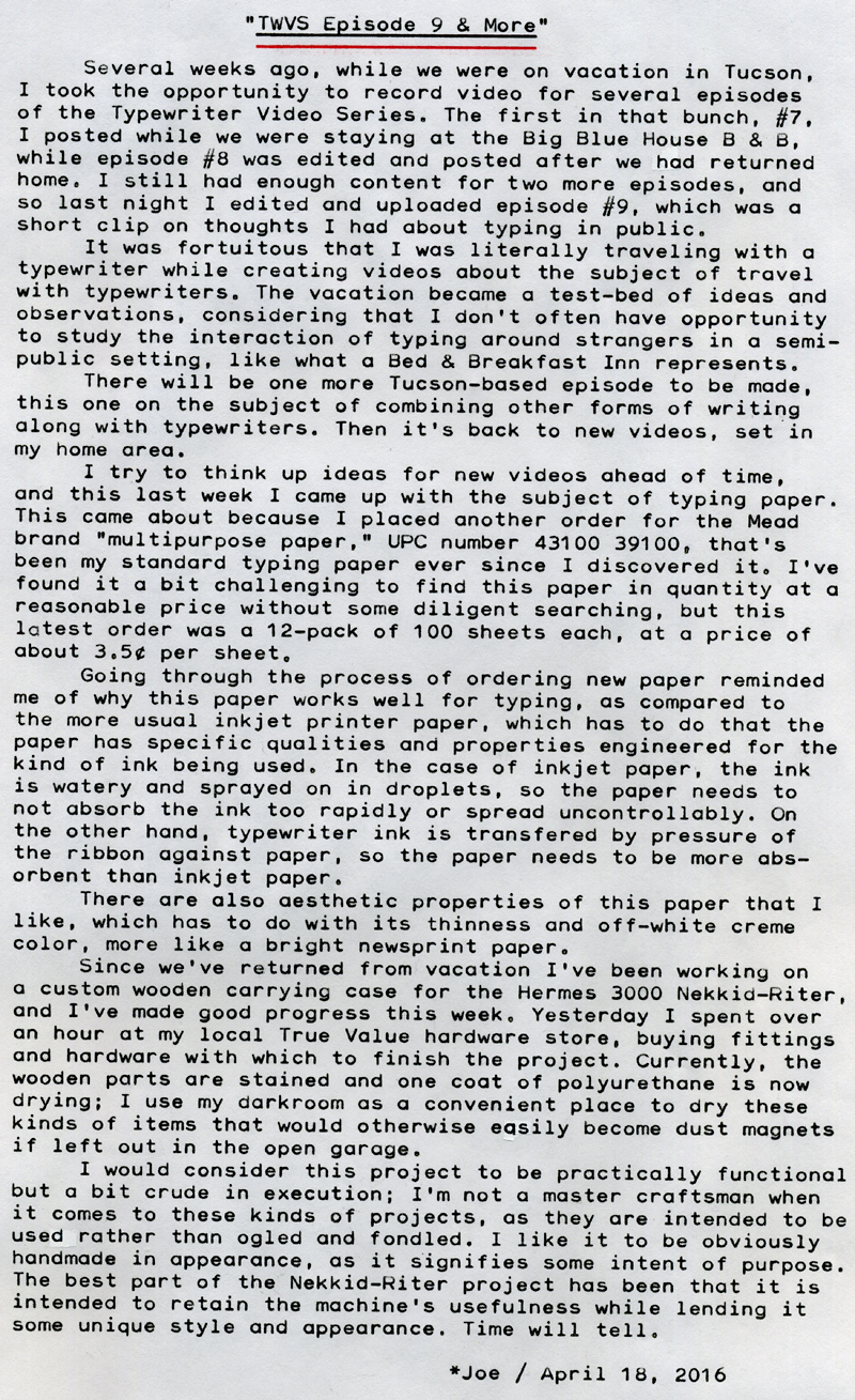
TWVS Episode 9 & More


Typecast161

Post-Script: I think the audio quality is the best part of my video productions thus far. But my video style is much too static. I keep seeing other You Tube channels with much more dynamic and spontaneous footage. For example, there's "Big Head Taco," a photographer from Vancouver, BC by the name of Take Kayo, who this week posted a nice video of himself walking around the streets of his city, recorded using a small mirrorless camera with wide-angle lens, held in one hand via a tripod ball-head mount, that lends a kind of spontaneity that my productions lack. Of course, it's hard to carry a video camera in one hand if you intend on discussing typewriters while also carrying a typewriter. But still, I do need to improve these videos and make them a bit more visually interesting. This latest video of mine did have some visual appeal only because of the wonderful setting, with birds flitting round about me while I talked.

I recently "upgraded" my home Internet with a faster DSL plan and also ordered a new router; but the new router had poorer range and coverage than the older router; the new one lacks external dipole antennas, which I think is part of the problem (the main problem being that the phone company is obviously trying to save money). I thought about returning it, but then did some Internet research and figured out how to use the old router, daisy-chained to the new one via a network cable, as a secondary hot spot, and now I have good coverage and speed at home, including in the Man Cave shed out back. Last night's video rendered and uploaded, via WiFi from the iPad, in only 45 minutes, which was much faster than before.

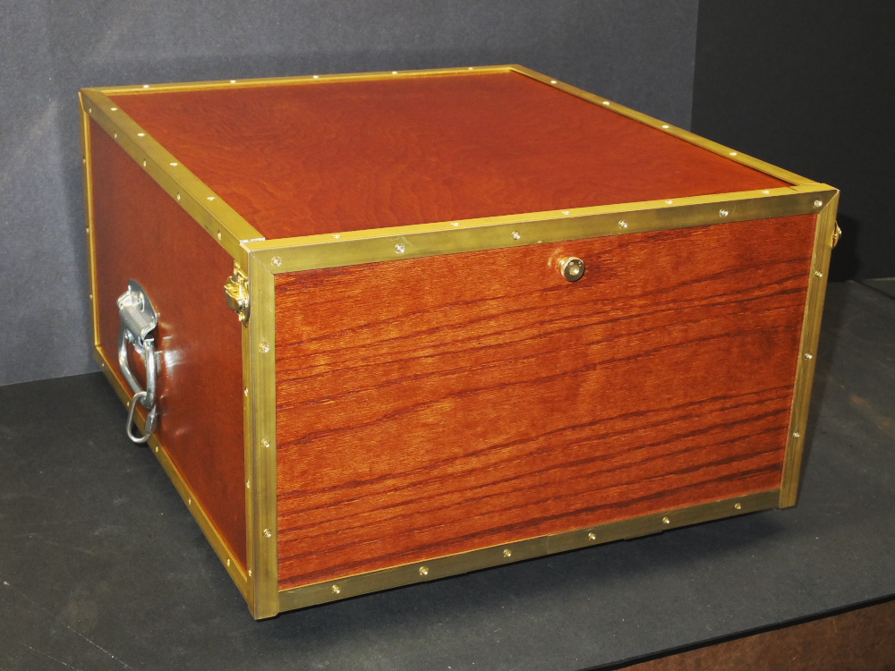
The storage box for the Nekkid-Riter is constructed in a similar fashion to many of my earlier pinhole camera designs, which is a space-frame made from 5/8" finish-grade poplar sticks, sheathed in thin luan plywood, with a base of heavier finish-grade oak plywood. It's a lightweight but strong design that's easy to execute. For the edges, where the plywood tended to flake and chip when cross-cut, I intend on installing 1/2" brass angle brackets, to cover the gaps and chips, while also giving it a bit more durability. I had to modify the space-frame design a bit, to permit the typewriter's platen knobs to clear the left and right side frame members when being slid in and out of the box; my intention was to make the box as small as possible while still being practical. I'm using folding metal equipment handles on both sides, that will also be convenient attachment points upon which to clip a carrying strap, should I decide to go mobile with the Nekkid-Riter. The typewriter's thick wooden base now has two 1/4-20 threaded inserts mounted underneath, which secures the typewriter in the case via a set of thumbscrews from the bottom side of the box. I'll post photos in a subsequent blog article after the project is complete.

Typecast via the Nekkid-Riter's more conservative sibling (who prefers to keep her clothes on, thank you very much), the blue Hermes 3000.

Labels: , , , , , , ,

Sunday, April 10, 2016

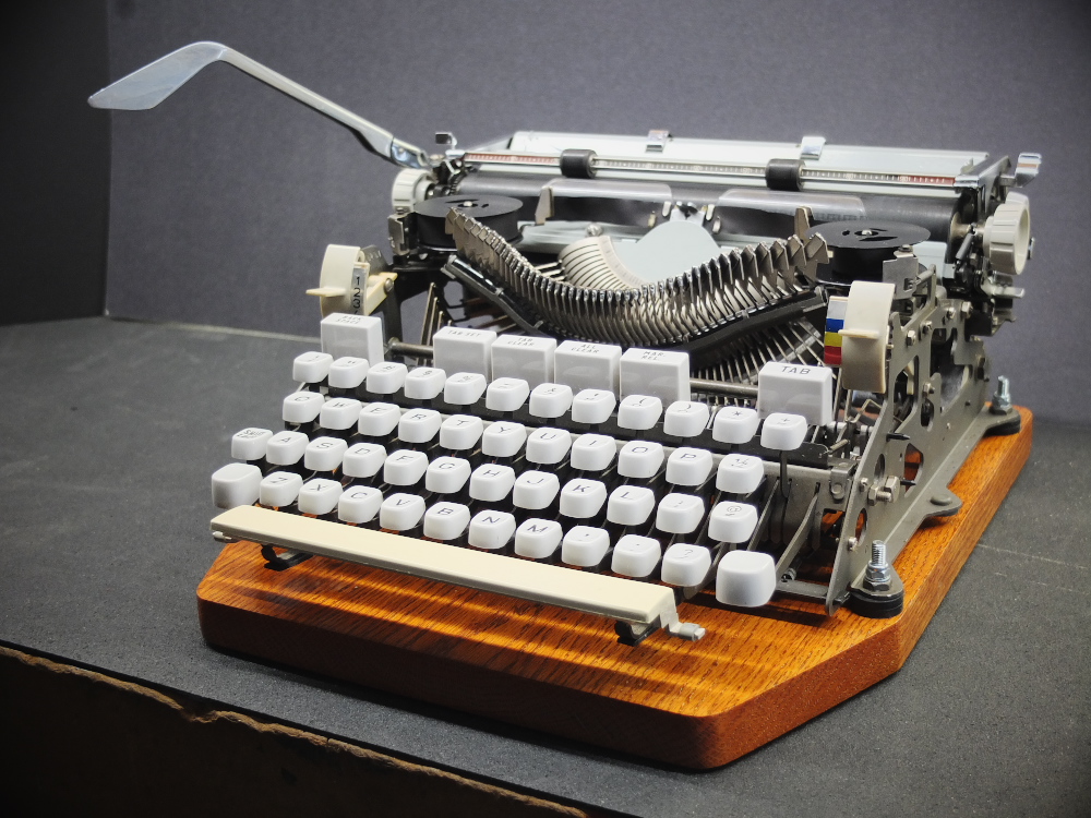
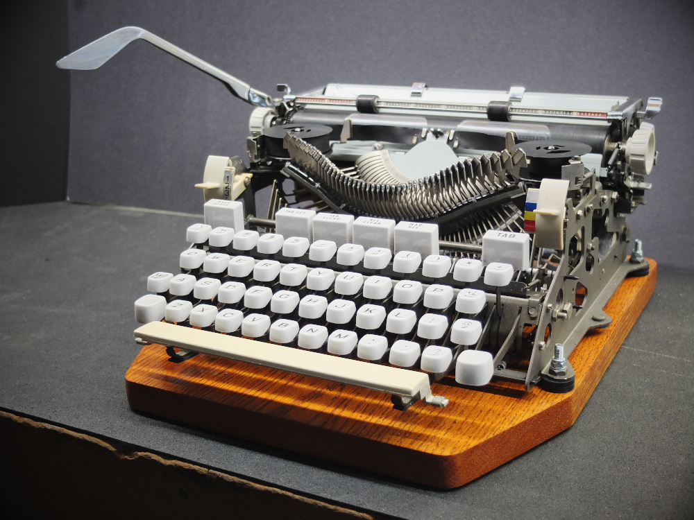
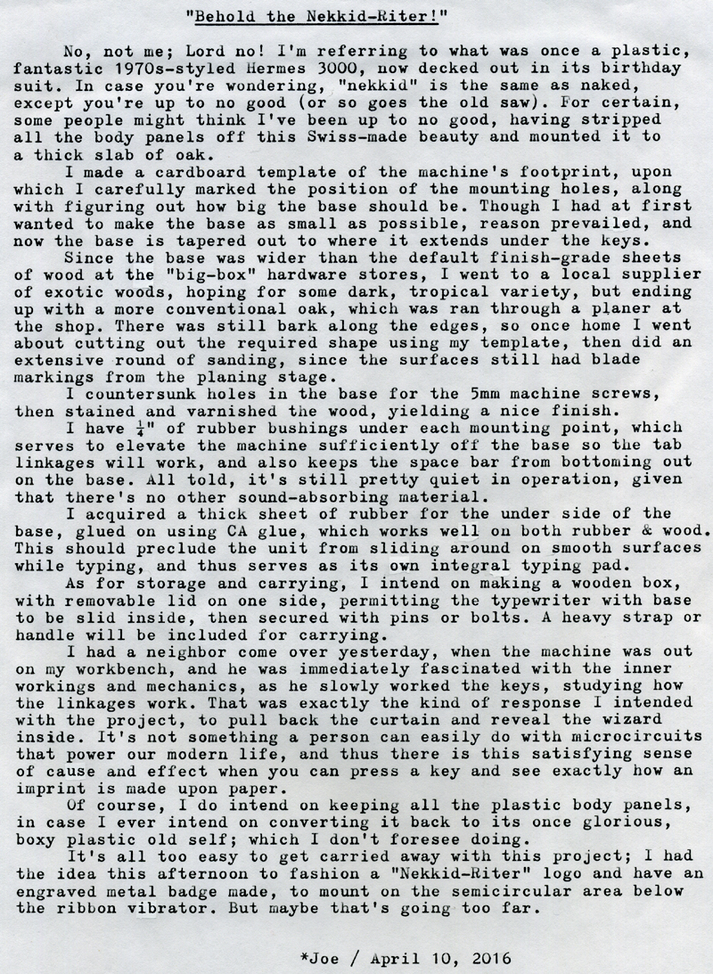
Behold the Nekkid-Riter!

DSCF4845a
Typecast159

Post-Script: This project came out pretty well. The machine types great, and I love the style of type face. The storage/carrying box project will have to wait for next week at the earliest - unless I get ambitious.

I'm willing to accept differences in spelling the word "nekkid"; I've also seen "nekked." I like the first version because it renders the pronunciation more, um, "red of the neck."

We returned Friday evening from our pleasant Tucson vacation, and I have enough "film in the can" for two more episodes of the Typewriter Video Series. The latest is episode 8, embedded below. I was able to edit and upload episode 7 while we stayed at the Big Blue House B & B; their Internet connection is fast, enough such that it only took about 35 minutes to render and upload an 8-minute video, from the iPad.

I really do wish I could attend the upcoming Tucson Type-In, this summer; perhaps I can makes plans far enough in advance. Living here in New Mexico feels at times like being on the edge of nowhere; unless I get off my butt and do some planning, there'll probably never be an Albuquerque Type-In. Speaking of which, someone who's better-experienced at these should publish an online "How to Conduct Your Very Own Type-In" document, for us newcomers to the genre.

Labels: , , , ,